


In the rapidly evolving landscape of retail technology, the ability to visualize system architecture is as critical as the code itself. Modern E-Commerce platforms are rarely monolithic; they are complex ecosystems of microservices, APIs, and third-party integrations. For software architects and developers, clarity in design prevents technical debt and ensures scalability. A well-structured component diagram serves as the blueprint for this complexity, defining boundaries between user-facing layers, business logic, and external dependencies.

This tutorial demonstrates how to build a professional E-Commerce Storefront component diagram using PlantUML within VPasCode. By leveraging a diagram-as-code approach, you maintain a single source of truth for your architecture. VPasCode allows you to render these diagrams instantly in your browser, removing the friction of local environment setup. Whether you are documenting a new project or refactoring an existing retail platform, visualizing your system’s component hierarchy is the first step toward robust engineering.
Understanding the Model: Purpose, Scope & Problem Framing
Before diving into the syntax, it is essential to understand what this specific diagram models and why it is the right tool for the problem.
Diagram Abstraction & Representation
A Component Diagram in PlantUML focuses on the structural organization of a system. Unlike sequence diagrams that show time-based interactions, or class diagrams that show data structures, component diagrams highlight the logical building blocks of the software. In this model, we represent subsystems as components (boxes) and their interactions as interfaces (lollipop and socket notation). This abstraction allows stakeholders to understand the system’s modularity without getting bogged down in implementation details.
Target Domain Scope & Scenario
This diagram specifically models a retail E-Commerce environment. The scope covers four primary architectural layers:
- Presentation Tier: The user-facing applications (Web and Mobile) that initiate requests.
- Core Domain Services: The central business logic handling catalogs, carts, and orders.
- Inventory & Fulfillment: The subsystem managing stock levels and logistics.
- External Integrations: Third-party services like Payment Gateways that extend functionality.
The problem being solved here is the separation of concerns. By defining clear provided and required interfaces, we ensure that the Web Storefront does not need to know the internal logic of the Order Service, only how to request an order via the Checkout API.
Key Takeaways & Educational Insights
By following this guide, you will gain insights into:
- How to structure large-scale systems using PlantUML packages.
- The semantic difference between provided interfaces (lollipop) and required interfaces (socket).
- How to use themes to standardize visual appearance across documentation.
Complete Diagram & Full Source Code
Below is the finished blueprint for the E-Commerce Storefront Architecture. This code is ready to be pasted directly into the VPasCode editor to generate the visual representation.
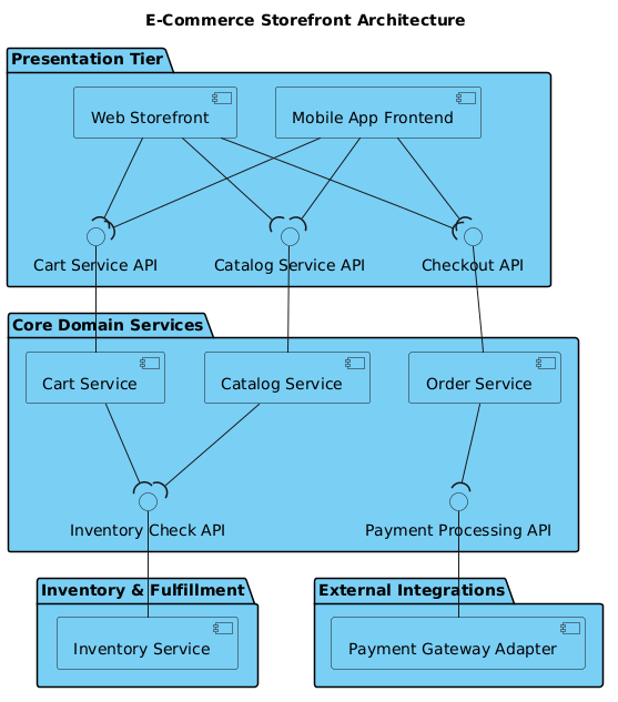
@startuml
!include https://static.visual-paradigm.com/web/resources/plantuml-stdlib/themes/vp.puml

title E-Commerce Storefront Architecture

/'
This diagram illustrates the architectural component breakdown for a modern e-commerce storefront. It models the structural separation between the user-facing presentation layers, core business logic services, and external integrations, highlighting how subsystems interact strictly through well-defined provided and required interfaces.
'/

package "Presentation Tier" {
    [Web Storefront] as WebUI
    [Mobile App Frontend] as MobileUI

    interface "Catalog Service API" as CatalogAPI
    interface "Cart Service API" as CartAPI
    interface "Checkout API" as CheckoutAPI

    WebUI --( CatalogAPI
    WebUI --( CartAPI
    WebUI --( CheckoutAPI

    MobileUI --( CatalogAPI
    MobileUI --( CartAPI
    MobileUI --( CheckoutAPI
}

package "Core Domain Services" {
    [Catalog Service] as CatalogSvc
    CatalogAPI -- CatalogSvc
    interface "Inventory Check API" as InventoryAPI
    CatalogSvc --( InventoryAPI

    [Cart Service] as CartSvc
    CartAPI -- CartSvc
    CartSvc --( InventoryAPI

    [Order Service] as OrderSvc
    CheckoutAPI -- OrderSvc
    interface "Payment Processing API" as PaymentAPI
    OrderSvc --( PaymentAPI
}

package "Inventory & Fulfillment" {
    [Inventory Service] as InventorySvc
    InventoryAPI -- InventorySvc
}

package "External Integrations" {
    [Payment Gateway Adapter] as PaymentAdapter
    PaymentAPI -- PaymentAdapter
}

@endumlStep-by-Step Architectural Walkthrough
Building this diagram from scratch involves four distinct phases. We will walk through each step to ensure you understand the underlying syntax and architectural decisions.
Phase 1: Canvas Configuration & Layout Directives
Every PlantUML diagram begins with setup directives that define the rendering engine and visual style. This ensures consistency across your documentation.
First, we initialize the diagram block:
@startuml
@enduml
Next, we include the VPasCode standard library theme. This directive pulls in a pre-defined set of colors, fonts, and shapes, giving the diagram a professional look without manual styling:
!include https://static.visual-paradigm.com/web/resources/plantuml-stdlib/themes/vp.pumlFinally, we set the diagram title and add a context comment. The comment block is wrapped in /' and '/, which allows you to document the diagram’s purpose without it appearing in the rendered output:
title E-Commerce Storefront Architecture

/'
This diagram illustrates the architectural component breakdown...
'/
Phase 2: Declaring Core Entities, Actors, and Boundaries
The heart of a component diagram is the use of packages to group related components. This creates a hierarchy that mirrors your deployment architecture.
We define the Presentation Tier first, as it is the entry point for users. Inside the package, we declare the components using square brackets:
package "Presentation Tier" {
    [Web Storefront] as WebUI
    [Mobile App Frontend] as MobileUI
}
We repeat this pattern for the Core Domain Services, Inventory & Fulfillment, and External Integrations packages. Using as allows us to create aliases (e.g., WebUI) which simplifies referencing these components in connection lines later.
Phase 3: Mapping Data Flows & Key Interactions
Now we connect the components using interfaces. In PlantUML, interfaces act as the contract between components. We define them explicitly within the package where they are relevant.
To define an interface, we use the interface keyword:
interface "Catalog Service API" as CatalogAPIOnce defined, we map the relationships. The direction of the arrow and the presence of parentheses dictate the nature of the dependency. A component requiring an interface uses the socket syntax --(:
WebUI --( CatalogAPIConversely, a component providing an interface connects the interface to the component without parentheses:
CatalogAPI -- CatalogSvcThis syntax explicitly shows that WebUI uses CatalogAPI, while CatalogSvc provides CatalogAPI.
Phase 4: Grouping, Annotations & Visual Polish
The final phase involves ensuring all cross-package dependencies are resolved. For example, the Core Domain Services need to talk to Inventory & Fulfillment. We achieve this by referencing the interface defined in the Core package and connecting it to the Inventory Service component.
CatalogSvc --( InventoryAPI
InventoryAPI -- InventorySvc
This creates a clean visual flow where dependencies are obvious. By grouping components logically, we reduce cognitive load for anyone reviewing the architecture. The VPasCode editor allows you to tweak these groupings instantly to see how the layout adapts.
Syntax & Keyword Deep Dive
Understanding the specific keywords used in this diagram empowers you to build more complex models. Here is a breakdown of the critical PlantUML syntax features utilized:
package: Groups components into logical namespaces. Essential for managing complexity in large systems.[Component Name]: Defines a standard component box. Can be used for services, applications, or subsystems.interface "Label" as Alias: Defines a named contract. Theaskeyword creates a shorthand reference.--(: Indicates a Required Interface. The component on the left requires the interface on the right.--: Indicates a Provided Interface or simple association. When placedInterface -- Component, it means the component provides the interface.title: Sets the main heading for the diagram output./\' ... \'/: Creates a comment block. Text inside is ignored by the renderer but visible in the code.
Best Practices & Pitfalls to Avoid
To maintain high-quality architectural documentation, follow these best practices when using VPasCode:
- Consistent Naming Conventions: Always use
asto create aliases (e.g.,[Service] as Svc). This keeps connection lines clean and reduces clutter. - Interface Abstraction: Do not connect components directly if they should interact via an API. Always use an interface box to represent the contract.
- Logical Grouping: Use packages to reflect deployment boundaries (e.g., Tier, Domain, Infrastructure). This helps stakeholders understand where code lives.
- Theming: Always include the standard library theme (
!include ...) to ensure your diagrams match the organization’s visual identity.
Try It Yourself with VPasCode
Start Building PlantUML Component Diagrams Faster with VPasCode
Design your retail architecture instantly in the browser without installing any tools. Test syntax, preview live, and customize themes for your documentation.