


In the rapidly evolving landscape of educational technology, architectural clarity is paramount for building scalable, maintainable platforms. A Peer Tutoring Matchmaker Platform, which connects students seeking assistance with qualified peer tutors, requires a robust backend structure to handle user management, intelligent matchmaking logic, and real-time communication. Without a clear visual representation of the system’s internal structure, development teams risk creating tightly coupled components that are difficult to test, deploy, or extend.

Using diagram-as-code tools like VPasCode allows architects to define these complex relationships precisely using PlantUML. By codifying the architecture, teams ensure that the separation of concerns between the presentation layer, business logic, and communication infrastructure is enforced from the very beginning. This approach transforms abstract requirements into a living blueprint that developers can reference, modify, and validate instantly within the browser.
Understanding the Model: Purpose, Scope & Problem Framing
This tutorial focuses on constructing a Component Diagram, a specific type of structural diagram used to model the physical or logical components of a system. Unlike class diagrams that focus on implementation details, component diagrams highlight the high-level building blocks and how they interact through interfaces. For a Peer Tutoring Matchmaker Platform, this diagram is critical for defining the boundaries between the user-facing applications and the core services that drive the matching algorithm.
Diagram Abstraction & Representation
The component diagram models the system as a collection of modular units. In this specific scenario, we use the “ball-and-socket” notation to represent interface contracts. A “ball” (provided interface) signifies a service offered by a component, while a “socket” (required interface) signifies a dependency on another component. This visual metaphor clarifies which parts of the system are self-sufficient and which parts rely on external logic, such as the Web UI requiring the Matchmaker Engine to function.
Target Domain Scope & Scenario
The scope of this model encompasses three primary architectural layers: Presentation, Business Logic, and Communication. The diagram intentionally excludes physical infrastructure details like specific database schemas or server hardware to maintain a logical view. It focuses on the software boundaries, ensuring that the User Manager, Matchmaker Engine, and Notification Service are clearly defined and accessible via standardized interfaces.
Key Takeaways & Educational Insights
By completing this tutorial, you will gain a deeper understanding of how to organize software architecture into logical packages. You will learn how to declare interfaces explicitly to decouple components, allowing the Web UI to change without affecting the underlying Matchmaker Engine. This separation is essential for agile development, enabling teams to update specific layers of the education platform independently.
Complete Diagram & Full Source Code
Before diving into the construction steps, review the final blueprint. This diagram visualizes the Peer Tutoring Matchmaker Platform architecture, grouping components by layer and defining their interactions through provided and required interfaces.
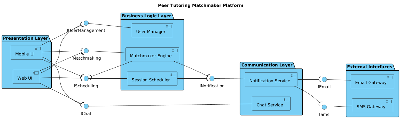
Copy the complete source code below. You can paste this directly into the VPasCode editor to render the diagram instantly.
@startuml
!include https://static.visual-paradigm.com/web/resources/plantuml-stdlib/themes/vp.puml
left to right direction
title Peer Tutoring Matchmaker Platform

/'
  Peer Tutoring Matchmaker Platform Context:
  This diagram illustrates the core component architecture of a platform that connects
  students seeking tutoring with peer tutors. The system handles user management,
  matchmaking logic based on subject expertise and availability, session scheduling,
  and real-time notifications. The components are grouped by logical layers to reflect
  the separation of concerns between presentation, business logic, and communication
  infrastructure.
'/

package "Presentation Layer" {
  component "Web UI" as WebUI
  component "Mobile UI" as MobileUI
}

package "Business Logic Layer" {
  component "User Manager" as UserMgr
  component "Matchmaker Engine" as MatchEng
  component "Session Scheduler" as Sched
}

package "Communication Layer" {
  component "Notification Service" as NotifSvc
  component "Chat Service" as ChatSvc
}

package "External Interfaces" {
  component "Email Gateway" as EmailGW
  component "SMS Gateway" as SmsGW
}

' Provided interfaces (ball on the left)
interface "IUserManagement" as IUserMgmt
interface "IMatchmaking" as IMatch
interface "IScheduling" as ISched
interface "INotification" as INotif
interface "IChat" as IChat
interface "IEmail" as IEmail
interface "ISms" as ISms

' Required interfaces (socket on the right, using --(
' Web UI requires user management and matchmaking
WebUI --( IUserMgmt
WebUI --( IMatch
WebUI --( ISched

' Mobile UI requires the same
MobileUI --( IUserMgmt
MobileUI --( IMatch
MobileUI --( ISched

' Business components provide their respective interfaces
IUserMgmt -- UserMgr
IMatch -- MatchEng
ISched -- Sched

' Matchmaker requires scheduling and notification
MatchEng --( ISched
MatchEng --( INotif

' Scheduler requires notification
Sched --( INotif

' Notification Service provides notification interface
INotif -- NotifSvc

' Chat Service provides chat interface
IChat -- ChatSvc

' Notification Service requires email and SMS
NotifSvc --( IEmail
NotifSvc --( ISms

' Email gateway provides email interface
IEmail -- EmailGW

' SMS gateway provides SMS interface
ISms -- SmsGW

' Web UI also requires chat
WebUI --( IChat
MobileUI --( IChat

@endumlStep-by-Step Architectural Walkthrough
Building a professional component diagram requires a structured approach. We will construct this diagram in four logical phases, moving from global configuration to specific interface mappings.
Phase 1: Canvas Configuration & Layout Directives
The first step is to set the stage for the diagram. We begin by including the VPasCode theme to ensure the visual style is consistent and professional. We also define the layout direction and the diagram title.
!include https://static.visual-paradigm.com/web/resources/plantuml-stdlib/themes/vp.puml
left to right direction
title Peer Tutoring Matchmaker Platform
The left to right direction directive ensures that the flow of the architecture reads naturally from left to right, which is standard for component diagrams. The title directive provides a clear identifier for the diagram when exported or shared.
Phase 2: Declaring Core Entities, Actors, and Boundaries
Next, we define the structural boundaries using packages. Packages act as folders that group related components together, reflecting the separation of concerns in the system architecture.
package "Presentation Layer" {
  component "Web UI" as WebUI
  component "Mobile UI" as MobileUI
}

package "Business Logic Layer" {
  component "User Manager" as UserMgr
  component "Matchmaker Engine" as MatchEng
  component "Session Scheduler" as Sched
}
We create distinct packages for Presentation Layer, Business Logic Layer, and Communication Layer. Inside each package, we declare components using the component keyword. We assign an alias (e.g., as WebUI) to simplify referencing this component later in the interface mapping phase.
Phase 3: Mapping Data Flows & Key Interactions
This is the most critical phase, where we define how components communicate. We use the ball-and-socket notation to represent interfaces. A provided interface (ball) is drawn on the left, while a required interface (socket) is drawn on the right.
' Required interfaces (socket on the right, using --(
WebUI --( IUserMgmt
WebUI --( IMatch

' Business components provide their respective interfaces
IUserMgmt -- UserMgr
Notice the syntax difference: --( indicates a required interface (the socket), and -- indicates a provided interface (the ball). For example, WebUI --( IUserMgmt means the Web UI requires the IUserManagement interface. Conversely, IUserMgmt -- UserMgr means the User Manager provides that interface.
Phase 4: Grouping, Annotations & Visual Polish
Finally, we add context to the diagram using comments. This helps future maintainers understand the intent behind the architecture without reading the code logic.
/'
  Peer Tutoring Matchmaker Platform Context:
  This diagram illustrates the core component architecture...
'/
We wrap the comment block using /' at the start and '/ at the end. This text does not render as part of the diagram shape but appears as metadata in the source or documentation, providing essential context about the system’s problem space.
Syntax & Keyword Deep Dive
Understanding the specific PlantUML syntax used in this diagram is essential for accurate modeling. Here is a breakdown of the key keywords and conventions:
package: Defines a container for grouping components. This is crucial for maintaining visual clarity in large systems.component: Declares a logical component within a package. It represents a deployable unit of software.interface: Defines a contract that a component implements or requires. It acts as a bridge between components.--(: Represents a required interface. The socket shape appears on the right side of the component, indicating a dependency.--: Represents a provided interface. The ball shape appears on the left side of the component, indicating a service offered./' ... '/: Defines a comment block. This is used for adding descriptive context to the diagram without affecting the visual rendering.
Best Practices & Pitfalls to Avoid
To ensure your PlantUML diagrams remain maintainable and readable, follow these architectural modeling best practices:
- Maintain Layered Consistency: Always group components by their architectural layer (e.g., Presentation, Logic, Data). Do not mix layers within a single package, as this obscures the system’s logical boundaries.
- Standardize Interface Naming: Use clear, consistent naming conventions for interfaces (e.g., prefix with “I” for Interface). This makes it immediately obvious which lines in the diagram represent contracts versus direct component links.
- Limit Component Complexity: Keep the diagram focused on high-level components. If a component becomes too complex, consider creating a separate sub-diagram for it rather than cluttering the main view.
- Use Comments for Context: Don’t just draw the code; explain the problem space. Use the comment block syntax to describe the “why” behind the architecture, such as the specific goals of a Peer Tutoring platform.
Try It Yourself with VPasCode
Start Building Peer Tutoring Platform Diagrams Faster with VPasCode
Instantly render and customize your PlantUML component diagrams in the browser with zero local installation or setup required.