


When tracking daily habits, website traffic, server activity logs, or sales intensity over full calendar years, the Calendar Chart provides an effective, grid-based visual layout. Modeled after contribution graphs and seasonal heatmaps, calendar charts map continuous quantitative metrics across specific calendar days, helping users identify high-activity peaks, weekend variations, and multi-month seasonal patterns at a glance.
The Mechanics of Calendar Charts
In Apache ECharts, calendar charts use a dedicated calendar coordinate system combined with a heatmap or scatter series type. Instead of standard cartesian X and Y axes, ECharts calculates day and month grid positions automatically using date strings.
1. Essential Setup
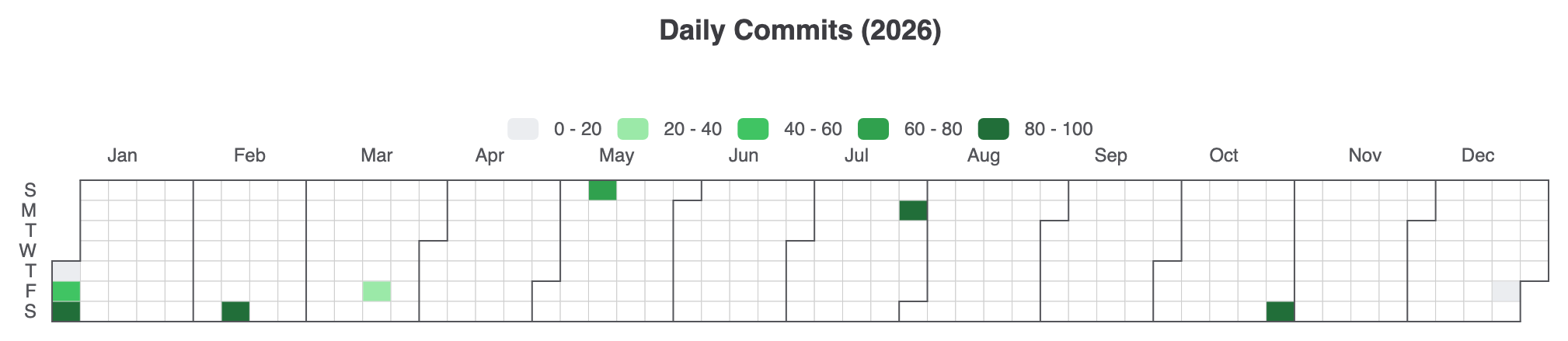
To create a basic annual calendar heatmap, define a calendar component specifying a range (e.g., '2026'), attach a visualMap to control metric color gradients, and pass daily date-value tuples formatted as ['YYYY-MM-DD', value]:
option = {
    title: {
        top: 10,
        left: 'center',
        text: 'Daily Commits (2026)'
    },
    tooltip: {
        formatter: function (params) {
            return params.value[0] + ': ' + params.value[1] + ' commits';
        }
    },
    visualMap: {
        min: 0,
        max: 100,
        type: 'piecewise',
        orient: 'horizontal',
        left: 'center',
        top: 65,
        inRange: {
            color: ['#ebedf0', '#9be9a8', '#40c463', '#30a14e', '#216e39']
        }
    },
    calendar: {
        top: 120,
        left: 30,
        right: 30,
        cellSize: ['auto', 13],
        range: '2026',
        itemStyle: {
            borderWidth: 0.5,
            borderColor: '#ccc'
        },
        yearLabel: { show: false }
    },
    series: {
        type: 'heatmap',
        coordinateSystem: 'calendar',
        data: [
            ['2026-01-01', 12], ['2026-01-02', 45], ['2026-01-03', 88],
            ['2026-02-14', 95], ['2026-03-20', 30], ['2026-05-10', 65],
            ['2026-07-27', 82], ['2026-10-31', 99], ['2026-12-25', 10]
        ]
    }
};
Advanced Structural Techniques
Calendar charts can be adapted for vertical scrolling layouts or customized with scatter representations to visualize discrete daily metrics.
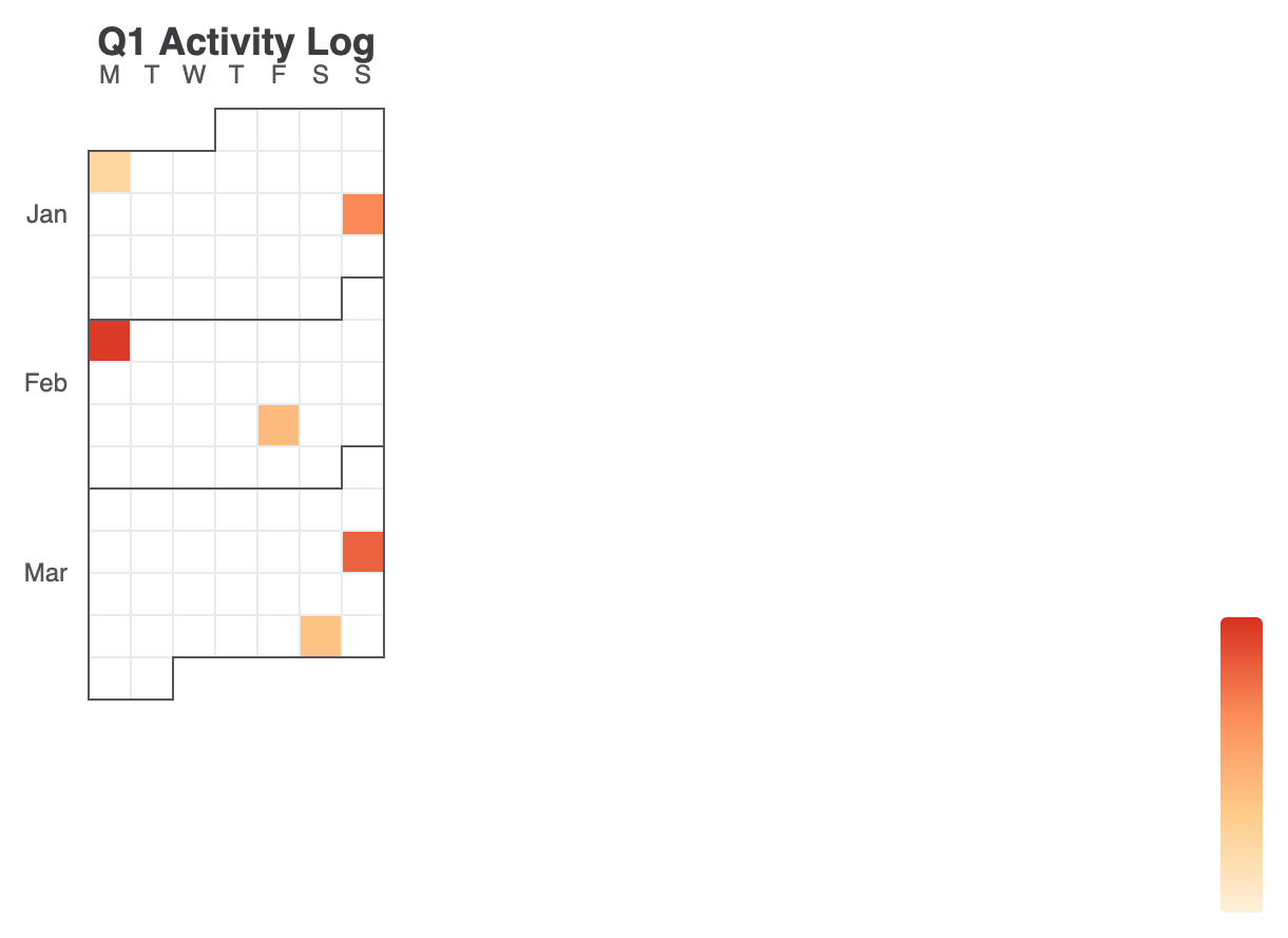
1. Vertical Multi-Month Calendar View
Change orient: 'vertical' on the calendar component to stack months vertically—ideal for tall dashboard widgets or mobile layouts:
option = {
    title: {
        text: 'Q1 Activity Log',
        left: 'center'
    },
    tooltip: {},
    visualMap: {
        min: 0,
        max: 500,
        type: 'continuous',
        orient: 'vertical',
        right: 10,
        top: 'center',
        inRange: {
            color: ['#fef0d9', '#fdcc8a', '#fc8d59', '#d7301f']
        }
    },
    calendar: {
        top: 60,
        left: 'center',
        orient: 'vertical',
        range: ['2026-01-01', '2026-03-31'],
        cellSize: [20, 20],
        yearLabel: { show: false },
        dayLabel: {
            firstDay: 1, // Start week on Monday
            nameMap: 'en'
        },
        monthLabel: { nameMap: 'en' }
    },
    series: {
        type: 'heatmap',
        coordinateSystem: 'calendar',
        data: [
            ['2026-01-05', 120], ['2026-01-18', 340], ['2026-02-02', 480],
            ['2026-02-20', 210], ['2026-03-15', 410], ['2026-03-28', 190]
        ]
    }
};
Fine-Tuning Layout and Styling
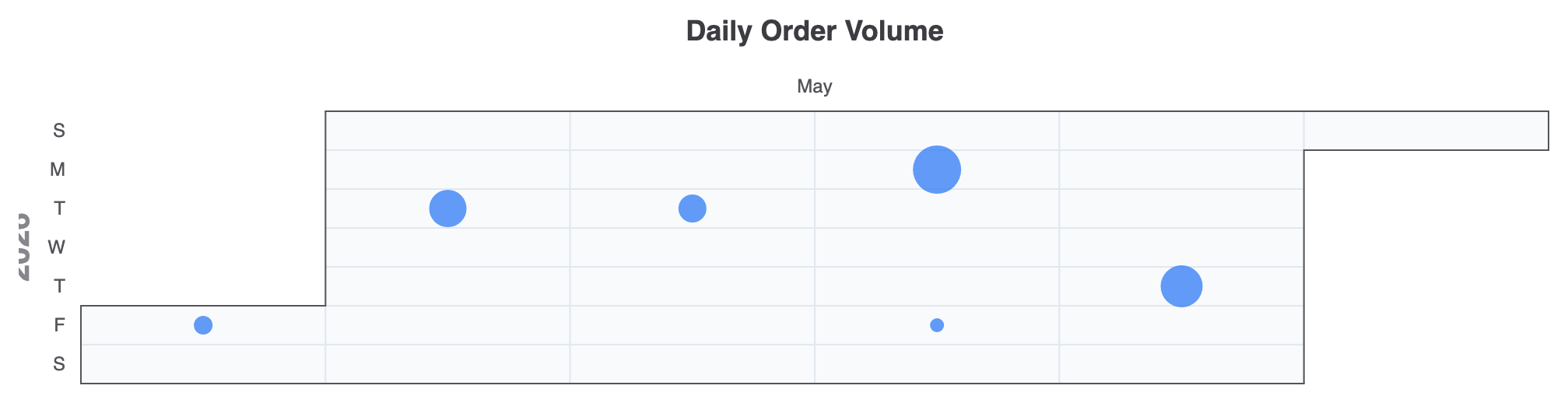
Combining calendar coordinate systems with scatter series allows you to scale point sizes based on intensity instead of color blocks alone.
1. Scatter Bubble Calendar
Using type: 'scatter' on a calendar coordinate system creates interactive bubble-style daily indicators:
option = {
    title: {
        text: 'Daily Order Volume',
        left: 'center'
    },
    tooltip: {
        formatter: function (params) {
            return params.value[0] + ': ' + params.value[1] + ' orders';
        }
    },
    calendar: {
        top: 80,
        left: 40,
        right: 40,
        range: '2026-05',
        cellSize: ['auto', 25],
        itemStyle: {
            color: '#f8fafc',
            borderWidth: 1,
            borderColor: '#e2e8f0'
        }
    },
    series: {
        type: 'scatter',
        coordinateSystem: 'calendar',
        symbolSize: function (val) {
            return val[1] / 10; // Scales bubble size according to order count
        },
        itemStyle: {
            color: '#3b82f6',
            opacity: 0.8
        },
        data: [
            ['2026-05-01', 120], ['2026-05-05', 240], ['2026-05-12', 180],
            ['2026-05-18', 310], ['2026-05-22', 90], ['2026-05-28', 270]
        ]
    }
};
Strategic Best Practices
- Match Dates to ISO Format: Ensure dates inside your series data array follow standard
'YYYY-MM-DD'string formats so the calendar grid maps records accurately. - Configure
firstDayfor Regional Consistency: UsedayLabel.firstDay(set to0for Sunday or1for Monday) to match your audience’s local calendar conventions. - Pair Piecewise VisualMap for Contributions: When rendering GitHub-style commit graphs, use a
piecewisevisual map type with discrete color stops rather than continuous gradients for cleaner categorical visual steps.