


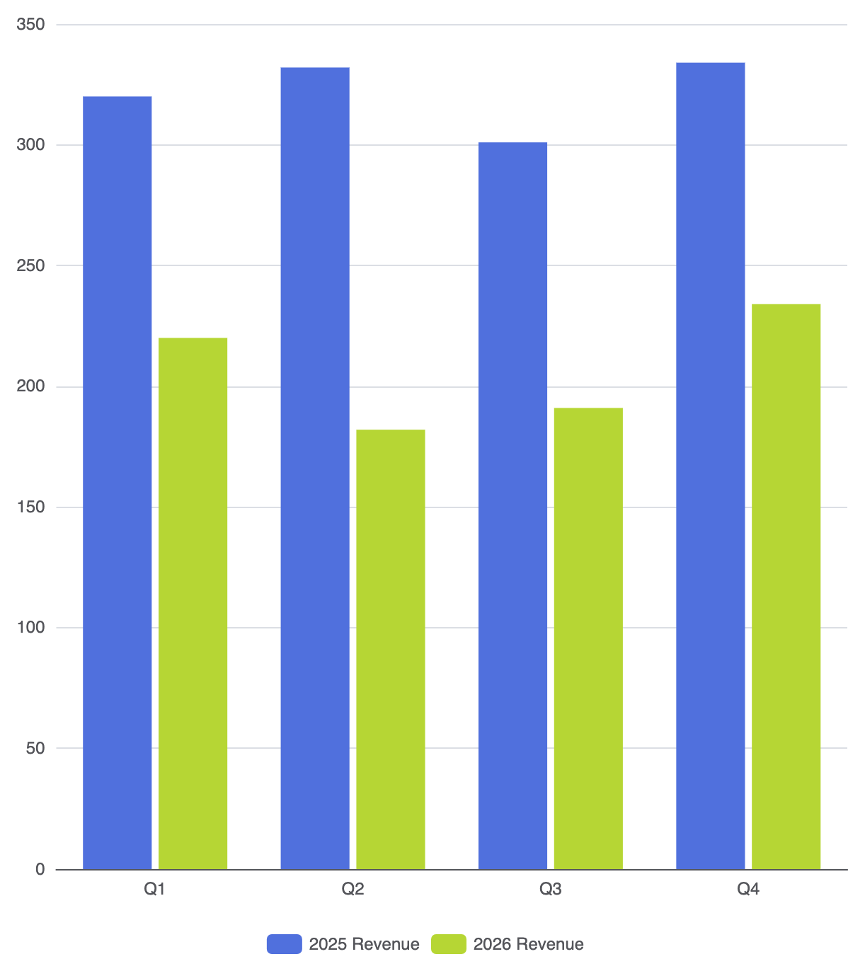
In data analysis and business reporting, the Grouped Column Chart (also known as a Clustered Column Chart) is the primary tool for side-by-side comparison across multiple dimensions. While a standard column chart evaluates a single metric per category, grouped column charts place related datasets next to each other within the same category bin. This enables immediate visual evaluation of trends across time, performance across teams, or multi-metric performance.
The Mechanics of Grouped Columns
Grouped column charts operate on a shared coordinate system where the horizontal axis represents discrete categories and the vertical axis handles continuous values. Grouping is achieved by declaring multiple series objects that share the exact same category alignment on the horizontal axis. The layout engine automatically calculates the required offset and renders each series side-by-side within its respective category block.
1. Essential Setup
To build a grouped column chart, define a single categorical axis and supply multiple series objects with type: 'bar':
option = {
    tooltip: {
        trigger: 'axis',
        axisPointer: { type: 'shadow' }
    },
    legend: {
        data: ['2025 Revenue', '2026 Revenue']
    },
    xAxis: {
        type: 'category',
        data: ['Q1', 'Q2', 'Q3', 'Q4']
    },
    yAxis: {
        type: 'value'
    },
    series: [
        {
            name: '2025 Revenue',
            type: 'bar',
            data: [320, 332, 301, 334]
        },
        {
            name: '2026 Revenue',
            type: 'bar',
            data: [220, 182, 191, 234]
        }
    ]
};
Advanced Structural Techniques
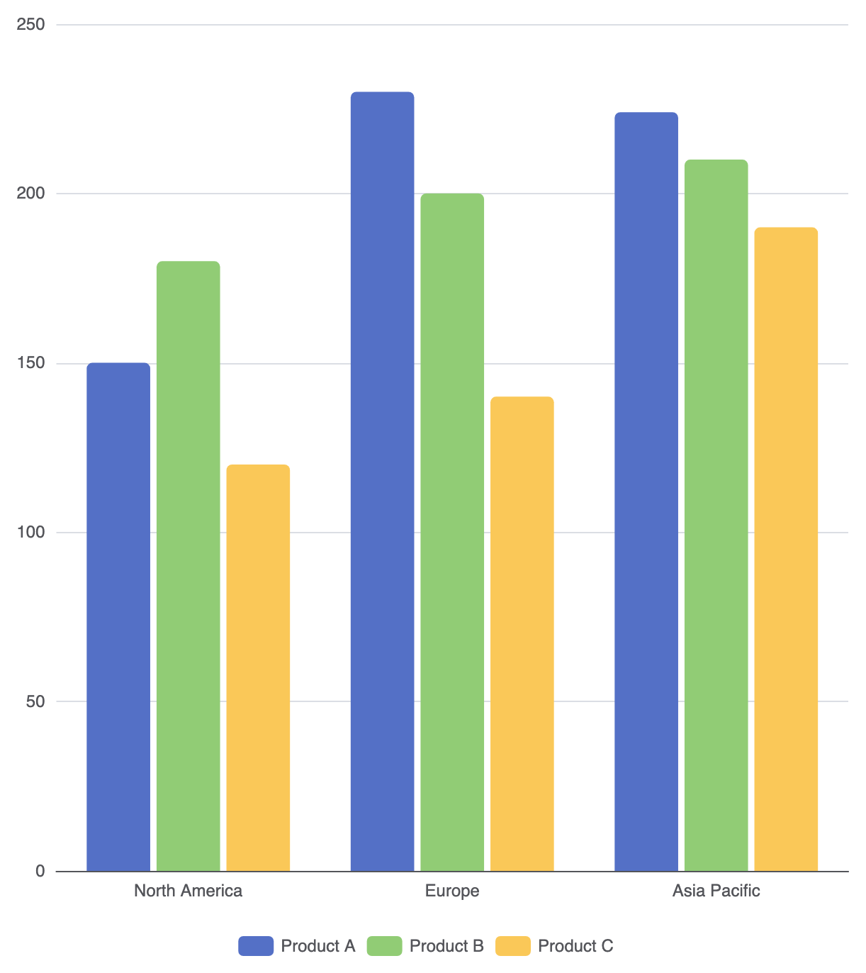
Adding a third or fourth series increases chart density. To maintain clarity, you can fine-tune series styling, layout spacing, and visual cues.
1. Custom Styling Across Groups
Applying unique colors, rounded corners, or custom item styles makes it easy to distinguish individual groups within dense charts:
option = {
    legend: {
        data: ['Product A', 'Product B', 'Product C']
    },
    xAxis: {
        type: 'category',
        data: ['North America', 'Europe', 'Asia Pacific']
    },
    yAxis: {
        type: 'value'
    },
    series: [
        {
            name: 'Product A',
            type: 'bar',
            data: [150, 230, 224],
            itemStyle: {
                color: '#5470c6',
                borderRadius: [4, 4, 0, 0]
            }
        },
        {
            name: 'Product B',
            type: 'bar',
            data: [180, 200, 210],
            itemStyle: {
                color: '#91cc75',
                borderRadius: [4, 4, 0, 0]
            }
        },
        {
            name: 'Product C',
            type: 'bar',
            data: [120, 140, 190],
            itemStyle: {
                color: '#fac858',
                borderRadius: [4, 4, 0, 0]
            }
        }
    ]
};
Fine-Tuning Layout and Spacing
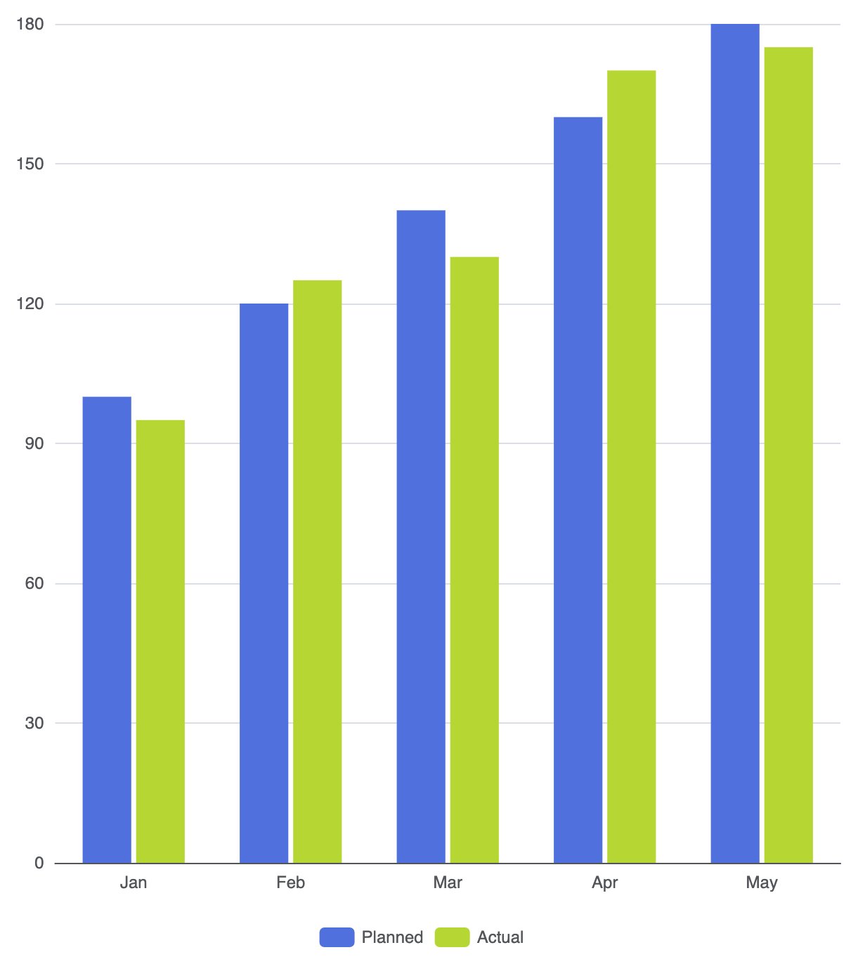
Spacing is critical when working with grouped columns. Controlling the gap between columns in the same group versus the gap between separate category groups prevents visual clutter.
1. Inner Gaps vs. Category Gaps
Use spacing attributes to balance layout density:
barGap: Controls the space between columns within the same category group (e.g.,'20%'or'0%'for touching columns).barCategoryGap: Controls the space between different category groups (e.g.,'40%').barWidth: Controls column width relative to category space.
option = {
    legend: {
        data: ['Planned', 'Actual']
    },
    xAxis: {
        type: 'category',
        data: ['Jan', 'Feb', 'Mar', 'Apr', 'May']
    },
    yAxis: {
        type: 'value'
    },
    series: [
        {
            name: 'Planned',
            type: 'bar',
            data: [100, 120, 140, 160, 180],
            barGap: '10%',
            barCategoryGap: '35%'
        },
        {
            name: 'Actual',
            type: 'bar',
            data: [95, 125, 130, 170, 175]
        }
    ]
};
Strategic Best Practices
- Limit Group Count: Avoid placing more than 3 to 4 columns in a single group. Too many columns per category make the chart difficult to scan.
- Always Include a Legend: Because grouped charts use color to differentiate variables, a clear top or bottom legend is mandatory for context.
- Consistent Group Order: Keep the sequence of series consistent across every category (e.g., always place “2025” before “2026”).