


When tracking continuous progression or time-series changes, the Line Chart serves as the primary visual tool. Unlike discrete column or bar charts that focus on individual category comparisons, line charts emphasize connection and slope to highlight momentum, seasonality, and sudden metric shifts over uninterrupted sequences, such as daily active user growth, monthly recurring revenue, or sensor telemetry streams.
The Mechanics of Line Charts
In Apache ECharts, line visualizations are configured by setting the series type property to 'line'. Line charts connect sequentially ordered data points along a continuous categorical or time scale horizontal axis (xAxis) and map continuous numerical values to the vertical axis (yAxis).
1. Essential Setup
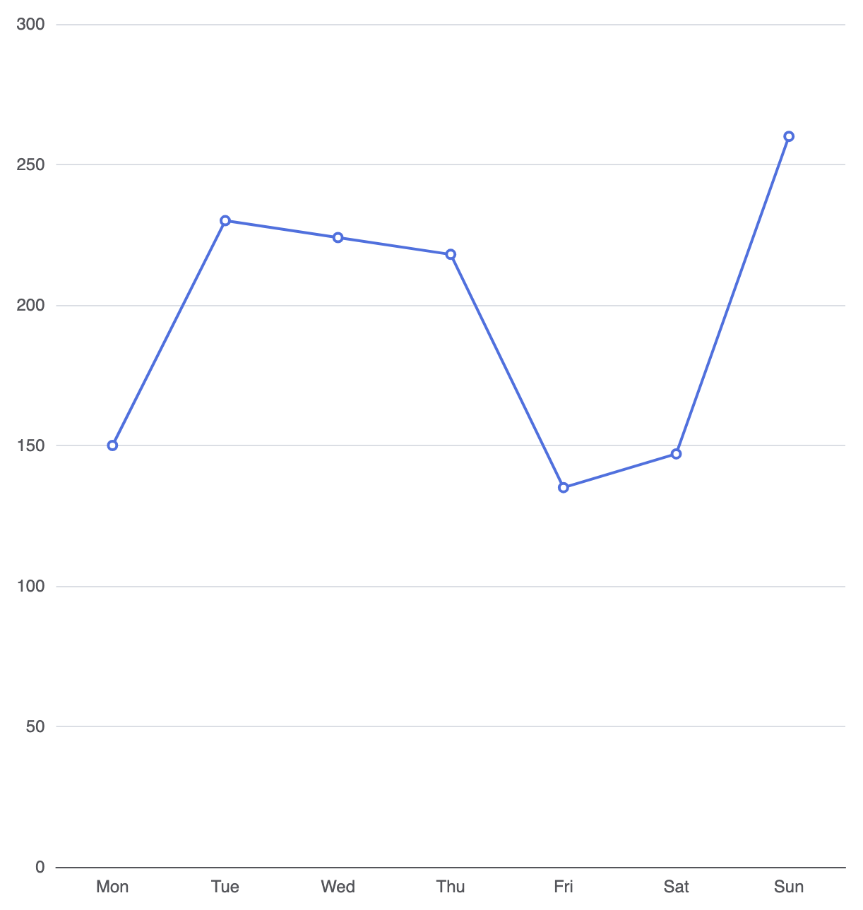
To build a basic line chart, define your continuous categories along the X-axis and map your dataset to a series object with type: 'line':
option = {
    tooltip: {
        trigger: 'axis'
    },
    xAxis: {
        type: 'category',
        data: ['Mon', 'Tue', 'Wed', 'Thu', 'Fri', 'Sat', 'Sun']
    },
    yAxis: {
        type: 'value'
    },
    series: [
        {
            type: 'line',
            data: [150, 230, 224, 218, 135, 147, 260]
        }
    ]
};
Advanced Structural Techniques
Line charts offer flexibility for multi-metric overlays, smooth interpolation curves, and customized data point indicators.
1. Smooth Interpolation Curves
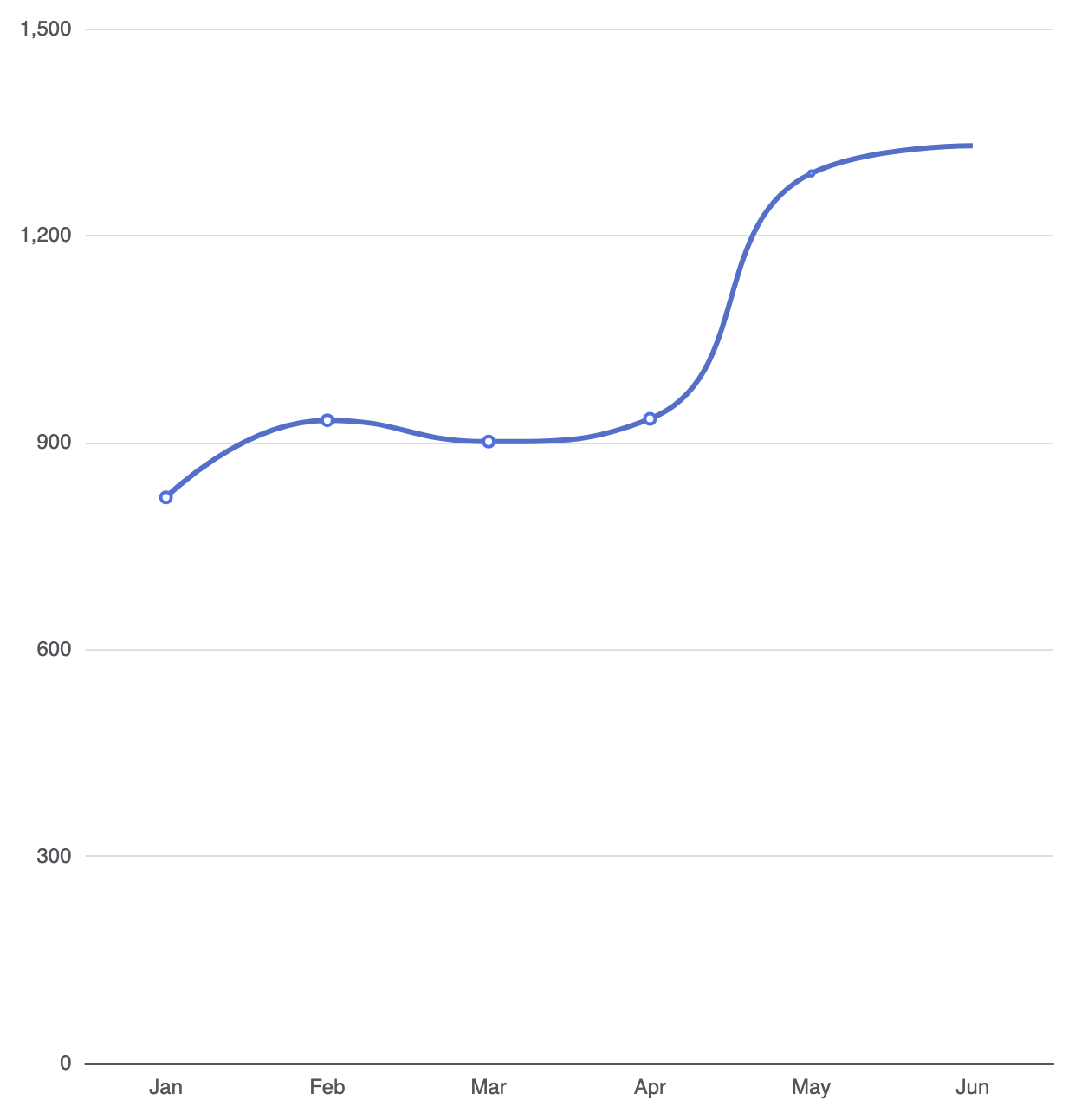
By default, line series connect data points with straight line segments. Enabling smooth: true applies cubic spline interpolation to create curved, organic line paths across your dataset:
option = {
    tooltip: {
        trigger: 'axis'
    },
    xAxis: {
        type: 'category',
        data: ['Jan', 'Feb', 'Mar', 'Apr', 'May', 'Jun']
    },
    yAxis: {
        type: 'value'
    },
    series: [
        {
            type: 'line',
            smooth: true,
            data: [820, 932, 901, 934, 1290, 1330],
            lineStyle: {
                width: 3,
                color: '#5470c6'
            }
        }
    ]
};
2. Multi-Line Performance Comparison
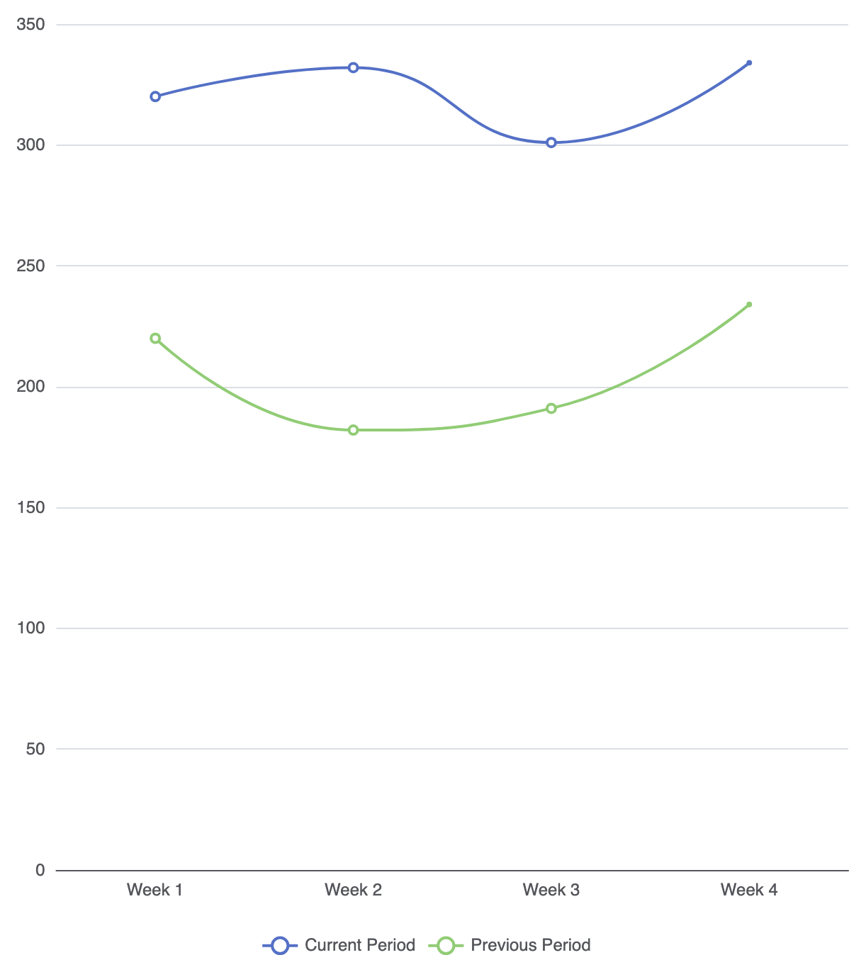
Compare secondary metrics across identical time intervals by supplying multiple line objects inside the series array:
option = {
    tooltip: {
        trigger: 'axis'
    },
    legend: {
        data: ['Current Period', 'Previous Period']
    },
    xAxis: {
        type: 'category',
        data: ['Week 1', 'Week 2', 'Week 3', 'Week 4']
    },
    yAxis: {
        type: 'value'
    },
    series: [
        {
            name: 'Current Period',
            type: 'line',
            smooth: true,
            data: [320, 332, 301, 334],
            itemStyle: { color: '#5470c6' }
        },
        {
            name: 'Previous Period',
            type: 'line',
            smooth: true,
            data: [220, 182, 191, 234],
            itemStyle: { color: '#91cc75' }
        }
    ]
};
Fine-Tuning Area Fills and Data Points
Line series can be visually enhanced using subtle background gradient fills and targeted data markers to call attention to key milestones.
1. Line Area Styling
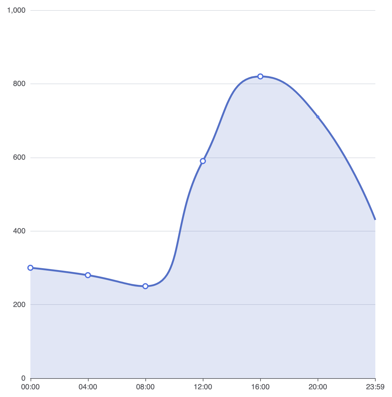
Adding an areaStyle property transforms a standard line chart into an area view, filling the region between the line path and the horizontal axis:
option = {
    xAxis: {
        type: 'category',
        boundaryGap: false, // Align line directly to axis edges
        data: ['00:00', '04:00', '08:00', '12:00', '16:00', '20:00', '23:59']
    },
    yAxis: {
        type: 'value'
    },
    series: [
        {
            type: 'line',
            smooth: true,
            data: [300, 280, 250, 590, 820, 710, 430],
            areaStyle: {
                color: 'rgba(84, 112, 198, 0.25)' // Soft fill under line
            },
            lineStyle: {
                width: 3,
                color: '#5470c6'
            },
            symbolSize: 8
        }
    ]
};
Strategic Best Practices
- Use
boundaryGap: falsefor Time Sequences: Removing default edge gaps on continuous time axes lets the line start directly at the zero margin for a clean edge-to-edge presentation. - Keep Line Counts Low: Avoid rendering more than 4 to 5 lines in a single canvas. Overcrowded line charts („spaghetti charts”) quickly become unreadable.
- Axis Tooltip Triggers: Always configure
tooltip: { trigger: 'axis' }so users can hover along any horizontal point to view precise values across all active line series simultaneously.