


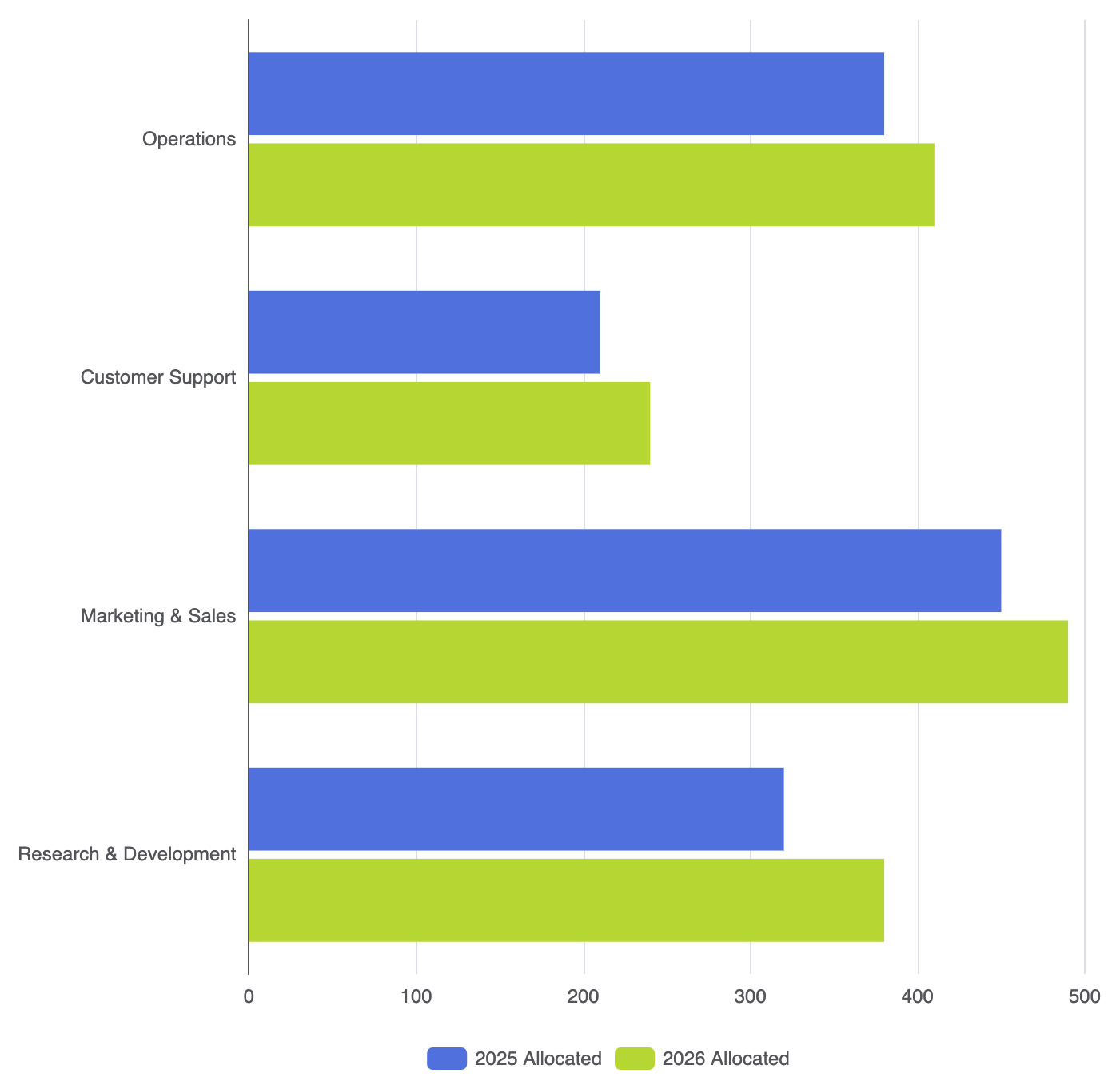
Comparing secondary metrics across lengthy category names is best handled with a Grouped Bar Chart. By placing related horizontal bars side-by-side along the Y-axis, this layout lets users scan performance metrics across multiple categories without sacrificing label readability. It serves as an effective choice for multi-year budget breakdowns, product feature comparisons, or multi-region sales benchmarks where category labels require ample horizontal space.
The Mechanics of Grouped Horizontal Bars
Like vertical column groups, horizontal bar groups are created by assigning identical categorical labels to the Y-axis while defining multiple series with type: 'bar'. The rendering engine handles the visual grouping automatically, offsetting each series within the category block along the vertical plane.
1. Essential Setup
To build a grouped bar chart, assign your discrete categories to yAxis.data, specify a numerical xAxis, and include multiple bar series:
option = {
    tooltip: {
        trigger: 'axis',
        axisPointer: { type: 'shadow' }
    },
    legend: {
        data: ['2025 Allocated', '2026 Allocated']
    },
    xAxis: {
        type: 'value'
    },
    yAxis: {
        type: 'category',
        data: ['Research & Development', 'Marketing & Sales', 'Customer Support', 'Operations']
    },
    series: [
        {
            name: '2025 Allocated',
            type: 'bar',
            data: [320, 450, 210, 380]
        },
        {
            name: '2026 Allocated',
            type: 'bar',
            data: [380, 490, 240, 410]
        }
    ]
};
Advanced Structural Techniques
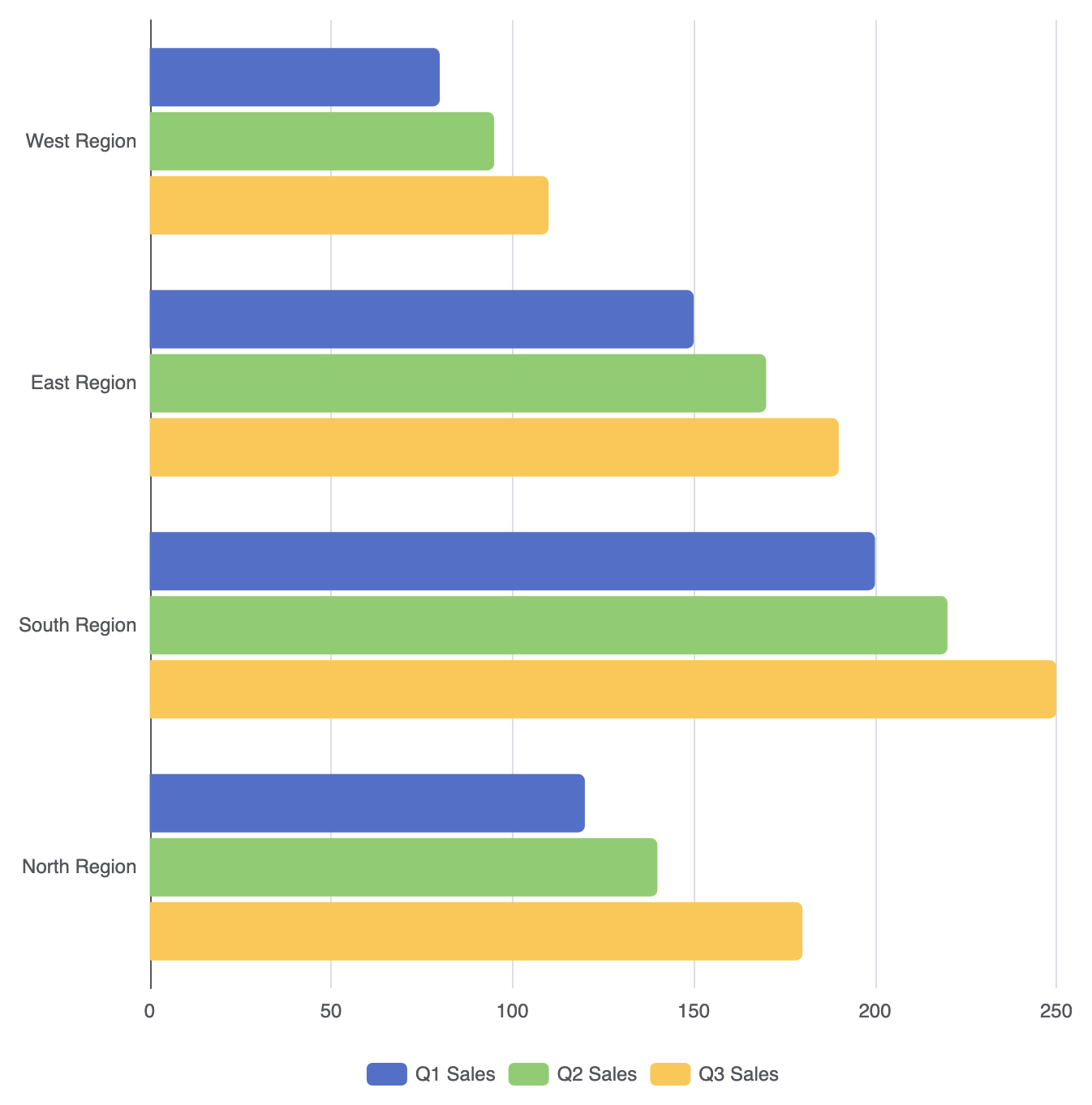
Expanding your chart to three or more series provides richer insights, provided the visual density remains easy to read.
1. Multi-Metric Styling with Custom Color Gradients
Apply unique color palettes or subtle gradient fills across horizontal series to keep distinct groups legible:
option = {
    legend: {
        data: ['Q1 Sales', 'Q2 Sales', 'Q3 Sales']
    },
    xAxis: {
        type: 'value'
    },
    yAxis: {
        type: 'category',
        data: ['North Region', 'South Region', 'East Region', 'West Region']
    },
    series: [
        {
            name: 'Q1 Sales',
            type: 'bar',
            data: [120, 200, 150, 80],
            itemStyle: {
                color: '#5470c6',
                borderRadius: [0, 4, 4, 0]
            }
        },
        {
            name: 'Q2 Sales',
            type: 'bar',
            data: [140, 220, 170, 95],
            itemStyle: {
                color: '#91cc75',
                borderRadius: [0, 4, 4, 0]
            }
        },
        {
            name: 'Q3 Sales',
            type: 'bar',
            data: [180, 250, 190, 110],
            itemStyle: {
                color: '#fac858',
                borderRadius: [0, 4, 4, 0]
            }
        }
    ]
};
Fine-Tuning Layout and Spacing
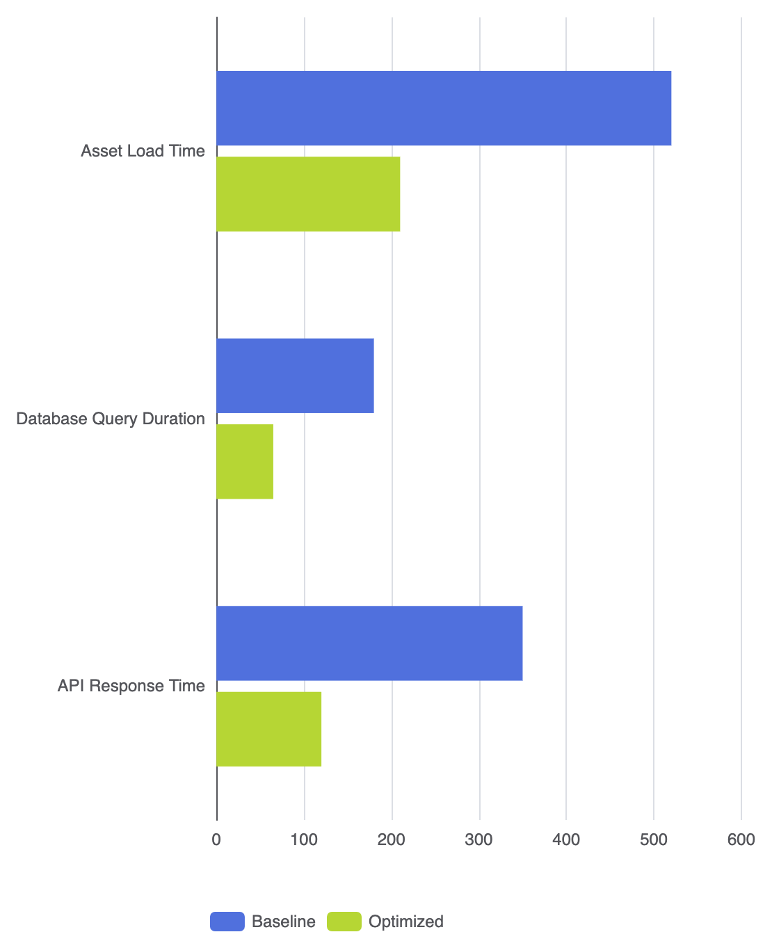
Managing bar gaps along the vertical Y-axis is key to maintaining clean separation between category blocks.
1. Vertical Inner Gaps and Category Margins
Adjust spacing attributes to keep series bars grouped neatly without blending into neighboring category groups:
option = {
    grid: {
        left: '20%',
        right: '10%',
        containLabel: true
    },
    legend: {
        data: ['Baseline', 'Optimized']
    },
    xAxis: {
        type: 'value'
    },
    yAxis: {
        type: 'category',
        data: ['API Response Time', 'Database Query Duration', 'Asset Load Time']
    },
    series: [
        {
            name: 'Baseline',
            type: 'bar',
            barGap: '15%',            // Space between bars within the same category
            barCategoryGap: '40%',    // Space between category blocks
            data: [350, 180, 520]
        },
        {
            name: 'Optimized',
            type: 'bar',
            data: [120, 65, 210]
        }
    ]
};
Strategic Best Practices
- Keep Groups Focused: Stick to a maximum of 3 or 4 series per category. Beyond this, stacked or multi-panel charts are better suited to prevent vertical visual clutter.
- Allocate Adequate Y-Axis Margin: Grouped horizontal charts take up substantial vertical height. Increase container height or adjust
grid.leftto prevent text truncation. - Consistent Metric Order: Ensure the series order in your code matches the natural flow of your narrative (e.g., historical year first, current year second).