


When comparing multivariate data points across many numerical or categorical axes simultaneously, the Parallel Coordinates Chart is an essential visual tool. Instead of mapping coordinates to perpendicular horizontal and vertical axes, parallel plots place all dimensions side-by-side as parallel lines. Individual data entries are rendered as continuous polyline paths intersecting each axis, making it easy to identify multi-attribute clusters, trade-offs, correlations, and outliers—such as comparing car models across horsepower, weight, fuel efficiency, price, and safety rating.
The Mechanics of Parallel Charts
In Apache ECharts, parallel coordinates plots rely on a dedicated parallelAxis configuration block that defines each parallel scale (its axis index, dimension name, and data type). The chart series sets type: 'parallel' and maps rows of multi-element value arrays to each corresponding axis index.
1. Essential Setup
To construct a basic parallel chart, define your dimensions in the parallelAxis array and pass corresponding coordinate arrays inside your series data:
option = {
    parallelAxis: [
        { dim: 0, name: 'Price ($)' },
        { dim: 1, name: 'Rating' },
        { dim: 2, name: 'Weight (kg)' },
        { dim: 3, name: 'Power (HP)' }
    ],
    series: [
        {
            type: 'parallel',
            lineStyle: {
                width: 2
            },
            data: [
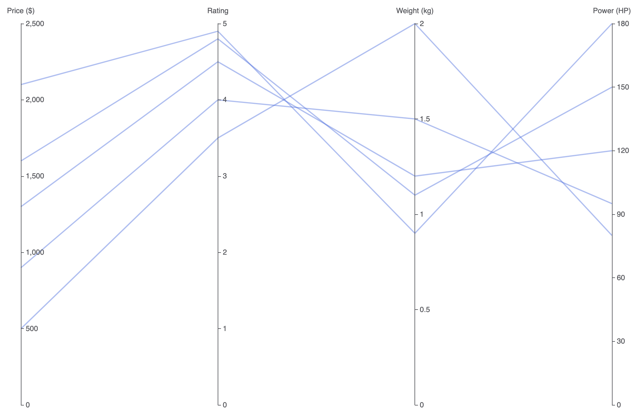
                [1299, 4.5, 1.2, 120],
                [899, 4.0, 1.5, 95],
                [1599, 4.8, 1.1, 150],
                [499, 3.5, 2.0, 80],
                [2100, 4.9, 0.9, 180]
            ]
        }
    ]
};
Advanced Structural Techniques
Parallel charts can be combined with visual color gradients or mixed categorical scales to evaluate complex trade-offs across distinct product categories.
1. Visual Map Color Gradients Across Dimensions
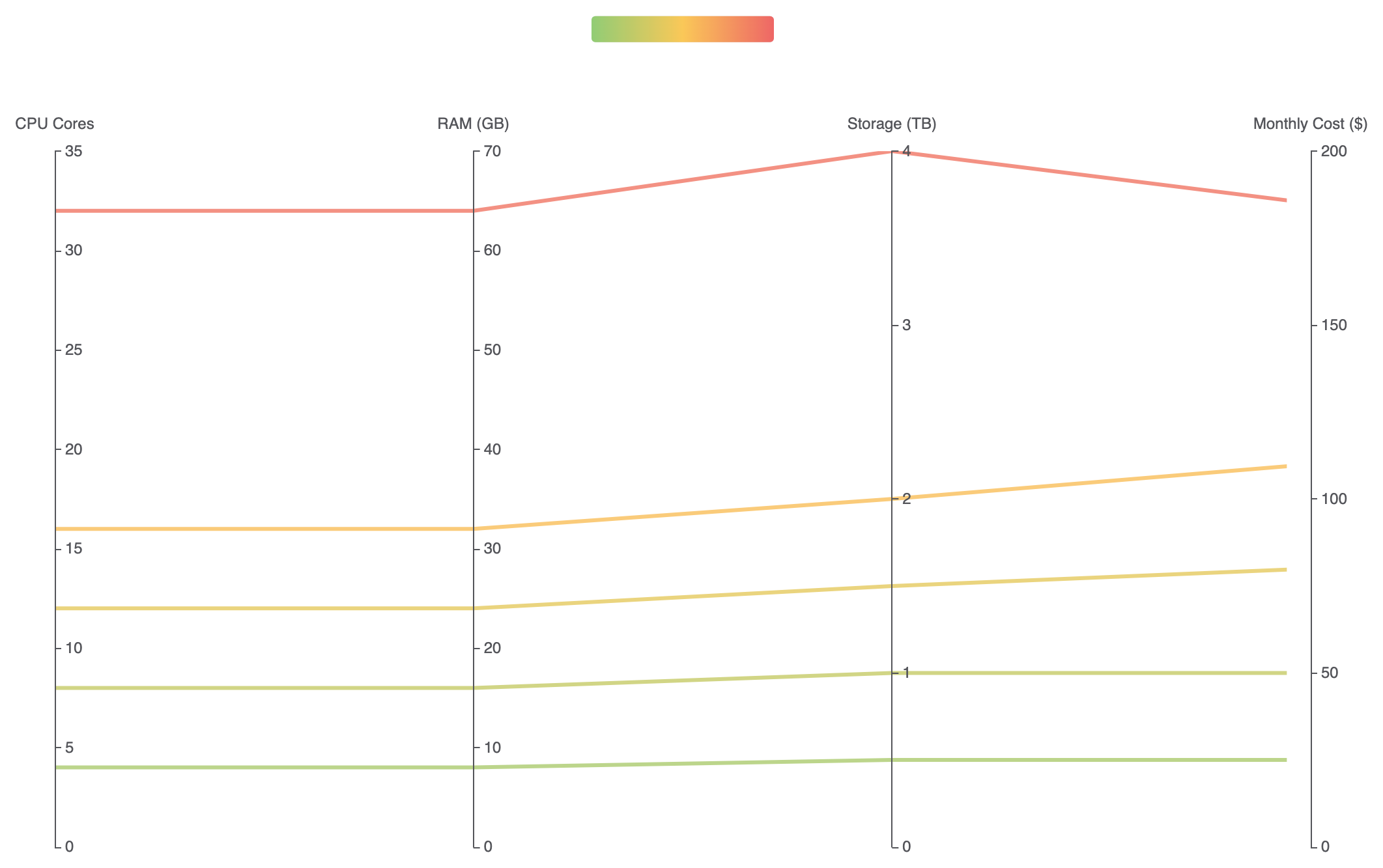
Pair a visualMap component with a key axis dimension (e.g., mapping line color to performance ratings) to instantly highlight top-tier performers across all parallel axes:
option = {
    parallelAxis: [
        { dim: 0, name: 'CPU Cores' },
        { dim: 1, name: 'RAM (GB)' },
        { dim: 2, name: 'Storage (TB)' },
        { dim: 3, name: 'Monthly Cost ($)', min: 0, max: 200 }
    ],
    visualMap: {
        show: true,
        type: 'continuous',
        min: 0,
        max: 200,
        dimension: 3, // Color line paths based on dimension index 3 (Monthly Cost)
        inRange: {
            color: ['#91cc75', '#fac858', '#ee6666'] // Green (Low Cost) to Red (High Cost)
        },
        orient: 'horizontal',
        top: '2%',
        left: 'center'
    },
    parallel: {
        top: '18%',
        bottom: '10%'
    },
    series: [
        {
            type: 'parallel',
            lineStyle: {
                width: 3,
                opacity: 0.8
            },
            data: [
                [4, 8, 0.5, 25],
                [8, 16, 1.0, 50],
                [16, 32, 2.0, 110],
                [32, 64, 4.0, 185],
                [12, 24, 1.5, 80]
            ]
        }
    ]
};
Fine-Tuning Layout and Interactive Filtering
Adding smooth curves and line opacity prevents dense, crisscrossing data threads from overwhelming the user interface.
1. Smooth Curve Paths and Low-Opacity Threads
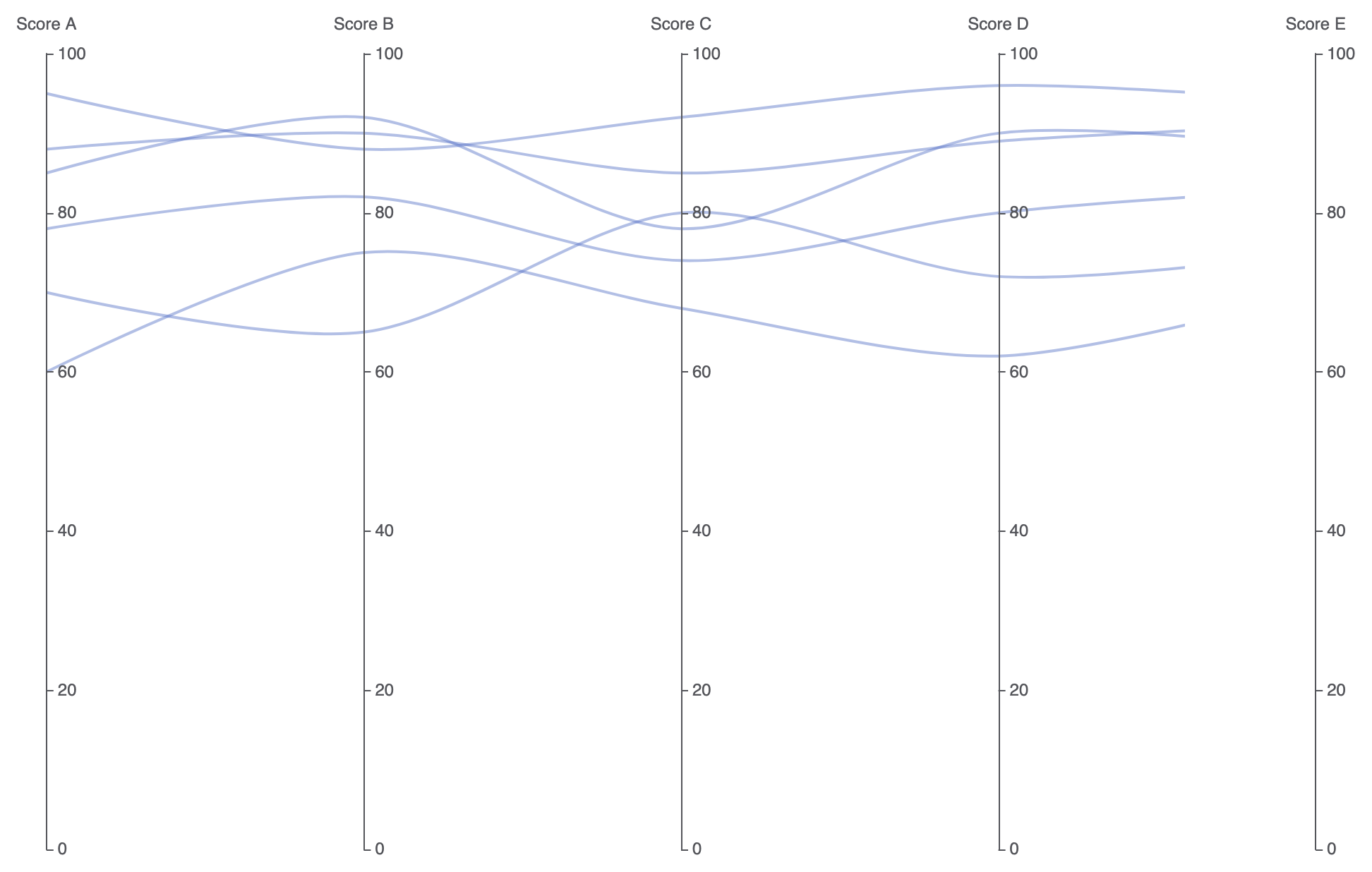
Set smooth: true and lower line opacity to make high-density data overlaps and clusters naturally visible:
option = {
    parallelAxis: [
        { dim: 0, name: 'Score A' },
        { dim: 1, name: 'Score B' },
        { dim: 2, name: 'Score C' },
        { dim: 3, name: 'Score D' },
        { dim: 4, name: 'Score E' }
    ],
    parallel: {
        left: '10%',
        right: '10%',
        bottom: '12%',
        top: '12%'
    },
    series: [
        {
            type: 'parallel',
            smooth: true, // Curves line paths for cleaner visuals
            lineStyle: {
                color: '#5470c6',
                width: 2,
                opacity: 0.45
            },
            data: [
                [85, 92, 78, 90, 88],
                [70, 65, 80, 72, 75],
                [95, 88, 92, 96, 94],
                [60, 75, 68, 62, 70],
                [88, 90, 85, 89, 91],
                [78, 82, 74, 80, 83]
            ]
        }
    ]
};
Strategic Best Practices
- Arrange Axes Thoughtfully: Place strongly correlated or directly comparable metrics on adjacent axes so relationships and cross-over trends are easier to spot.
- Use Lower Opacity for High Data Volume: When plotting dozens or hundreds of lines, reduce
lineStyle.opacityto0.2–0.5so overlapping trends create darker, high-density bands naturally. - Enable
smooth: truefor Complex Datasets: Applying subtle curvature to line paths reduces sharp visual angles when threads cross multiple parallel axes in quick succession.