


For analyzing component breakdowns across items with long category titles, the Stacked Bar Chart is the ideal choice. By stacking data segments horizontally from left to right along the Y-axis, this visualization maintains long label clarity while showing both the overall category totals and the internal proportional breakdown. It works exceptionally well for survey demographic results, project resource allocation by department, or multi-channel conversion pipelines.
The Mechanics of Stacked Horizontal Bars
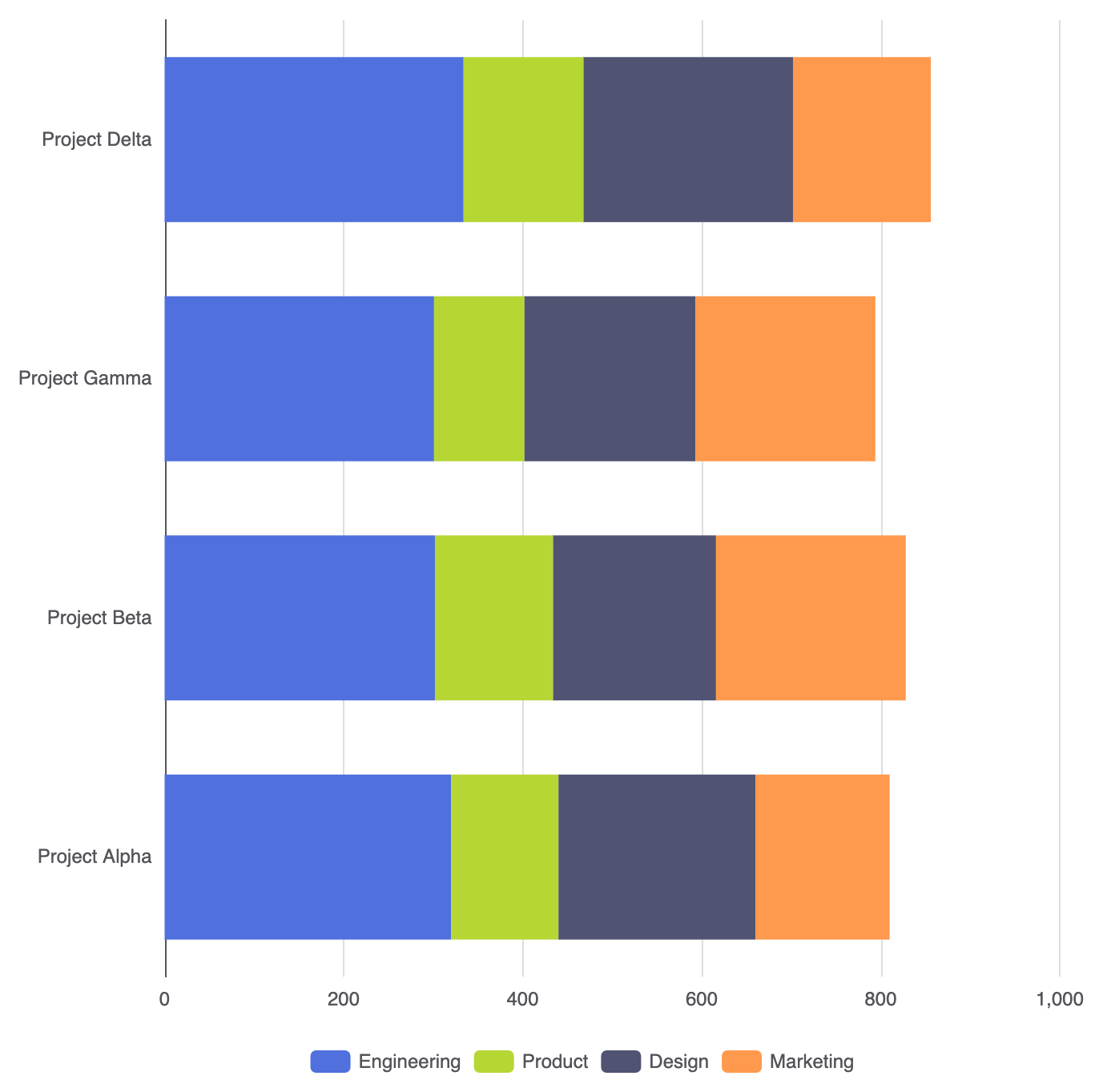
Creating a horizontal stacked chart involves using the same stack property as stacked column charts, paired with a category-based Y-axis. When multiple type: 'bar' series share an identical stack key on a horizontal orientation, the rendering engine accumulates values left-to-right along the X-axis.
1. Essential Setup
To build a basic stacked bar chart, set yAxis to type: 'category', xAxis to type: 'value', and assign a matching stack string to every series:
option = {
    tooltip: {
        trigger: 'axis',
        axisPointer: { type: 'shadow' }
    },
    legend: {
        data: ['Engineering', 'Product', 'Design', 'Marketing']
    },
    xAxis: {
        type: 'value'
    },
    yAxis: {
        type: 'category',
        data: ['Project Alpha', 'Project Beta', 'Project Gamma', 'Project Delta']
    },
    series: [
        {
            name: 'Engineering',
            type: 'bar',
            stack: 'allocation',
            data: [320, 302, 301, 334]
        },
        {
            name: 'Product',
            type: 'bar',
            stack: 'allocation',
            data: [120, 132, 101, 134]
        },
        {
            name: 'Design',
            type: 'bar',
            stack: 'allocation',
            data: [220, 182, 191, 234]
        },
        {
            name: 'Marketing',
            type: 'bar',
            stack: 'allocation',
            data: [150, 212, 201, 154]
        }
    ]
};
Advanced Structural Techniques
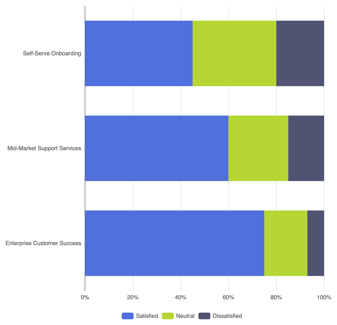
Stacked horizontal bars can be configured for absolute volume comparison or normalized to show percentage ratios across categories.
1. 100% Normalized Horizontal Bar Chart
To evaluate relative ratios rather than absolute counts across long-form categories, normalize your series data to sum to 100% per row:
option = {
    tooltip: {
        trigger: 'axis',
        axisPointer: { type: 'shadow' },
        formatter: '{b}
{a0}: {c0}%
{a1}: {c1}%
{a2}: {c2}%'
    },
    legend: {
        data: ['Satisfied', 'Neutral', 'Dissatisfied']
    },
    xAxis: {
        type: 'value',
        min: 0,
        max: 100,
        axisLabel: { formatter: '{value}%' }
    },
    yAxis: {
        type: 'category',
        data: [
            'Enterprise Customer Success',
            'Mid-Market Support Services',
            'Self-Serve Onboarding'
        ]
    },
    series: [
        {
            name: 'Satisfied',
            type: 'bar',
            stack: 'feedback',
            data: [75, 60, 45]
        },
        {
            name: 'Neutral',
            type: 'bar',
            stack: 'feedback',
            data: [18, 25, 35]
        },
        {
            name: 'Dissatisfied',
            type: 'bar',
            stack: 'feedback',
            data: [7, 15, 20]
        }
    ]
};
Fine-Tuning Layout and Styling
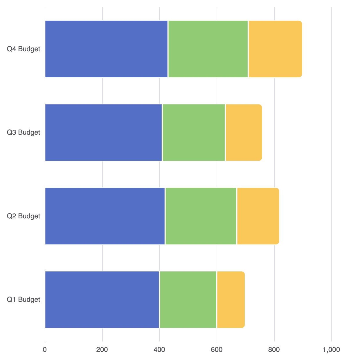
Clean visual boundaries and rounded outer ends give horizontal stacked bars a polished, modern feel.
1. Segment Separation and Outer End Rounding
Apply thin vertical border lines to delineate inner segments, and restrict corner radius styling to the final segment on the right:
option = {
    grid: {
        left: '15%',
        right: '10%',
        containLabel: true
    },
    xAxis: {
        type: 'value'
    },
    yAxis: {
        type: 'category',
        data: ['Q1 Budget', 'Q2 Budget', 'Q3 Budget', 'Q4 Budget']
    },
    series: [
        {
            name: 'Fixed Costs',
            type: 'bar',
            stack: 'budget',
            data: [400, 420, 410, 430],
            itemStyle: {
                color: '#5470c6',
                borderColor: '#ffffff',
                borderWidth: 1
            }
        },
        {
            name: 'Variable Costs',
            type: 'bar',
            stack: 'budget',
            data: [200, 250, 220, 280],
            itemStyle: {
                color: '#91cc75',
                borderColor: '#ffffff',
                borderWidth: 1
            }
        },
        {
            name: 'Discretionary',
            type: 'bar',
            stack: 'budget',
            data: [100, 150, 130, 190],
            itemStyle: {
                color: '#fac858',
                borderColor: '#ffffff',
                borderWidth: 1,
                borderRadius: [0, 6, 6, 0] // Rounded corners on the right end cap
            }
        }
    ]
};
Strategic Best Practices
- First Segment Baseline: The segment closest to the Y-axis baseline is the easiest to compare across categories. Always place your most critical component as the first series object.
- Limit Stacked Components: Keep the total number of stacked segments to 5 or fewer per bar to maintain clear visual analysis without overwhelming the viewer.
- In-Bar Text Labels: For horizontal stacked bars with wide segments, consider enabling
label: { show: true, position: 'inside' }to make individual segment values readable without relying on hover tooltips.