


When tracking how multiple continuous categories evolve over time—such as product sales across quarters, changing topic trends in news coverage, or media consumption patterns—the Theme River Chart (a specialized form of a streamgraph) provides an intuitive, visually striking presentation. Unlike standard stacked area charts that anchor to a flat baseline, a Theme River chart flows horizontally around a central axis, creating an organic, river-like visualization where individual streams widen or shrink based on quantitative value shifts.
The Mechanics of Theme River Charts
In Apache ECharts, Theme River charts use type: 'themeRiver'. Instead of relying on traditional xAxis and yAxis configurations, the chart operates on a single horizontal singleAxis with type: 'time' or type: 'value'. Data items are passed as array tuples formatted as [time, value, categoryName].
1. Essential Setup
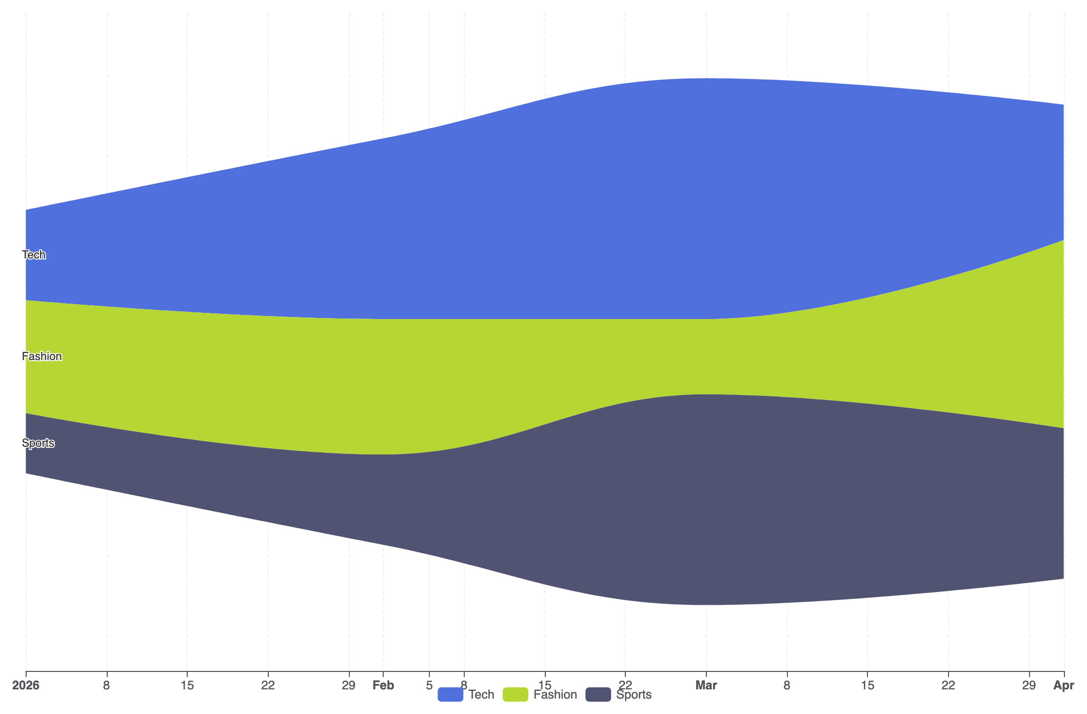
To create a basic Theme River chart, configure a singleAxis of type 'time', specify type: 'themeRiver' in your series, and supply your flow observations in the data array:
option = {
    tooltip: {
        trigger: 'axis',
        axisPointer: {
            type: 'line',
            lineStyle: {
                color: 'rgba(0,0,0,0.2)',
                width: 1,
                type: 'solid'
            }
        }
    },
    legend: {
        data: ['Tech', 'Fashion', 'Sports']
    },
    singleAxis: {
        top: 50,
        bottom: 50,
        axisTick: {},
        axisLabel: {},
        type: 'time',
        axisPointer: {
            animation: true,
            label: { show: true }
        },
        splitLine: {
            show: true,
            lineStyle: {
                type: 'dashed',
                opacity: 0.5
            }
        }
    },
    series: [
        {
            type: 'themeRiver',
            emphasis: {
                itemStyle: {
                    shadowBlur: 20,
                    shadowColor: 'rgba(0, 0, 0, 0.3)'
                }
            },
            data: [
                ['2026-01-01', 12, 'Tech'],
                ['2026-02-01', 24, 'Tech'],
                ['2026-03-01', 32, 'Tech'],
                ['2026-04-01', 18, 'Tech'],
                ['2026-01-01', 15, 'Fashion'],
                ['2026-02-01', 18, 'Fashion'],
                ['2026-03-01', 10, 'Fashion'],
                ['2026-04-01', 25, 'Fashion'],
                ['2026-01-01', 8, 'Sports'],
                ['2026-02-01', 12, 'Sports'],
                ['2026-03-01', 28, 'Sports'],
                ['2026-04-01', 20, 'Sports']
            ]
        }
    ]
};
Advanced Structural Techniques
Theme River charts excel when monitoring complex multi-category events across long timeline sequences with custom tooltips and styled category palettes.
1. Multi-Stream Media Volume Flow
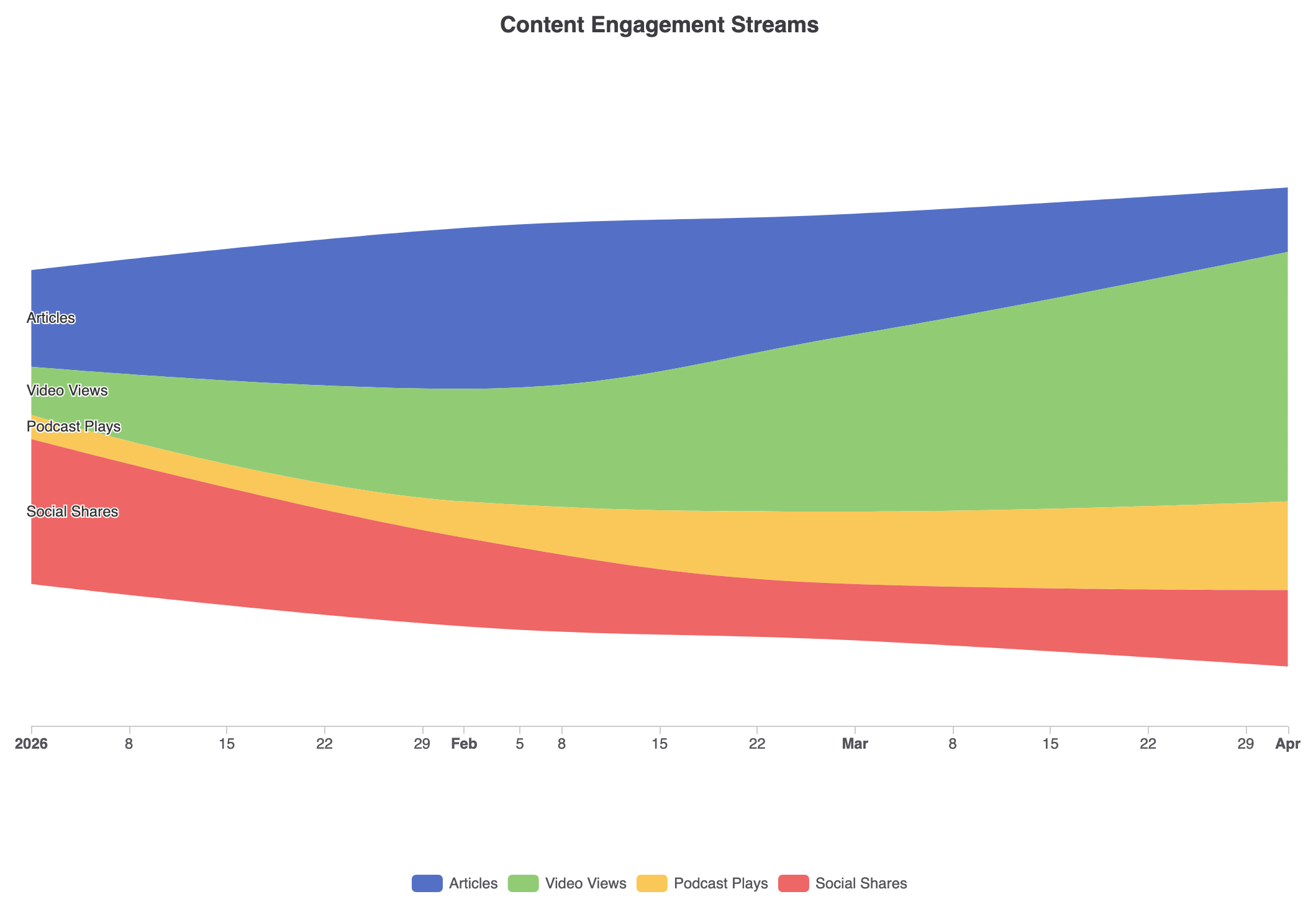
Customizing stream colors with explicit palette mappings and custom axis tooltips turns raw event logs into a clean activity timeline:
const categories = ['Articles', 'Video Views', 'Podcast Plays', 'Social Shares'];

option = {
    title: {
        text: 'Content Engagement Streams',
        left: 'center'
    },
    tooltip: {
        trigger: 'axis',
        axisPointer: {
            type: 'line',
            lineStyle: {
                color: '#333',
                width: 1
            }
        }
    },
    legend: {
        data: categories,
        bottom: 10
    },
    color: ['#5470c6', '#91cc75', '#fac858', '#ee6666'],
    singleAxis: {
        top: '15%',
        bottom: '20%',
        type: 'time',
        axisLine: { lineStyle: { color: '#ccc' } },
        splitLine: { show: false }
    },
    series: [
        {
            type: 'themeRiver',
            label: {
                show: true,
                position: 'left',
                fontSize: 12
            },
            data: [
                ['2026-01-01', 120, 'Articles'], ['2026-02-01', 200, 'Articles'], ['2026-03-01', 150, 'Articles'], ['2026-04-01', 80, 'Articles'],
                ['2026-01-01', 60, 'Video Views'], ['2026-02-01', 140, 'Video Views'], ['2026-03-01', 220, 'Video Views'], ['2026-04-01', 310, 'Video Views'],
                ['2026-01-01', 30, 'Podcast Plays'], ['2026-02-01', 45, 'Podcast Plays'], ['2026-03-01', 90, 'Podcast Plays'], ['2026-04-01', 110, 'Podcast Plays'],
                ['2026-01-01', 180, 'Social Shares'], ['2026-02-01', 110, 'Social Shares'], ['2026-03-01', 70, 'Social Shares'], ['2026-04-01', 95, 'Social Shares']
            ]
        }
    ]
};
Strategic Best Practices
- Format Data Tuples Correctly: Each entry in the
dataarray must follow the exact order[date, value, categoryName]for ECharts to properly slice and stack continuous streams. - Limit Category Sprawl: Keep the number of distinct categories between 3 and 7. Too many streams make individual bands narrow and hard to trace across time points.
- Leverage
singleAxisSizing: Adjusttopandbottomon thesingleAxisproperty to control vertical padding and prevent outer stream labels from clipping against the container edges.