


当追踪多个连续类别随时间的演变时——例如季度产品销售、新闻报道中主题趋势的变化或媒体消费模式——主题河流图(一种流图的特殊形式)提供了直观且视觉冲击力强的展示。与锚定在平坦基线上的标准堆叠面积图不同,主题河流图围绕中心轴水平流动,形成有机的、类似河流的可视化效果,其中各个流线的宽度会根据数值变化而增宽或变窄。
主题河流图的原理
在 Apache ECharts 中,主题河流图使用type: 'themeRiver'。与依赖传统xAxis和yAxis配置不同,该图表基于一个单一的水平singleAxis,其type: 'time'或type: 'value'。数据项以数组元组的形式传递,格式为[time, value, categoryName].
1. 基础设置
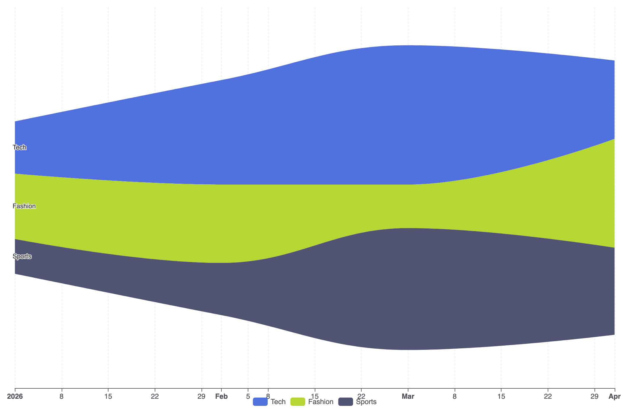
要创建一个基本的主题河流图,请配置一个singleAxis类型为'time',在系列中指定type: 'themeRiver',并将你的流动观测数据提供到data数组中:
ECharts
在 VPasCode 中编辑 ECharts
ECharts
Edit ECharts in VPasCode
option = {
    tooltip: {
        trigger: 'axis',
        axisPointer: {
            type: 'line',
            lineStyle: {
                color: 'rgba(0,0,0,0.2)',
                width: 1,
                type: 'solid'
            }
        }
    },
    legend: {
        data: ['科技', '时尚', '体育']
    },
    singleAxis: {
        top: 50,
        bottom: 50,
        axisTick: {},
        axisLabel: {},
        type: 'time',
        axisPointer: {
            animation: true,
            label: { show: true }
        },
        splitLine: {
            show: true,
            lineStyle: {
                type: 'dashed',
                opacity: 0.5
            }
        }
    },
    series: [
        {
            type: 'themeRiver',
            emphasis: {
                itemStyle: {
                    shadowBlur: 20,
                    shadowColor: 'rgba(0, 0, 0, 0.3)'
                }
            },
            data: [
                ['2026-01-01', 12, '科技'],
                ['2026-02-01', 24, '科技'],
                ['2026-03-01', 32, '科技'],
                ['2026-04-01', 18, '科技'],
                ['2026-01-01', 15, '时尚'],
                ['2026-02-01', 18, '时尚'],
                ['2026-03-01', 10, '时尚'],
                ['2026-04-01', 25, '时尚'],
                ['2026-01-01', 8, '体育'],
                ['2026-02-01', 12, '体育'],
                ['2026-03-01', 28, '体育'],
                ['2026-04-01', 20, '体育']
            ]
        }
    ]
};
高级结构技术
当需要在长时间序列中监控复杂的多类别事件,并使用自定义提示框和样式化的类别调色板时,主题河流图表现出色。
1. 多流媒体流量
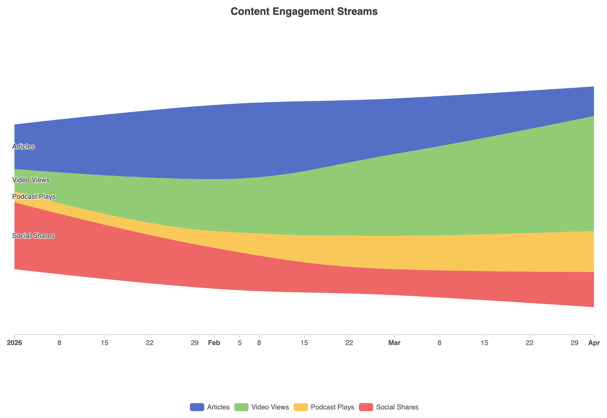
通过显式调色板映射和自定义坐标轴提示框来定制流颜色,可将原始事件日志转化为清晰的活动时间轴:
ECharts
在 VPasCode 中编辑 ECharts
ECharts
Edit ECharts in VPasCode
const categories = ['文章', '视频观看', '播客播放', '社交分享'];

option = {
    title: {
        text: '内容参与度流',
        left: 'center'
    },
    tooltip: {
        trigger: 'axis',
        axisPointer: {
            type: 'line',
            lineStyle: {
                color: '#333',
                width: 1
            }
        }
    },
    legend: {
        data: categories,
        bottom: 10
    },
    color: ['#5470c6', '#91cc75', '#fac858', '#ee6666'],
    singleAxis: {
        top: '15%',
        bottom: '20%',
        type: 'time',
        axisLine: { lineStyle: { color: '#ccc' } },
        splitLine: { show: false }
    },
    series: [
        {
            type: 'themeRiver',
            label: {
                show: true,
                position: 'left',
                fontSize: 12
            },
            data: [
                ['2026-01-01', 120, '文章'], ['2026-02-01', 200, '文章'], ['2026-03-01', 150, '文章'], ['2026-04-01', 80, '文章'],
                ['2026-01-01', 60, '视频观看'], ['2026-02-01', 140, '视频观看'], ['2026-03-01', 220, '视频观看'], ['2026-04-01', 310, '视频观看'],
                ['2026-01-01', 30, '播客播放'], ['2026-02-01', 45, '播客播放'], ['2026-03-01', 90, '播客播放'], ['2026-04-01', 110, '播客播放'],
                ['2026-01-01', 180, '社交分享'], ['2026-02-01', 110, '社交分享'], ['2026-03-01', 70, '社交分享'], ['2026-04-01', 95, '社交分享']
            ]
        }
    ]
};
战略最佳实践
- 正确格式化数据元组: 数据数组中的每一项必须严格遵循顺序
data[日期, 值, 类别名称][date, value, categoryName]否则 ECharts 无法正确切分和堆叠连续的数据流。 - 限制类别数量: 将不同类别的数量控制在 3 到 7 个之间。类别过多会使各个数据带过窄,难以在时间点之间追踪。
- 利用
singleAxis单轴尺寸调整: 调整top和bottom在singleAxis属性用于控制垂直内边距,并防止外部流标签与容器边缘发生裁剪。