


在数据可视化和报告领域,柱状图(一种垂直条形图)是用于比较单个或多个指标上离散类别的主要工具。与适合长文本标签的水平条形图不同,垂直柱状图利用高度差异来即时传达数量、增长和差异。无论您是在展示季度销售数据、服务器CPU使用率的峰值,还是按渠道划分的网络流量,柱状图都为基于类别的指标提供了清晰的视觉标准。
垂直柱状图的原理
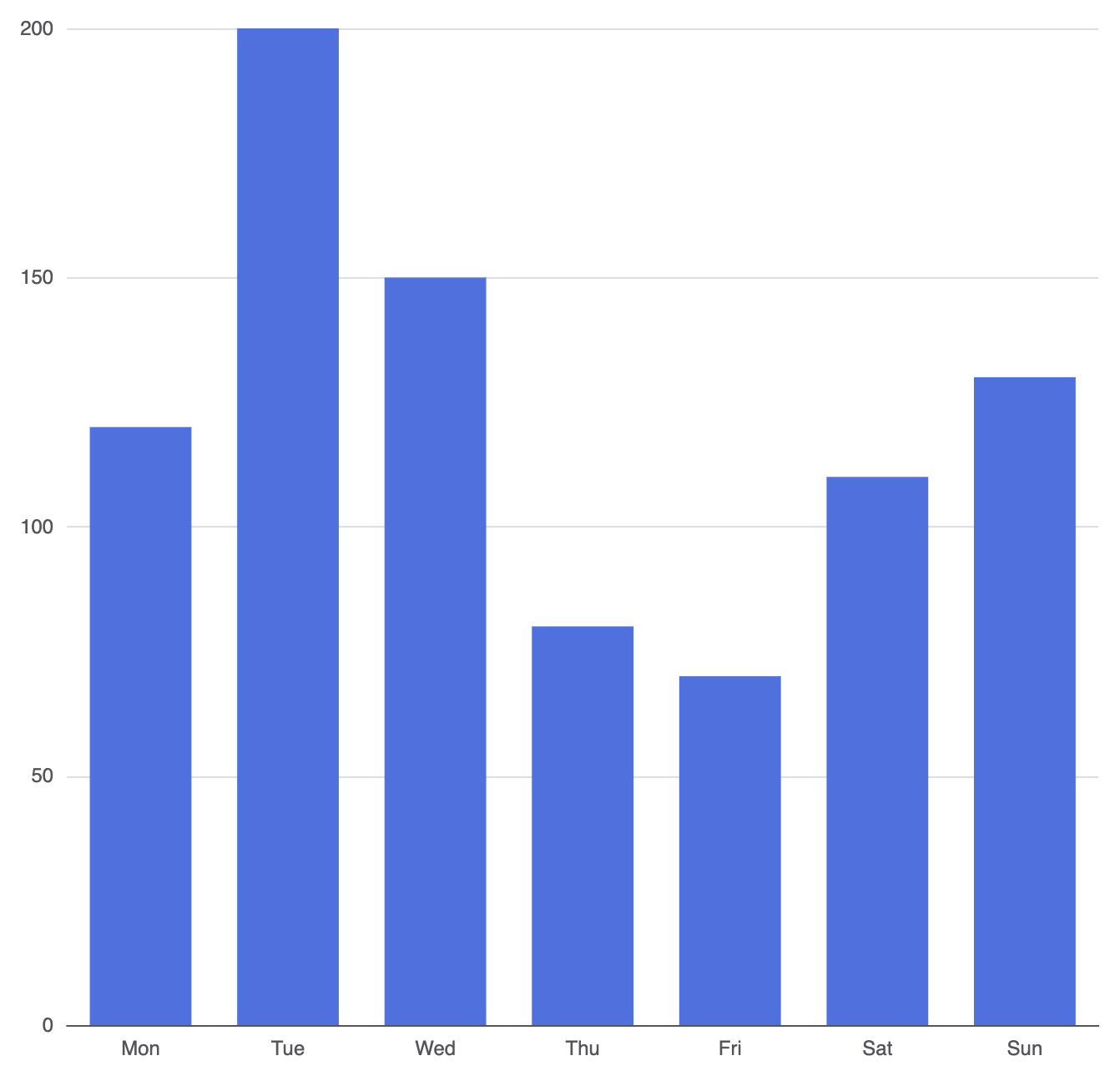
在 Apache ECharts 中,水平条形图和垂直柱状图都依赖于'bar'系列类型。创建柱状图的关键因素是将类别标签放置在水平轴(xAxis)上,同时将垂直轴(yAxis)设置为数值。图表引擎读取数据数组,并根据数值比例动态调整每个垂直柱子的高度。
1. 基础设置
要构建一个基本的柱状图,需定义基于类别的X轴,并将数据集映射到一个带有type: 'bar':
ECharts
在 VPasCode 中编辑 ECharts
ECharts
Edit ECharts in VPasCode
option = {
    xAxis: {
        type: 'category',
        data: ['周一', '周二', '周三', '周四', '周五', '周六', '周日']
    },
    yAxis: {
        type: 'value'
    },
    series: [
        {
            type: 'bar',
            data: [120, 200, 150, 80, 70, 110, 130]
        }
    ]
};
高级结构技术
在构建仪表板时,简单的单系列图表通常不足以满足需求。ECharts 提供了简洁的语法选项,用于管理多系列对比、自定义维度和布局间距。
多系列对比
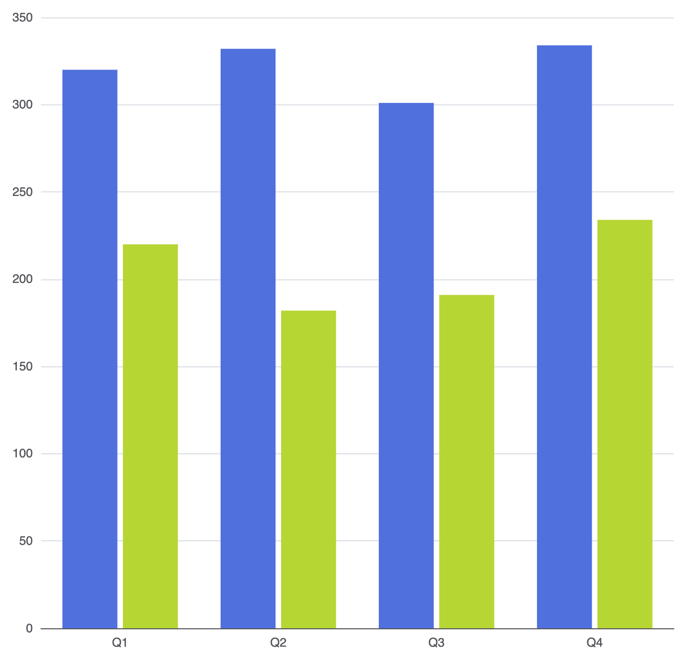
要并排比较多个数据集(例如年度收入对比),请在series数组中添加多个对象。布局引擎将在X轴上按类别分组相关柱子:
ECharts
在 VPasCode 中编辑 ECharts
ECharts
Edit ECharts in VPasCode
option = {
    xAxis: {
        type: 'category',
        data: ['Q1', 'Q2', 'Q3', 'Q4']
    },
    yAxis: {
        type: 'value'
    },
    series: [
        {
            name: '2025年收入',
            type: 'bar',
            data: [320, 332, 301, 334]
        },
        {
            name: '2026年收入',
            type: 'bar',
            data: [220, 182, 191, 234]
        }
    ]
};
自定义柱状图样式与单个数据点高亮
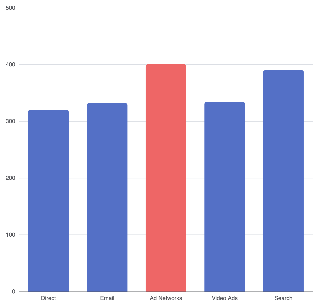
您可以为整个系列应用全局样式,或直接针对特定数据点进行设置。这在突出显示关键事件、异常值或特定目标时尤其有用。
颜色: 设置填充颜色(十六进制、RGB 或线性渐变)。边框圆角: 为柱状图添加圆角(例如,[5, 5, 0, 0]用于顶部角落)。透明度: 调整柱状图的透明度。阴影模糊&阴影颜色: 为柱状图添加立体感和阴影效果。
ECharts
在VPasCode中编辑ECharts
ECharts
Edit ECharts in VPasCode
option = {
    xAxis: {
        type: 'category',
        data: ['直接', '电子邮件', '广告网络', '视频广告', '搜索']
    },
    yAxis: {
        type: 'value'
    },
    series: [
        {
            type: 'bar',
            data: [
                320,
                332,
                {
                    value: 401,
                    // 高亮单个峰值柱状图
                    itemStyle: {
                        color: '#ee6666',
                        borderRadius: [6, 6, 0, 0]
                    }
                },
                334,
                390
            ],
            itemStyle: {
                color: '#5470c6',
                borderRadius: [4, 4, 0, 0]
            }
        }
    ]
};
微调布局与尺寸
柱状图的尺寸和间距对可读性有显著影响,尤其是在响应式屏幕或密集仪表板上显示图表时。
1. 控制宽度与限制
默认情况下,柱状图的宽度会根据图表容器动态缩放。您可以使用尺寸属性来控制这些比例:
柱宽: 使用固定像素或类别宽度的百分比来定义柱状图宽度(例如,'30%').最大柱宽: 设置宽度上限,防止柱状图在宽屏显示时过度拉伸。条形最小高度: 强制设置最小像素高度,以确保接近零的值仍然可点击且可见。
2. 列间距和背景轨道
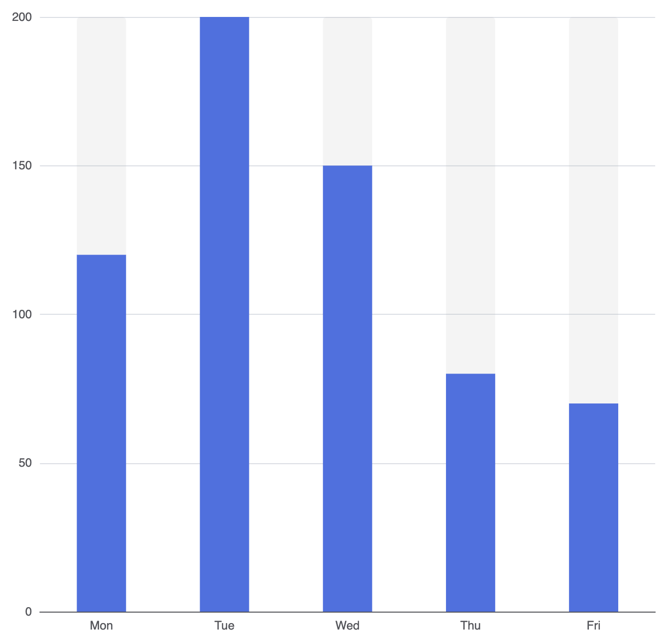
要使您的列呈现现代仪表板外观,请调整内部间距或启用全高背景轨道:
ECharts
在VPasCode中编辑ECharts
ECharts
Edit ECharts in VPasCode
option = {
    xAxis: {
        type: 'category',
        data: ['周一', '周二', '周三', '周四', '周五']
    },
    yAxis: {
        type: 'value'
    },
    series: [
        {
            type: 'bar',
            data: [120, 200, 150, 80, 70],
            barWidth: '40%',
            showBackground: true,
            backgroundStyle: {
                color: 'rgba(180, 180, 180, 0.15)',
                borderRadius: [4, 4, 0, 0]
            }
        }
    ]
};
战略最佳实践
- 保持间距均衡: 避免设置
条形宽度过宽(超过60%),以防止视觉布局显得过于拥挤。 - 横向与纵向选择: 当类别标签较短时(例如月份、季度、代码),使用柱状图。如果您的标签是较长的描述或名称,请考虑将类别数据切换到
y轴以创建横向条形图。 - 零基线完整性: 始终保持数值轴从零开始(
0)。在柱状图中截断底部刻度会扭曲高度比例,误导观察者。