


在分析活动密度、连续趋势或两个离散维度之间的相关性时,热力图提供了一种强大的可视化解决方案。通过将数据值映射到二维网格上的动态颜色尺度,热力图使用户能够迅速识别使用高峰时段、季节性瓶颈或矩阵关系——例如按小时和星期几划分的服务器负载、用户活动日志或跨类别相关性矩阵。
热力图的工作原理
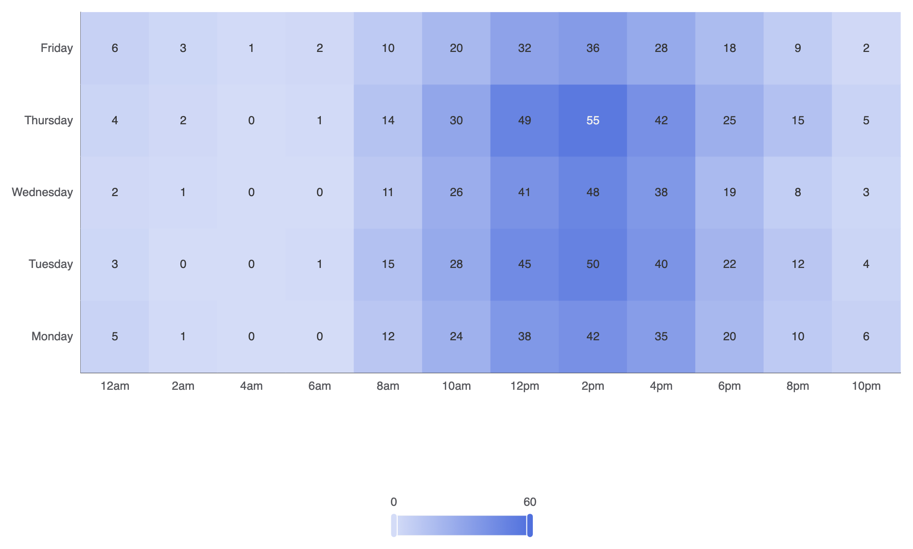
在 Apache ECharts 中,热力图使用type: 'heatmap'在二维笛卡尔坐标网格上。每个数据点都期望一个三元素数组,格式为[xAxisIndex, yAxisIndex, value]。一个必需的visualMap组件将数值映射到连续或分段的颜色渐变。
1. 基础设置
要构建一个基本的热力图,需为水平(xAxis)和垂直(yAxis)坐标轴,传入[xIndex, yIndex, value]数组到你的系列数据中,并配置一个visualMap组件:
ECharts
在 VPasCode 中编辑 ECharts
ECharts
Edit ECharts in VPasCode
const hours = ['12am', '2am', '4am', '6am', '8am', '10am', '12pm', '2pm', '4pm', '6pm', '8pm', '10pm'];
const days = ['星期一', '星期二', '星期三', '星期四', '星期五'];

// 数据格式:[xIndex, yIndex, value]
const data = [
    [0, 0, 5], [1, 0, 1], [2, 0, 0], [3, 0, 0], [4, 0, 12], [5, 0, 24], [6, 0, 38], [7, 0, 42], [8, 0, 35], [9, 0, 20], [10, 0, 10], [11, 0, 6],
    [0, 1, 3], [1, 1, 0], [2, 1, 0], [3, 1, 1], [4, 1, 15], [5, 1, 28], [6, 1, 45], [7, 1, 50], [8, 1, 40], [9, 1, 22], [10, 1, 12], [11, 1, 4],
    [0, 2, 2], [1, 2, 1], [2, 2, 0], [3, 2, 0], [4, 2, 11], [5, 2, 26], [6, 2, 41], [7, 2, 48], [8, 2, 38], [9, 2, 19], [10, 2, 8],  [11, 2, 3],
    [0, 3, 4], [1, 3, 2], [2, 3, 0], [3, 3, 1], [4, 3, 14], [5, 3, 30], [6, 3, 49], [7, 3, 55], [8, 3, 42], [9, 3, 25], [10, 3, 15], [11, 3, 5],
    [0, 4, 6], [1, 4, 3], [2, 4, 1], [3, 4, 2], [4, 4, 10], [5, 4, 20], [6, 4, 32], [7, 4, 36], [8, 4, 28], [9, 4, 18], [10, 4, 9],  [11, 4, 2]
];

option = {
    tooltip: {
        position: 'top'
    },
    grid: {
        height: '50%',
        top: '10%'
    },
    xAxis: {
        type: 'category',
        data: hours,
        splitArea: { show: true }
    },
    yAxis: {
        type: 'category',
        data: days,
        splitArea: { show: true }
    },
    visualMap: {
        min: 0,
        max: 60,
        calculable: true,
        orient: 'horizontal',
        left: 'center',
        bottom: '15%'
    },
    series: [
        {
            name: '系统负载',
            type: 'heatmap',
            data: data,
            label: {
                show: true
            },
            emphasis: {
                itemStyle: {
                    shadowBlur: 10,
                    shadowColor: 'rgba(0, 0, 0, 0.5)'
                }
            }
        }
    ]
};
高级结构技术
热力图可以通过离散的颜色层级、明显的单元格间距进行自定义,或与日历坐标结合,以追踪全年活动情况。
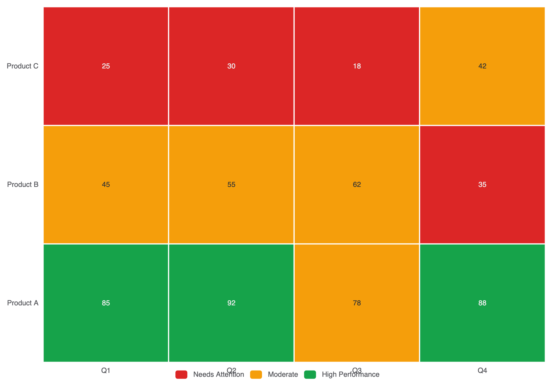
1. 分段颜色映射与自定义单元格间距
与连续颜色渐变不同,使用分段visualMap将数值分组为不同的操作区间(例如:低、中、高):
ECharts
在 VPasCode 中编辑 ECharts
ECharts
Edit ECharts in VPasCode
option = {
    tooltip: { position: 'top' },
    xAxis: {
        type: 'category',
        data: ['Q1', 'Q2', 'Q3', 'Q4']
    },
    yAxis: {
        type: 'category',
        data: ['Product A', 'Product B', 'Product C']
    },
    visualMap: {
        type: 'piecewise',
        min: 0,
        max: 100,
        left: 'center',
        bottom: '5%',
        orient: 'horizontal',
        pieces: [
            { min: 80, label: '高性能', color: '#16a34a' },
            { min: 40, max: 79, label: '中等', color: '#f59e0b' },
            { max: 39, label: '需关注', color: '#dc2626' }
        ]
    },
    series: [
        {
            type: 'heatmap',
            data: [
                [0, 0, 85], [1, 0, 92], [2, 0, 78], [3, 0, 88],
                [0, 1, 45], [1, 1, 55], [2, 1, 62], [3, 1, 35],
                [0, 2, 25], [1, 2, 30], [2, 2, 18], [3, 2, 42]
            ],
            label: { show: true },
            itemStyle: {
                borderColor: '#ffffff',
                borderWidth: 2
            }
        }
    ]
};
布局与颜色渐变的精细调整
选择清晰可读的颜色停靠点并启用分隔区域,可使大型矩阵网格的扫描变得轻松自如。
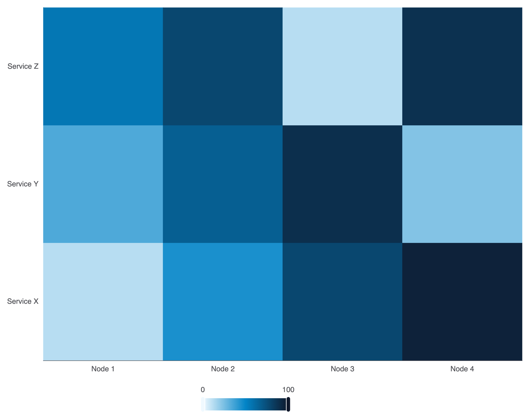
1. 渐变自定义与标签对齐
在visualMap.inRange中配置自定义多停靠点颜色渐变,以匹配您的平台主题:
ECharts
在 VPasCode 中编辑 ECharts
ECharts
Edit ECharts in VPasCode
option = {
    grid: { containLabel: true },
    xAxis: {
        type: 'category',
        data: ['节点 1', '节点 2', '节点 3', '节点 4']
    },
    yAxis: {
        type: 'category',
        data: ['服务 X', '服务 Y', '服务 Z']
    },
    visualMap: {
        min: 0,
        max: 100,
        calculable: true,
        orient: 'horizontal',
        left: 'center',
        bottom: '0%',
        inRange: {
            color: ['#f0f9ff', '#0284c7', '#0f172a'] // 柔和蓝色到深灰蓝色渐变
        }
    },
    series: [
        {
            type: 'heatmap',
            data: [
                [0, 0, 12], [1, 0, 45], [2, 0, 78], [3, 0, 95],
                [0, 1, 34], [1, 1, 67], [2, 1, 89], [3, 1, 23],
                [0, 2, 56], [1, 2, 78], [2, 2, 12], [3, 2, 88]
            ]
        }
    ]
};
战略最佳实践
- 始终包含一个
visualMap:热力图若无视觉图例,会迫使用户猜测颜色的含义。始终将连续或分段的visualMap清晰地放置在画布边缘附近。 - 使用网格边框进行分隔:使用
itemStyle.borderColor: '#fff'和borderWidth: 1或2以在密集矩阵中保持各个单元格的视觉区分度。 - 确保高对比度文本: 如果单元格数值标签已启用(
label.show: true),请测试文本颜色在颜色渐变中最亮和最暗的步骤上是否仍保持可读性。