


在追踪连续进展或时间序列变化时,折线图成为主要的视觉工具。与专注于单个类别比较的离散柱状图或条形图不同,折线图强调连接性和斜率,以突出显示动量、季节性以及指标的突然变化在不间断的序列中,例如每日活跃用户增长、每月经常性收入或传感器遥测数据流。
折线图的原理
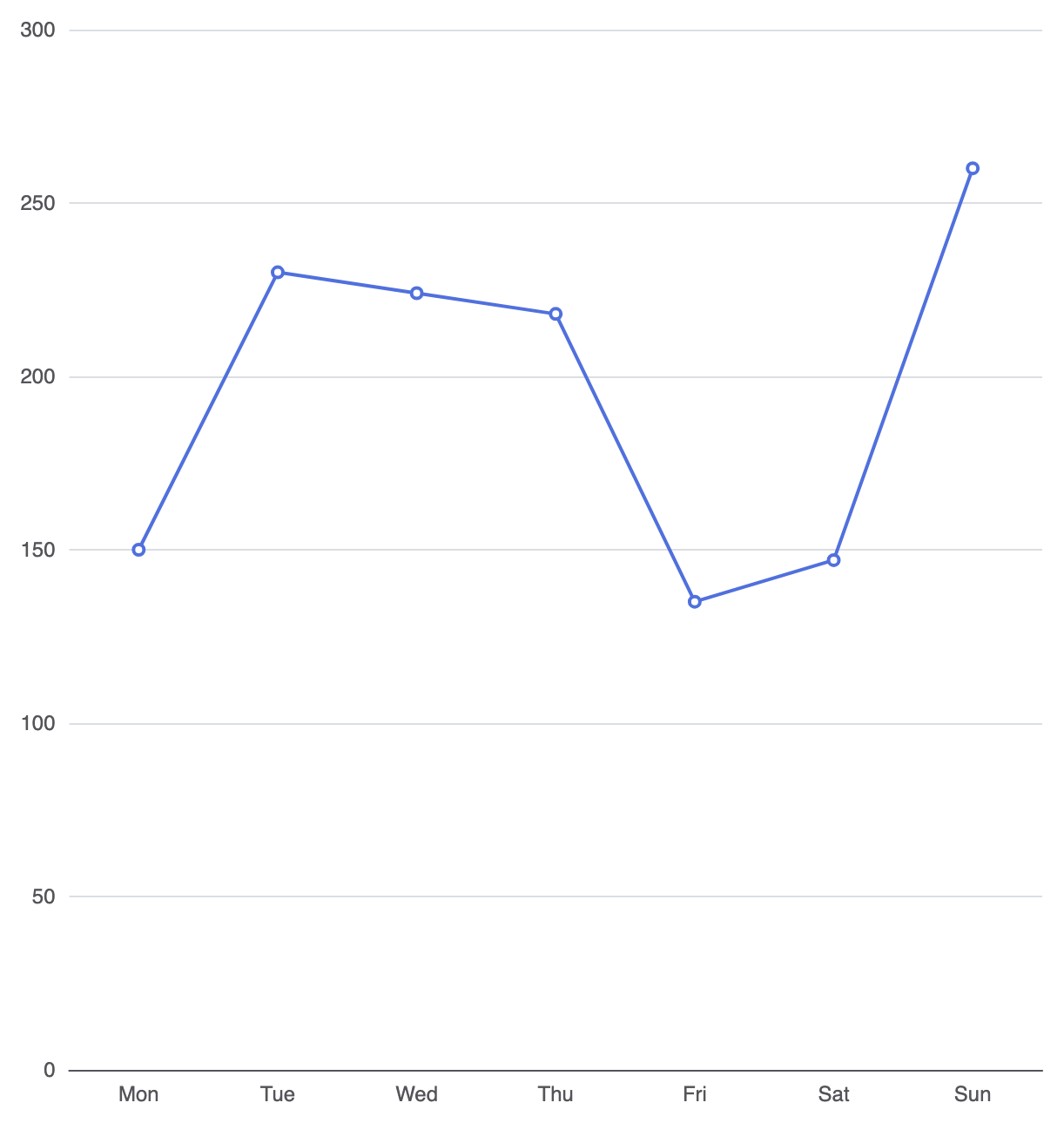
在 Apache ECharts 中,折线图可视化通过将 series 的type 属性设置为 'line'。折线图将按顺序排列的数据点连接在连续的类别或时间尺度的水平轴(xAxis)上,并将连续的数值映射到垂直轴(yAxis).
1. 基础设置
要构建一个基本的折线图,沿 X 轴定义连续的类别,并将数据集映射到一个 series 对象,其中包含type: 'line':
ECharts
在 VPasCode 中编辑 ECharts
ECharts
Edit ECharts in VPasCode
option = {
    tooltip: {
        trigger: 'axis'
    },
    xAxis: {
        type: 'category',
        data: ['周一', '周二', '周三', '周四', '周五', '周六', '周日']
    },
    yAxis: {
        type: 'value'
    },
    series: [
        {
            type: 'line',
            data: [150, 230, 224, 218, 135, 147, 260]
        }
    ]
};
高级结构技术
折线图提供了多指标叠加、平滑插值曲线以及自定义数据点指示器的灵活性。
1. 平滑插值曲线
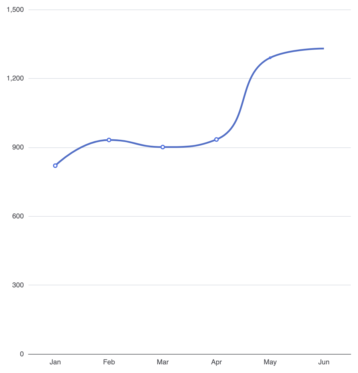
默认情况下,折线系列使用直线段连接数据点。启用smooth: true将应用三次样条插值,以在您的数据集中创建曲线且自然的折线路径:
ECharts
在 VPasCode 中编辑 ECharts
ECharts
Edit ECharts in VPasCode
option = {
    tooltip: {
        trigger: 'axis'
    },
    xAxis: {
        type: 'category',
        data: ['一月', '二月', '三月', '四月', '五月', '六月']
    },
    yAxis: {
        type: 'value'
    },
    series: [
        {
            type: 'line',
            smooth: true,
            data: [820, 932, 901, 934, 1290, 1330],
            lineStyle: {
                width: 3,
                color: '#5470c6'
            }
        }
    ]
};
2. 多线性能对比
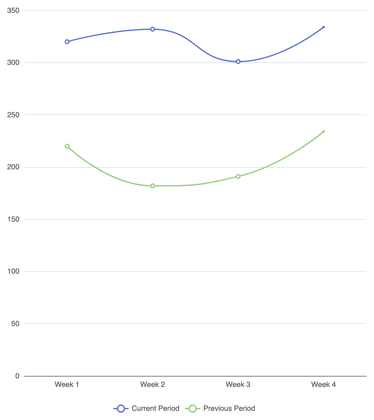
通过在“series”数组中提供多个线对象,可以在相同的时间区间内对比次要指标:series数组:
ECharts
在 VPasCode 中编辑 ECharts
ECharts
Edit ECharts in VPasCode
option = {
    tooltip: {
        trigger: 'axis'
    },
    legend: {
        data: ['当前周期', '前一周期']
    },
    xAxis: {
        type: 'category',
        data: ['第1周', '第2周', '第3周', '第4周']
    },
    yAxis: {
        type: 'value'
    },
    series: [
        {
            name: '当前周期',
            type: 'line',
            smooth: true,
            data: [320, 332, 301, 334],
            itemStyle: { color: '#5470c6' }
        },
        {
            name: '前一周期',
            type: 'line',
            smooth: true,
            data: [220, 182, 191, 234],
            itemStyle: { color: '#91cc75' }
        }
    ]
};
微调区域填充与数据点
通过使用微妙的背景渐变填充和有针对性的数据标记,可以视觉上增强折线系列,以突出显示关键里程碑。
1. 折线区域样式
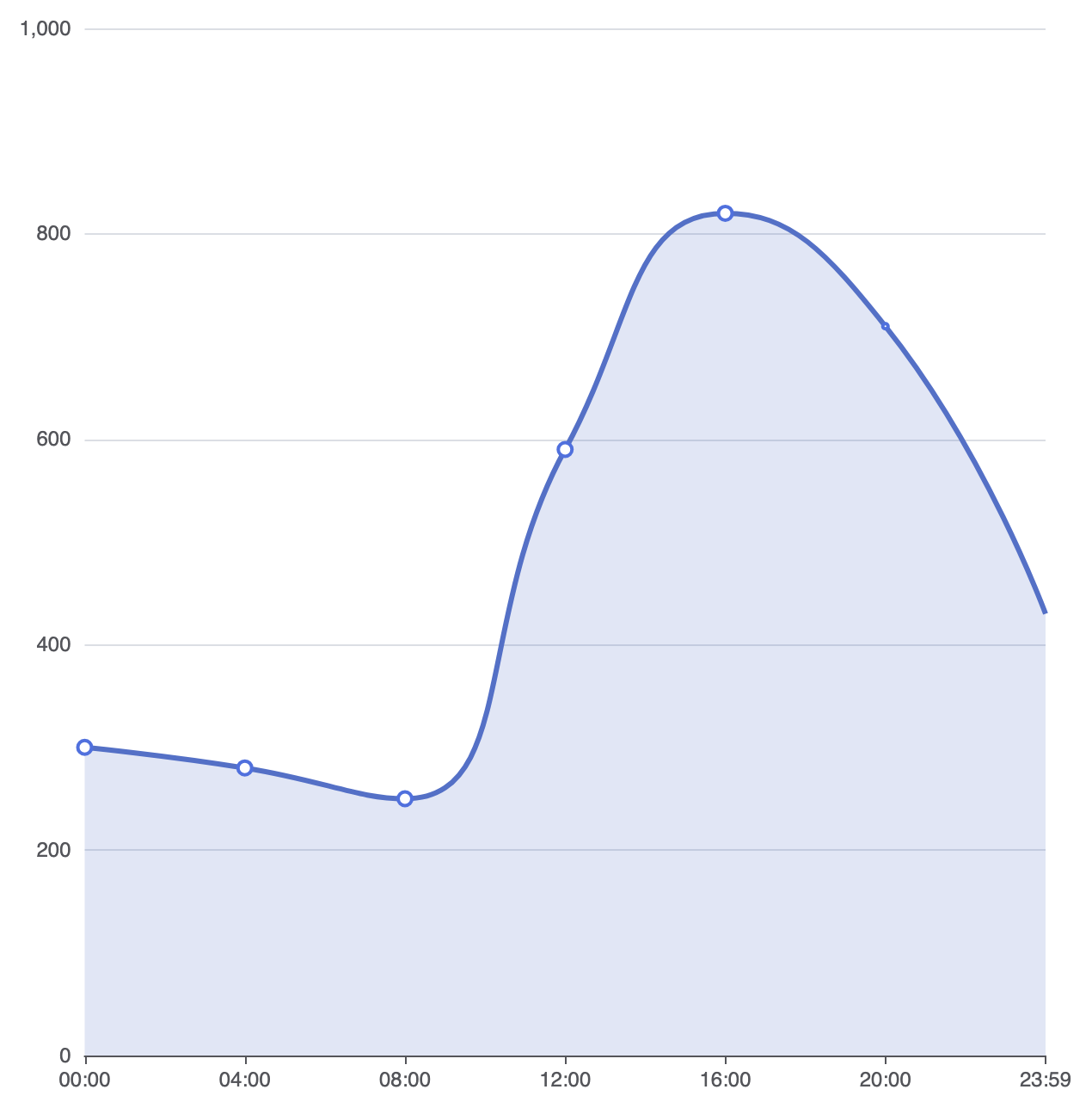
添加一个areaStyle属性可将标准折线图转换为面积图,填充线条路径与水平轴之间的区域:
ECharts
在 VPasCode 中编辑 ECharts
ECharts
Edit ECharts in VPasCode
option = {
    xAxis: {
        type: 'category',
        boundaryGap: false, // 将线条直接对齐到坐标轴边缘
        data: ['00:00', '04:00', '08:00', '12:00', '16:00', '20:00', '23:59']
    },
    yAxis: {
        type: 'value'
    },
    series: [
        {
            type: 'line',
            smooth: true,
            data: [300, 280, 250, 590, 820, 710, 430],
            areaStyle: {
                color: 'rgba(84, 112, 198, 0.25)' // 线条下方的柔和填充
            },
            lineStyle: {
                width: 3,
                color: '#5470c6'
            },
            symbolSize: 8
        }
    ]
};
战略最佳实践
- 使用
boundaryGap: false用于时间序列:在连续时间轴上移除默认的边缘间距,可使线条直接从零边距开始,实现干净的从边缘到边缘的展示效果。 - 保持线条数量较少:避免在一个画布中渲染超过4到5条线条。线条过多的折线图(“意大利面图”)会迅速变得难以阅读。
- 坐标轴提示触发器 始终配置
工具提示:{ trigger: 'axis' }以便用户可以将鼠标悬停在任意水平点上,同时查看所有活动折线系列的精确值。