


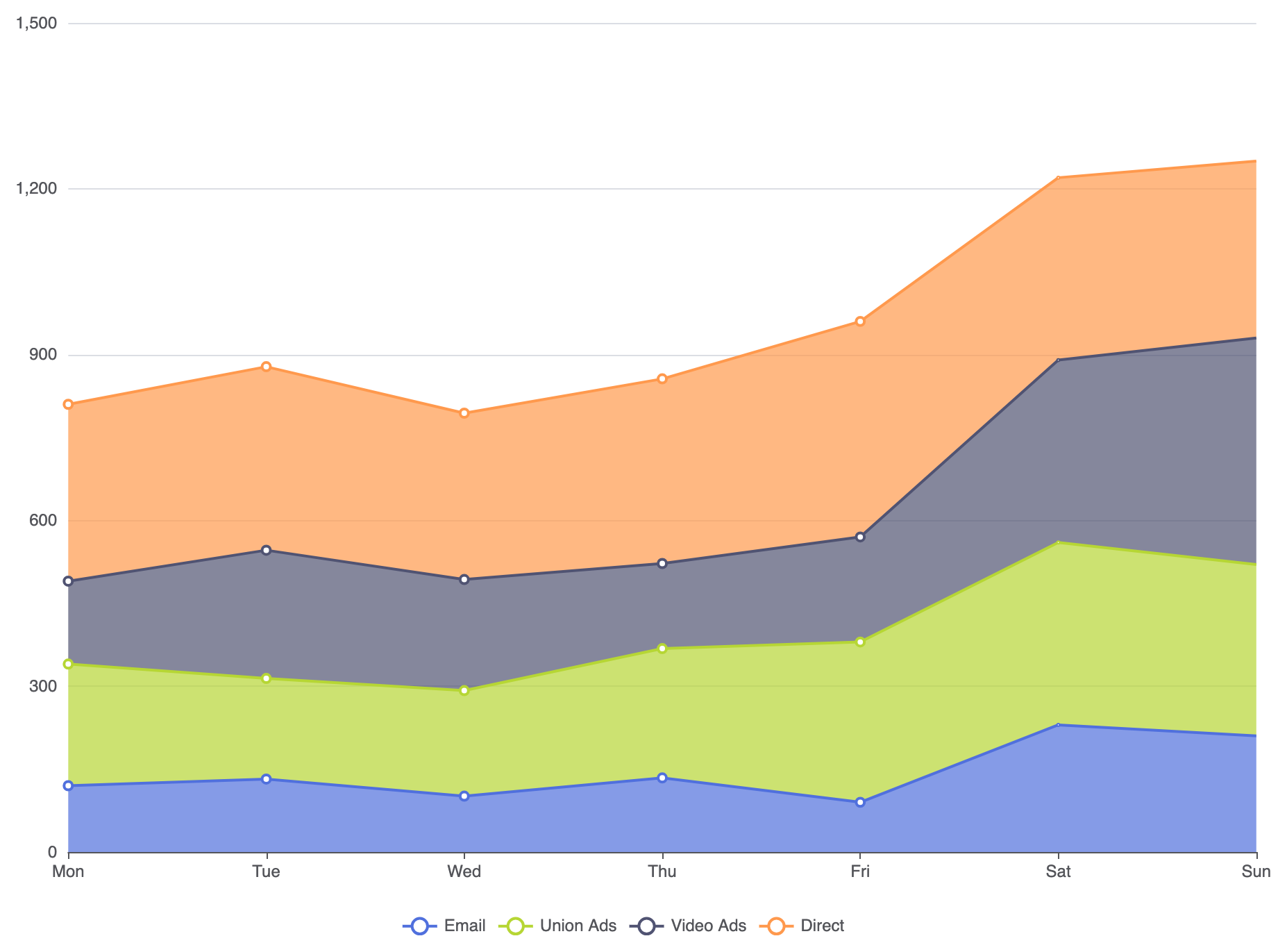
When you need to track both overall total volume and individual sub-component contributions over time, the Stacked Area Chart is the ideal visualization tool. Stacking area fills vertically creates a continuous composite view where the topmost line represents the aggregate total, while individual band widths show changing sub-category contributions, such as total web traffic broken down by search engine, organic, and direct referral channels over several months.
The Mechanics of Stacked Area Charts
Stacked area charts combine line series configurations with matching stack attributes. When the rendering engine detects identical stack identifiers across multiple series with type: 'line' and areaStyle active, it stacks each data point sequentially above the preceding series line path along the vertical Y-axis.
1. Essential Setup
To construct a basic stacked area chart, define a continuous X-axis, set type: 'line' on each series, enable areaStyle, and assign an identical stack identifier across all series:
option = {
    tooltip: {
        trigger: 'axis',
        axisPointer: { type: 'cross' }
    },
    legend: {
        data: ['Email', 'Union Ads', 'Video Ads', 'Direct']
    },
    xAxis: {
        type: 'category',
        boundaryGap: false,
        data: ['Mon', 'Tue', 'Wed', 'Thu', 'Fri', 'Sat', 'Sun']
    },
    yAxis: {
        type: 'value'
    },
    series: [
        {
            name: 'Email',
            type: 'line',
            stack: 'Total',
            areaStyle: {},
            data: [120, 132, 101, 134, 90, 230, 210]
        },
        {
            name: 'Union Ads',
            type: 'line',
            stack: 'Total',
            areaStyle: {},
            data: [220, 182, 191, 234, 290, 330, 310]
        },
        {
            name: 'Video Ads',
            type: 'line',
            stack: 'Total',
            areaStyle: {},
            data: [150, 232, 201, 154, 190, 330, 410]
        },
        {
            name: 'Direct',
            type: 'line',
            stack: 'Total',
            areaStyle: {},
            data: [320, 332, 301, 334, 390, 330, 320]
        }
    ]
};
Advanced Structural Techniques
Stacked area charts can be configured to focus either on overall cumulative growth or relative proportional shifts over time.
1. 100% Normalized Percentage Area Chart
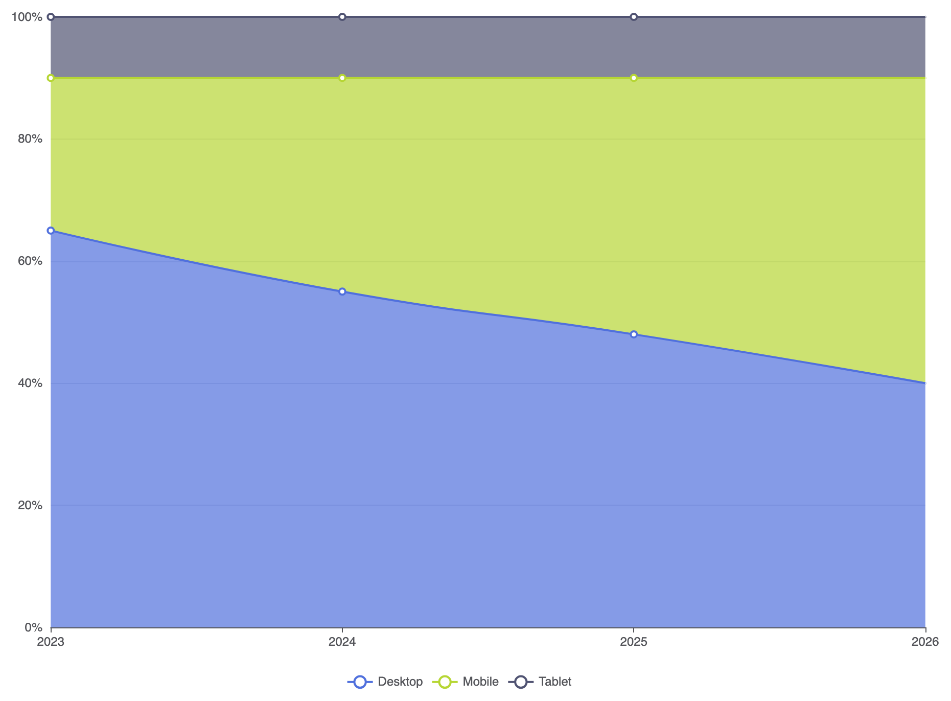
When evaluating proportional shifts rather than total aggregate volume over time, normalize your dataset to 100% per horizontal time point:
option = {
    tooltip: {
        trigger: 'axis',
        formatter: '{b}
{a0}: {c0}%
{a1}: {c1}%
{a2}: {c2}%'
    },
    legend: {
        data: ['Desktop', 'Mobile', 'Tablet']
    },
    xAxis: {
        type: 'category',
        boundaryGap: false,
        data: ['2023', '2024', '2025', '2026']
    },
    yAxis: {
        type: 'value',
        min: 0,
        max: 100,
        axisLabel: { formatter: '{value}%' }
    },
    series: [
        {
            name: 'Desktop',
            type: 'line',
            stack: 'percent',
            smooth: true,
            areaStyle: {},
            data: [65, 55, 48, 40]
        },
        {
            name: 'Mobile',
            type: 'line',
            stack: 'percent',
            smooth: true,
            areaStyle: {},
            data: [25, 35, 42, 50]
        },
        {
            name: 'Tablet',
            type: 'line',
            stack: 'percent',
            smooth: true,
            areaStyle: {},
            data: [10, 10, 10, 10]
        }
    ]
};
Fine-Tuning Layout and Styling
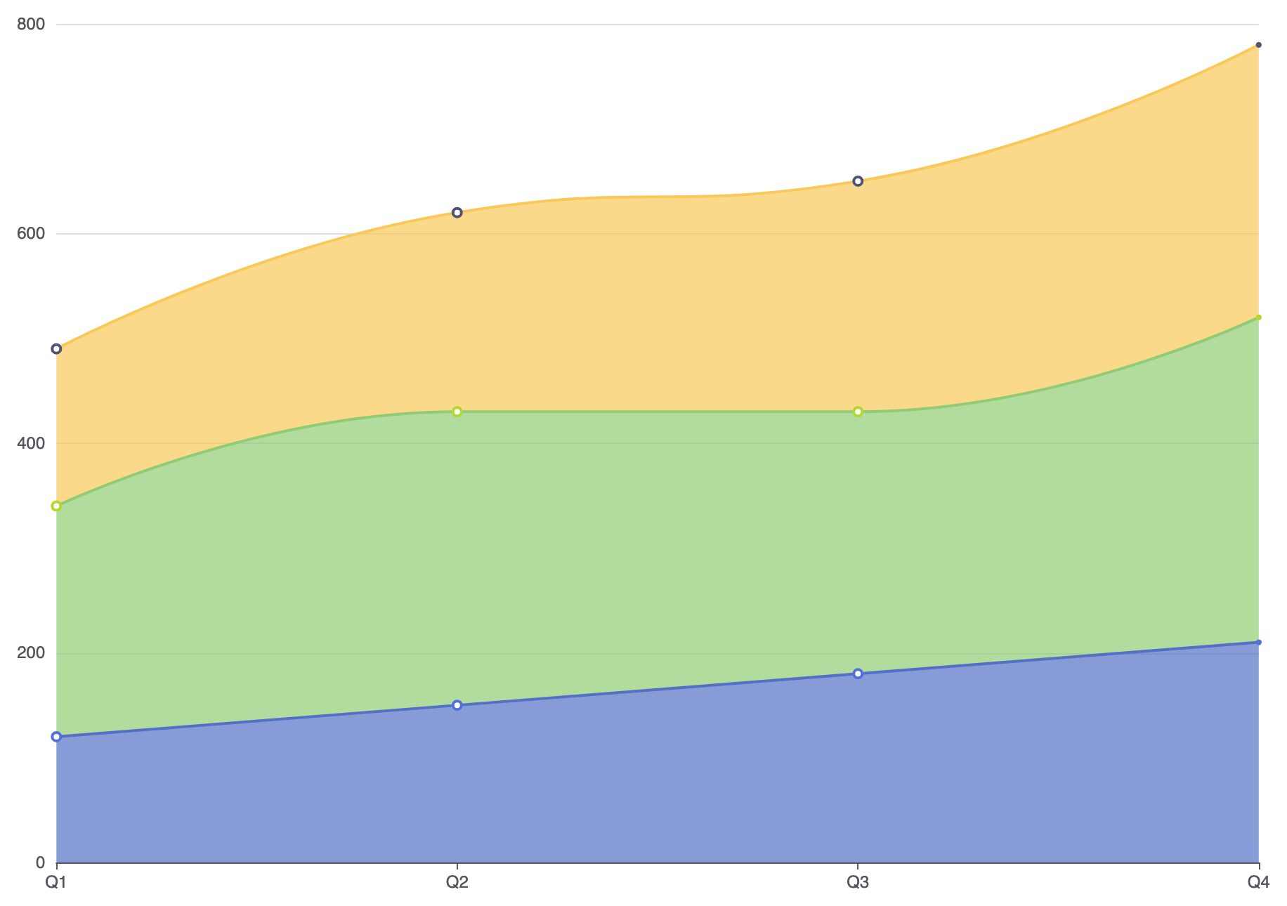
Because stacked areas completely cover the background, adjusting fill opacity and line strokes helps keep individual layers clear and legible.
1. Custom Layer Opacity and Border Separators
Setting solid line strokes over slightly translucent area fills creates crisp visual boundaries between adjacent stacked bands:
option = {
    tooltip: {
        trigger: 'axis'
    },
    xAxis: {
        type: 'category',
        boundaryGap: false,
        data: ['Q1', 'Q2', 'Q3', 'Q4']
    },
    yAxis: {
        type: 'value'
    },
    series: [
        {
            name: 'Product A',
            type: 'line',
            stack: 'volume',
            smooth: true,
            lineStyle: { width: 2, color: '#5470c6' },
            areaStyle: { color: '#5470c6', opacity: 0.7 },
            data: [120, 150, 180, 210]
        },
        {
            name: 'Product B',
            type: 'line',
            stack: 'volume',
            smooth: true,
            lineStyle: { width: 2, color: '#91cc75' },
            areaStyle: { color: '#91cc75', opacity: 0.7 },
            data: [220, 280, 250, 310]
        },
        {
            name: 'Product C',
            type: 'line',
            stack: 'volume',
            smooth: true,
            lineStyle: { width: 2, color: '#fac858' },
            areaStyle: { color: '#fac858', opacity: 0.7 },
            data: [150, 190, 220, 260]
        }
    ]
};
Strategic Best Practices
- Anchor Stable Series at the Bottom: Place the largest or least volatile series at the bottom of the stack to establish a predictable baseline for the bands above it.
- Limit Band Count: Stacking more than 4 to 5 series makes middle bands hard to evaluate accurately. Consider grouping minor categories into an “Other” category.
- Use
axisPointer: { type: 'cross' }: Combining hover crosshairs with a continuous tooltip makes pinpointing specific date values across dense vertical stacks straightforward.