


When presenting relative proportions or percentage shares of a single static total, the Pie Chart is a familiar and intuitive choice. By dividing a circle into proportional slices, pie charts allow viewers to quickly grasp how individual components contribute to a unified whole, such as market share distribution, device preference splits, or expense category allocations.
The Mechanics of Pie Charts
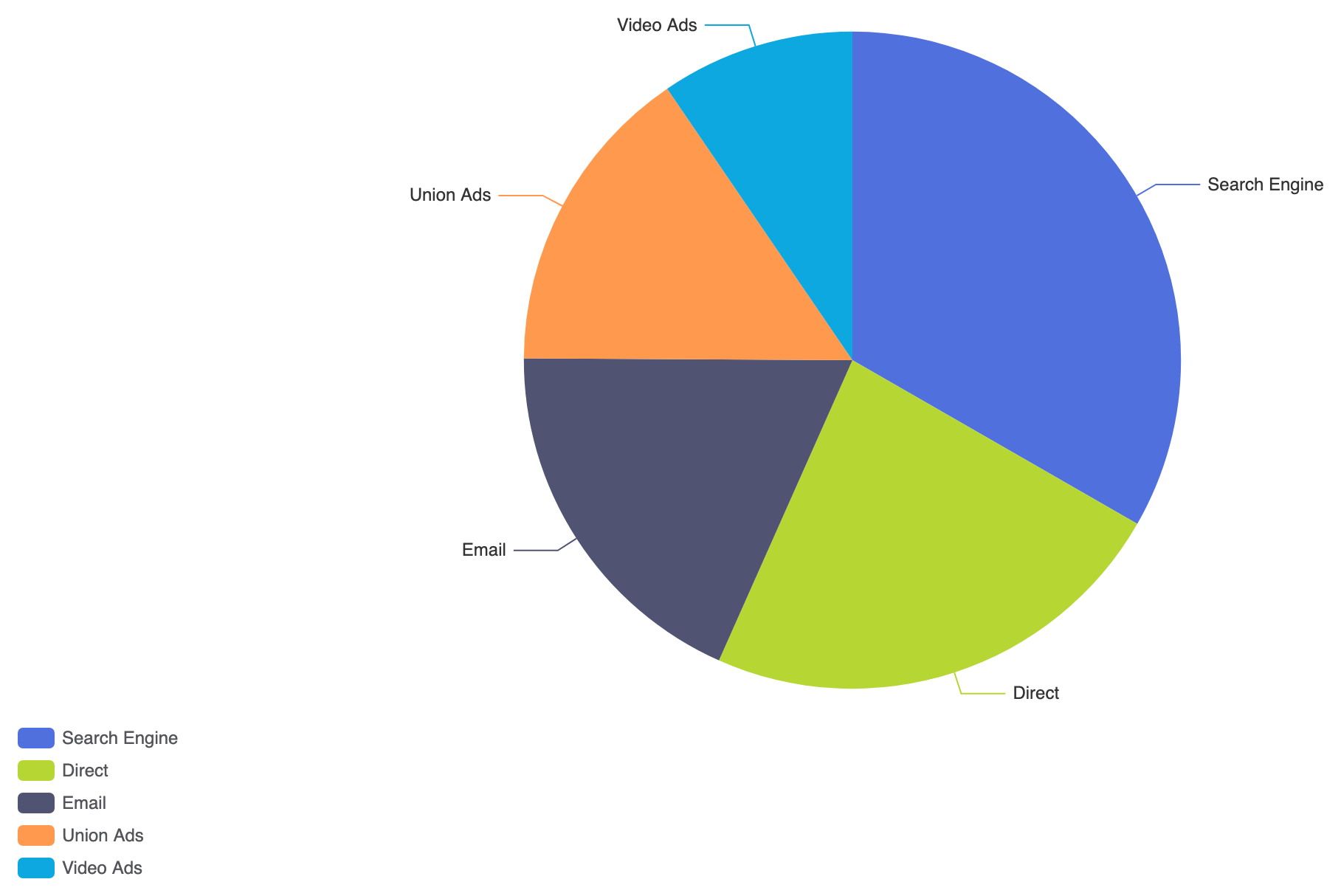
Unlike Cartesian charts that use horizontal and vertical axes, pie charts map categorical data directly to radial angles on a polar coordinate system. In Apache ECharts, a pie chart is created by setting the series type to 'pie' and supplying an array of objects where each entry contains a numeric value and descriptive name.
1. Essential Setup
To build a basic pie chart, define a single series with type: 'pie' and pass your structured dataset inside the data array:
option = {
    tooltip: {
        trigger: 'item',
        formatter: '{a}
{b}: {c} ({d}%)'
    },
    legend: {
        orient: 'vertical',
        left: 'left'
    },
    series: [
        {
            name: 'Access Source',
            type: 'pie',
            radius: '60%',
            data: [
                { value: 1048, name: 'Search Engine' },
                { value: 735, name: 'Direct' },
                { value: 580, name: 'Email' },
                { value: 484, name: 'Union Ads' },
                { value: 300, name: 'Video Ads' }
            ],
            emphasis: {
                itemStyle: {
                    shadowBlur: 10,
                    shadowOffsetX: 0,
                    shadowColor: 'rgba(0, 0, 0, 0.5)'
                }
            }
        }
    ]
};
Advanced Structural Techniques
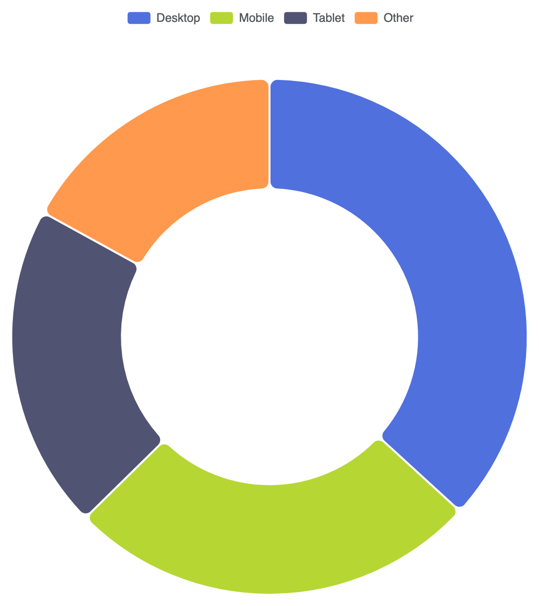
Pie charts can be adjusted into ring-shaped donut layouts or styled with custom radii to emphasize primary data segments.
1. Donut Chart Variant
Setting the radius property as a two-value array (e.g., ['40%', '70%']) hollows out the center to create a clean donut chart. This leaves space in the middle for custom summary labels:
option = {
    tooltip: {
        trigger: 'item'
    },
    legend: {
        top: '5%',
        left: 'center'
    },
    series: [
        {
            name: 'Device Type',
            type: 'pie',
            radius: ['40%', '70%'],
            avoidLabelOverlap: true,
            itemStyle: {
                borderRadius: 8,
                borderColor: '#fff',
                borderWidth: 2
            },
            label: {
                show: false,
                position: 'center'
            },
            emphasis: {
                label: {
                    show: true,
                    fontSize: 20,
                    fontWeight: 'bold'
                }
            },
            data: [
                { value: 1048, name: 'Desktop' },
                { value: 735, name: 'Mobile' },
                { value: 580, name: 'Tablet' },
                { value: 484, name: 'Other' }
            ]
        }
    ]
};
Fine-Tuning Layout and Styling
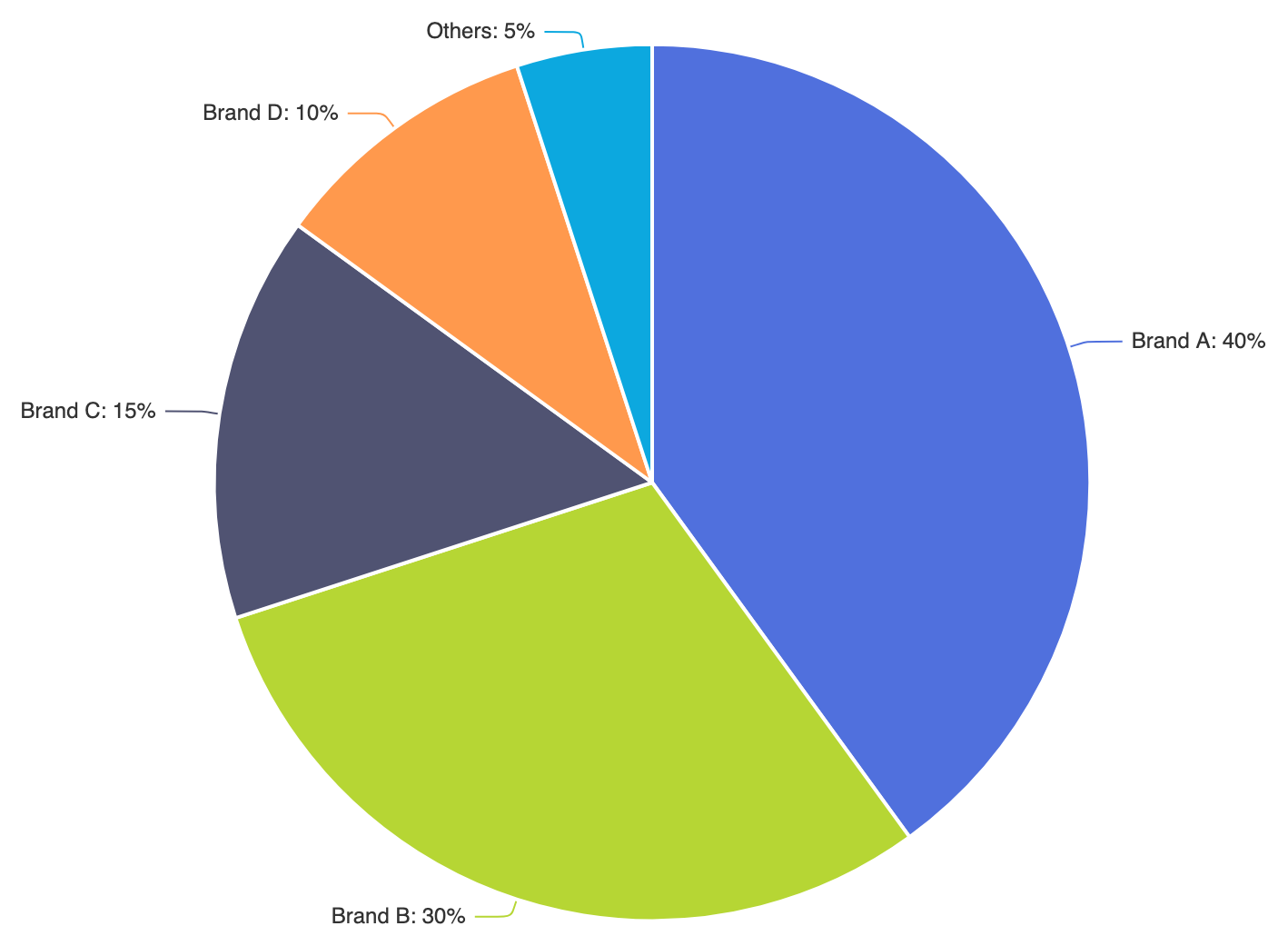
Controlling label callout lines and slice borders keeps pie charts readable even when dealing with smaller data values.
1. Custom Slice Separation and Label Callouts
Applying item border widths and configuring external guide lines prevents text overlapping on adjacent slices:
option = {
    series: [
        {
            name: 'Market Share',
            type: 'pie',
            radius: '65%',
            center: ['50%', '50%'],
            selectedMode: 'single',
            data: [
                { value: 40, name: 'Brand A' },
                { value: 30, name: 'Brand B' },
                { value: 15, name: 'Brand C' },
                { value: 10, name: 'Brand D' },
                { value: 5, name: 'Others' }
            ],
            label: {
                formatter: '{b}: {d}%'
            },
            labelLine: {
                smooth: 0.2,
                length: 10,
                length2: 20
            },
            itemStyle: {
                borderColor: '#ffffff',
                borderWidth: 2
            }
        }
    ]
};
Strategic Best Practices
- Limit Slices to 5 or 6: Too many small slices make a pie chart hard to read. Group minor values under an « Other » category to keep the focus sharp.
- Order Slices by Size: Place the largest segment starting at 12 o’clock and order remaining slices sequentially clockwise to facilitate easy scanning.
- Show Percentages Direct in Tooltips or Labels: Always include
{d}%in label or tooltip formatters so viewers immediately see proportion ratios without performing mental math.