


When presenting relative category allocations, the Doughnut Chart offers a modern, high-contrast alternative to traditional solid pie charts. By removing the center core, a doughnut chart shifts visual emphasis from filled area size to arc lengths along the outer ring. This hollow center creates prime visual real estate for key performance metrics, summary totals, or status indicators—making it a staple for executive status dashboards and financial summaries.
The Mechanics of Doughnut Charts
In Apache ECharts, doughnut charts are configured using the 'pie' series type paired with a two-element radius array: ['innerRadius', 'outerRadius']. The first value defines the hollow center opening, while the second value controls the outer boundary.
1. Essential Setup
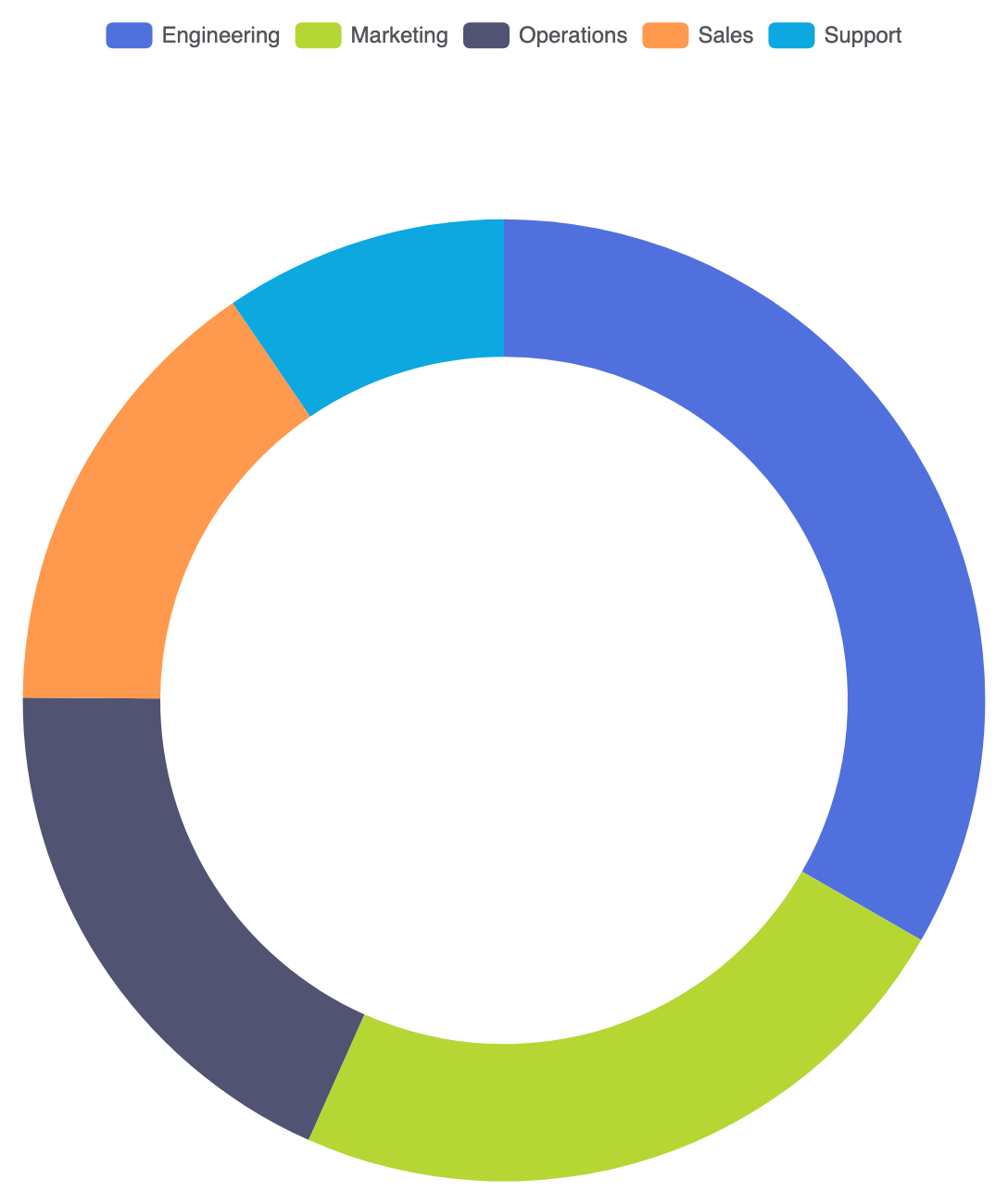
To build a standard doughnut chart, declare a series with type: 'pie', set radius: ['50%', '70%'], and pass your data objects with name and value properties:
option = {
    tooltip: {
        trigger: 'item',
        formatter: '{a}
{b}: {c} ({d}%)'
    },
    legend: {
        top: '5%',
        left: 'center'
    },
    series: [
        {
            name: 'Budget Allocation',
            type: 'pie',
            radius: ['50%', '70%'],
            center: ['50%', '55%'],
            avoidLabelOverlap: true,
            label: {
                show: false
            },
            data: [
                { value: 1048, name: 'Engineering' },
                { value: 735, name: 'Marketing' },
                { value: 580, name: 'Operations' },
                { value: 484, name: 'Sales' },
                { value: 300, name: 'Support' }
            ]
        }
    ]
};
Advanced Structural Techniques
Doughnut charts excel when paired with central statistics or rounded visual styling to create polished UI components.
1. Center Label Statistics Overlay
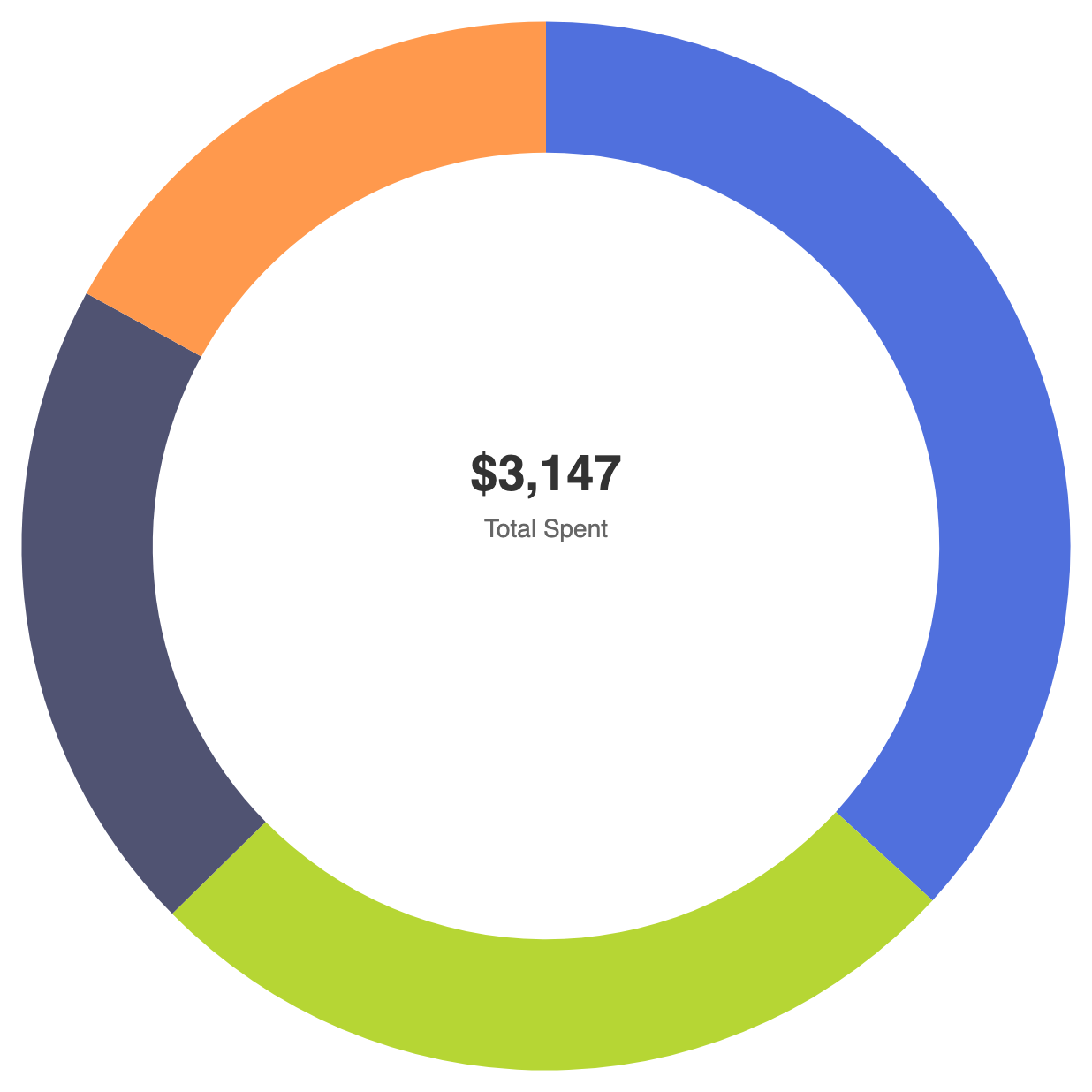
Utilize graphic elements or centered title components to display a grand total or primary KPI directly inside the doughnut ring:
option = {
    title: {
        text: '$3,147',
        subtext: 'Total Spent',
        left: 'center',
        top: '42%',
        textStyle: {
            fontSize: 28,
            fontWeight: 'bold',
            color: '#333'
        },
        subtextStyle: {
            fontSize: 14,
            color: '#666'
        }
    },
    tooltip: {
        trigger: 'item'
    },
    series: [
        {
            name: 'Expenses',
            type: 'pie',
            radius: ['60%', '80%'],
            center: ['50%', '50%'],
            avoidLabelOverlap: false,
            label: {
                show: false
            },
            data: [
                { value: 1048, name: 'Hardware' },
                { value: 735, name: 'SaaS Subscriptions' },
                { value: 580, name: 'Office Supplies' },
                { value: 484, name: 'Travel' }
            ]
        }
    ]
};
Fine-Tuning Layout and Segment Styling
Adding subtle corner radii and distinct segment margins gives doughnut charts a sleek, modern look.
1. Rounded Ends and Segment Spacing
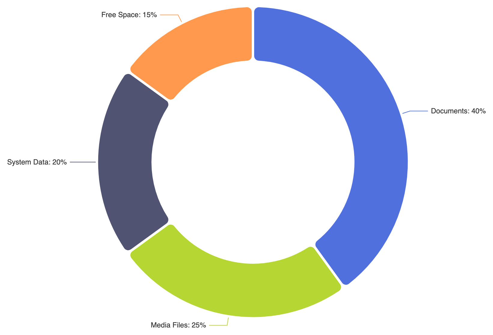
Use itemStyle.borderRadius along with clear white borders to give each arc segment a soft, pill-like appearance:
option = {
    series: [
        {
            name: 'Storage Usage',
            type: 'pie',
            radius: ['45%', '70%'],
            itemStyle: {
                borderRadius: 10,
                borderColor: '#ffffff',
                borderWidth: 4
            },
            label: {
                show: true,
                formatter: '{b}: {d}%'
            },
            data: [
                { value: 40, name: 'Documents' },
                { value: 25, name: 'Media Files' },
                { value: 20, name: 'System Data' },
                { value: 15, name: 'Free Space' }
            ]
        }
    ]
};
Strategic Best Practices
- Optimize Inner-to-Outer Radius Ratio: Maintain an inner radius between 50% and 70% of the outer radius to keep segments thick enough for easy hovering while preserving ample space in the center.
- Utilize the Center Space Intentionally: Use the central hollow area to display the grand total or selected slice metric instead of cluttering the chart perimeter with extra text boxes.
- Keep Slices Limited: Limit the ring to 5 or 6 primary segments. If you have numerous small categories, consolidate them into an “Other” category to prevent thin, unreadable arcs.