


When evaluating structural breakdown across discrete metrics, the Stacked Column Chart offers an efficient way to visualize part-to-whole distributions. Unlike grouped layouts that spread data series horizontally, stacked charts accumulate values vertically within a single column boundary. This format makes it simple to monitor total category growth while tracking the changing proportions of internal sub-components, such as device traffic split by operating system or quarterly expense breakdowns across departments.
The Mechanics of Stacked Columns
Stacked column charts rely on assigning a matching stack identifier across multiple series. When the rendering engine detects identical stack string values on a series with type: 'bar', it stacks the numerical values sequentially along the vertical Y-axis rather than rendering overlapping or side-by-side columns.
1. Essential Setup
To build a basic stacked column chart, define a category-based X-axis and apply a common stack property to each series in your series array:
option = {
    tooltip: {
        trigger: 'axis',
        axisPointer: { type: 'shadow' }
    },
    legend: {
        data: ['Direct', 'Organic Search', 'Paid Ads', 'Referral']
    },
    xAxis: {
        type: 'category',
        data: ['Mon', 'Tue', 'Wed', 'Thu', 'Fri', 'Sat', 'Sun']
    },
    yAxis: {
        type: 'value'
    },
    series: [
        {
            name: 'Direct',
            type: 'bar',
            stack: 'total',
            data: [120, 132, 101, 134, 90, 230, 210]
        },
        {
            name: 'Organic Search',
            type: 'bar',
            stack: 'total',
            data: [220, 182, 191, 234, 290, 330, 310]
        },
        {
            name: 'Paid Ads',
            type: 'bar',
            stack: 'total',
            data: [150, 232, 201, 154, 190, 330, 410]
        },
        {
            name: 'Referral',
            type: 'bar',
            stack: 'total',
            data: [98, 77, 101, 99, 40, 120, 110]
        }
    ]
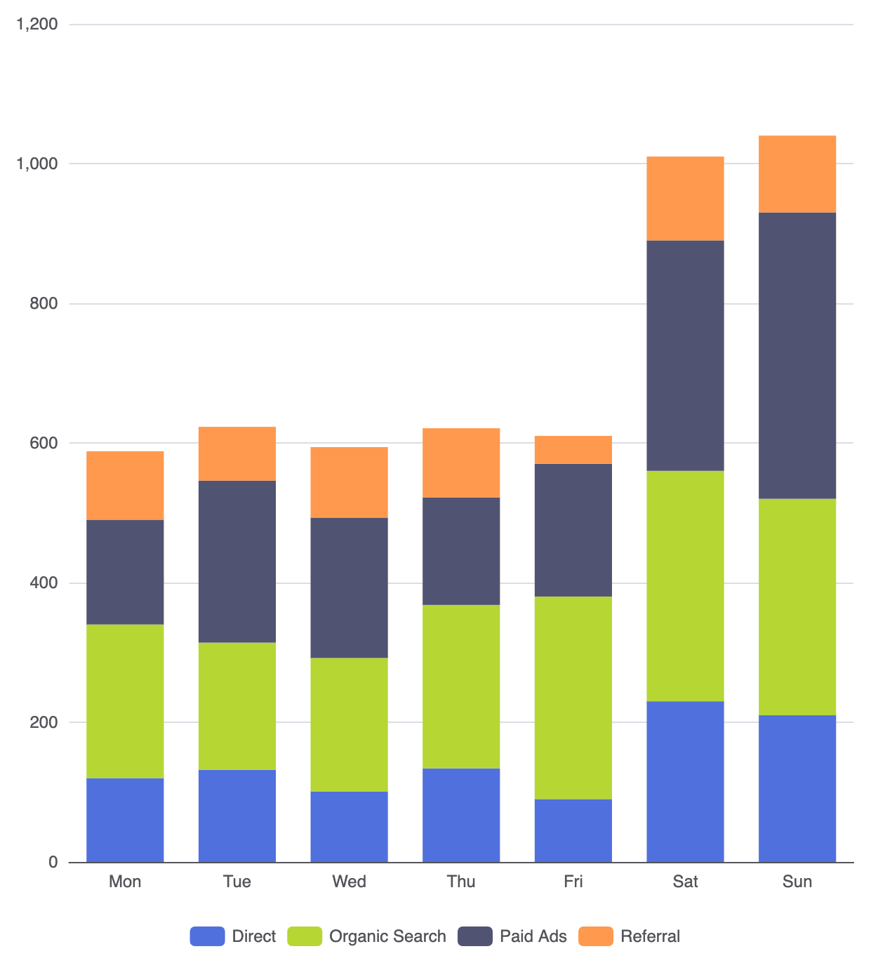
};
Advanced Structural Techniques
Stacked column charts can be tailored to show percentage distributions or selective sub-grouping depending on your analytical requirements.
1. 100% Normalized Stacked Columns
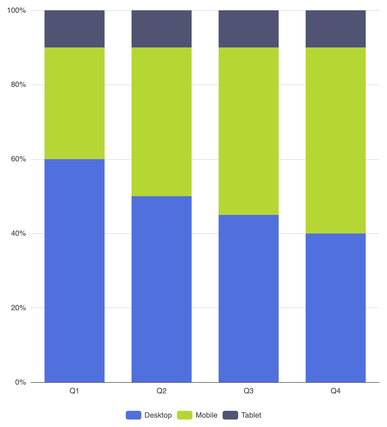
When your primary goal is to compare proportion ratios rather than absolute numerical totals, convert your data values into normalized percentages totaling 100% per category:
option = {
    tooltip: {
        trigger: 'axis',
        axisPointer: { type: 'shadow' },
        formatter: '{b}
{a0}: {c0}%
{a1}: {c1}%
{a2}: {c2}%'
    },
    legend: {
        data: ['Desktop', 'Mobile', 'Tablet']
    },
    xAxis: {
        type: 'category',
        data: ['Q1', 'Q2', 'Q3', 'Q4']
    },
    yAxis: {
        type: 'value',
        min: 0,
        max: 100,
        axisLabel: { formatter: '{value}%' }
    },
    series: [
        {
            name: 'Desktop',
            type: 'bar',
            stack: 'percentage',
            data: [60, 50, 45, 40]
        },
        {
            name: 'Mobile',
            type: 'bar',
            stack: 'percentage',
            data: [30, 40, 45, 50]
        },
        {
            name: 'Tablet',
            type: 'bar',
            stack: 'percentage',
            data: [10, 10, 10, 10]
        }
    ]
};
2. Multi-Stack Grouping
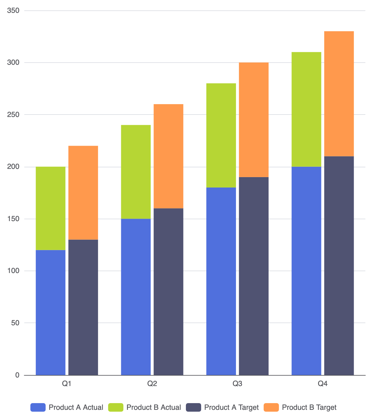
You can combine grouping and stacking in a single view by using distinct stack identifiers across series. For example, compare actual vs. target totals, where each is made up of stacked sub-components:
option = {
    legend: {
        data: ['Product A Actual', 'Product B Actual', 'Product A Target', 'Product B Target']
    },
    xAxis: {
        type: 'category',
        data: ['Q1', 'Q2', 'Q3', 'Q4']
    },
    yAxis: {
        type: 'value'
    },
    series: [
        {
            name: 'Product A Actual',
            type: 'bar',
            stack: 'actual',
            data: [120, 150, 180, 200]
        },
        {
            name: 'Product B Actual',
            type: 'bar',
            stack: 'actual',
            data: [80, 90, 100, 110]
        },
        {
            name: 'Product A Target',
            type: 'bar',
            stack: 'target',
            data: [130, 160, 190, 210]
        },
        {
            name: 'Product B Target',
            type: 'bar',
            stack: 'target',
            data: [90, 100, 110, 120]
        }
    ]
};
Fine-Tuning Layout and Styling
Visual polish is crucial for stacked columns to ensure segments remain distinguishable without causing visual fatigue.
1. Segment Boundaries and Rounded Top Caps
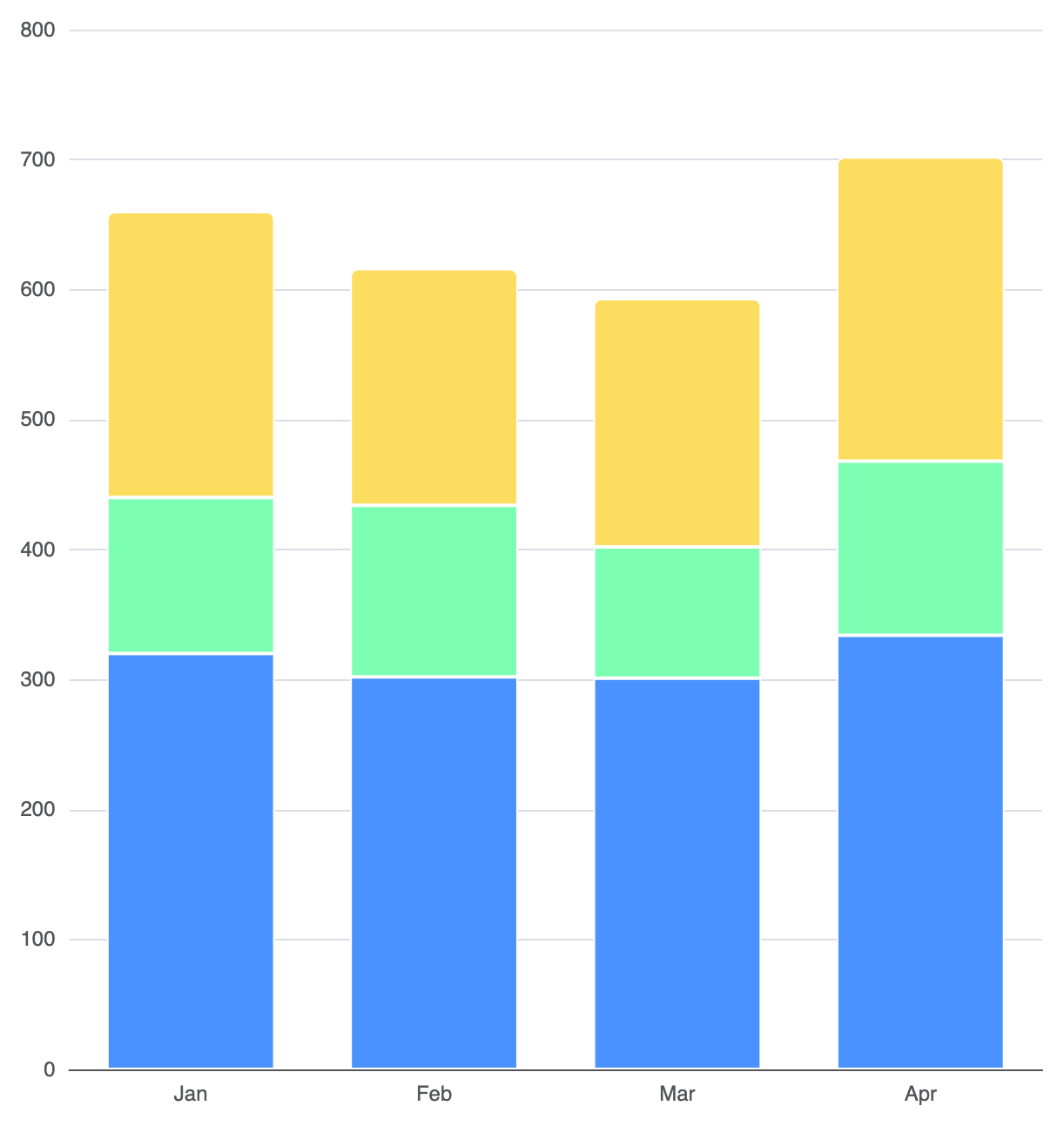
Apply clean border separators between stacked segments and restrict corner rounding to only the top-most series segment in the stack:
option = {
    xAxis: {
        type: 'category',
        data: ['Jan', 'Feb', 'Mar', 'Apr']
    },
    yAxis: {
        type: 'value'
    },
    series: [
        {
            name: 'Base Layer',
            type: 'bar',
            stack: 'total',
            data: [320, 302, 301, 334],
            itemStyle: {
                color: '#4992ff',
                borderColor: '#ffffff',
                borderWidth: 1
            }
        },
        {
            name: 'Middle Layer',
            type: 'bar',
            stack: 'total',
            data: [120, 132, 101, 134],
            itemStyle: {
                color: '#7cffb2',
                borderColor: '#ffffff',
                borderWidth: 1
            }
        },
        {
            name: 'Top Layer',
            type: 'bar',
            stack: 'total',
            data: [220, 182, 191, 234],
            itemStyle: {
                color: '#fddd60',
                borderColor: '#ffffff',
                borderWidth: 1,
                borderRadius: [4, 4, 0, 0] // Rounded corners on top segment only
            }
        }
    ]
};
Strategic Best Practices
- Limit Segment Count: Avoid stacking more than 4 to 5 categories per column. Beyond this threshold, comparing middle segments across columns becomes visually challenging.
- Anchor Baseline Items at the Bottom: Place your most important metric or largest sub-component as the first item in the
seriesarray so it rests directly on the baseline for easy alignment. - Use High-Contrast Palette or Borders: Apply subtle white border lines between segments to maintain clear distinction when adjacent colors have similar contrast levels.