


To emphasize both trend direction and overall volume over continuous time, the Area Chart provides an expressive visual approach. By filling the region between the trend line and the horizontal axis, area charts draw focus to relative magnitude and total volume shifts across sequences, such as server bandwidth consumption, active user volume, or daily transactional throughput.
The Mechanics of Area Charts
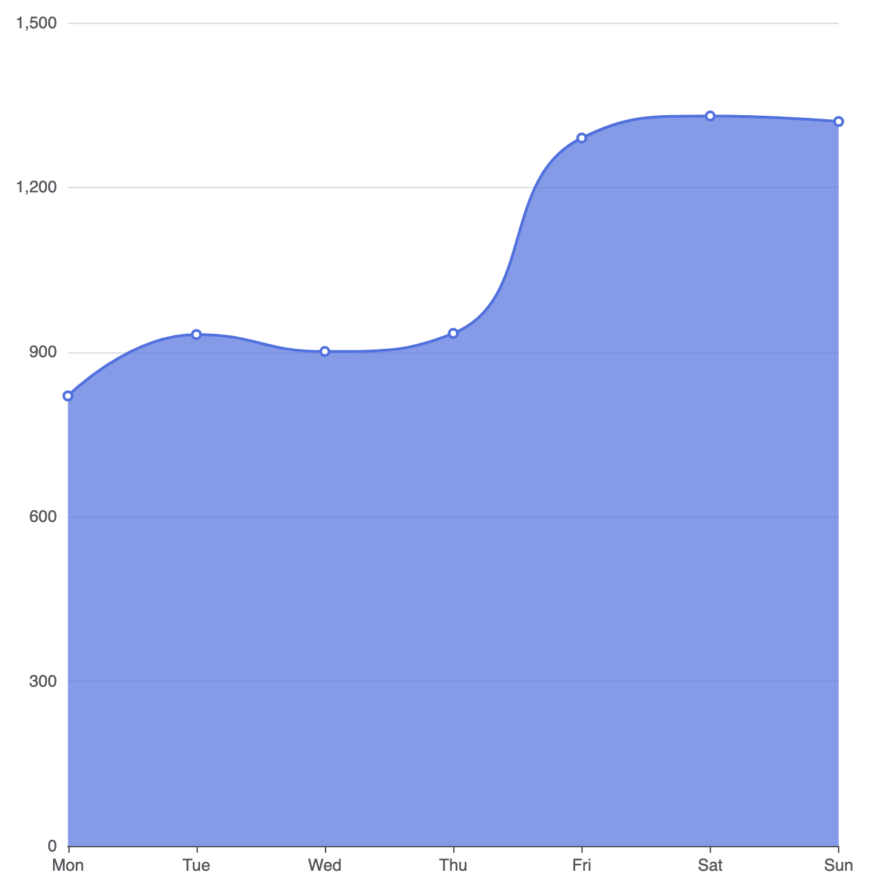
Area charts build directly on the line chart configuration. By setting type: 'line' and including an areaStyle property on a series object, the rendering engine automatically fills the geometric space beneath the line path down to the horizontal baseline.
1. Essential Setup
To build a basic area chart, define a continuous X-axis, set series type: 'line', and declare an empty or customized areaStyle object:
option = {
    tooltip: {
        trigger: 'axis'
    },
    xAxis: {
        type: 'category',
        boundaryGap: false,
        data: ['Mon', 'Tue', 'Wed', 'Thu', 'Fri', 'Sat', 'Sun']
    },
    yAxis: {
        type: 'value'
    },
    series: [
        {
            type: 'line',
            smooth: true,
            areaStyle: {}, // Enables default area fill
            data: [820, 932, 901, 934, 1290, 1330, 1320]
        }
    ]
};
Advanced Structural Techniques
Area charts can be enhanced with modern color gradients and smooth curves to improve readability and visual polish.
1. Gradient Fill Styling
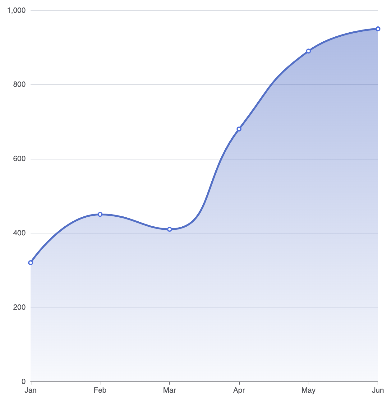
A solid color fill can sometimes feel heavy. Applying a semi-transparent linear gradient creates a modern, sleek appearance where the fill softly fades toward the bottom axis:
option = {
    tooltip: {
        trigger: 'axis'
    },
    xAxis: {
        type: 'category',
        boundaryGap: false,
        data: ['Jan', 'Feb', 'Mar', 'Apr', 'May', 'Jun']
    },
    yAxis: {
        type: 'value'
    },
    series: [
        {
            type: 'line',
            smooth: true,
            lineStyle: {
                width: 3,
                color: '#5470c6'
            },
            areaStyle: {
                opacity: 0.8,
                color: {
                    type: 'linear',
                    x: 0,
                    y: 0,
                    x2: 0,
                    y2: 1,
                    colorStops: [
                        { offset: 0, color: 'rgba(84, 112, 198, 0.6)' },
                        { offset: 1, color: 'rgba(84, 112, 198, 0.05)' }
                    ]
                }
            },
            data: [320, 450, 410, 680, 890, 950]
        }
    ]
};
2. Overlapping Multi-Series Area Comparison
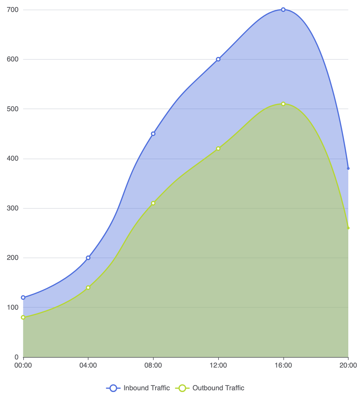
When displaying multiple area series in a single chart, adjusting fill opacity is crucial so underlying data paths remain fully visible:
option = {
    tooltip: {
        trigger: 'axis'
    },
    legend: {
        data: ['Inbound Traffic', 'Outbound Traffic']
    },
    xAxis: {
        type: 'category',
        boundaryGap: false,
        data: ['00:00', '04:00', '08:00', '12:00', '16:00', '20:00']
    },
    yAxis: {
        type: 'value'
    },
    series: [
        {
            name: 'Inbound Traffic',
            type: 'line',
            smooth: true,
            areaStyle: { opacity: 0.4 },
            data: [120, 200, 450, 600, 700, 380]
        },
        {
            name: 'Outbound Traffic',
            type: 'line',
            smooth: true,
            areaStyle: { opacity: 0.4 },
            data: [80, 140, 310, 420, 510, 260]
        }
    ]
};
Fine-Tuning Layout and Spacing
Because area fills run all the way down to the Y-axis baseline, configuring continuous boundary gaps keeps the fill aligned cleanly with the canvas border.
1. Seamless Edge Alignment
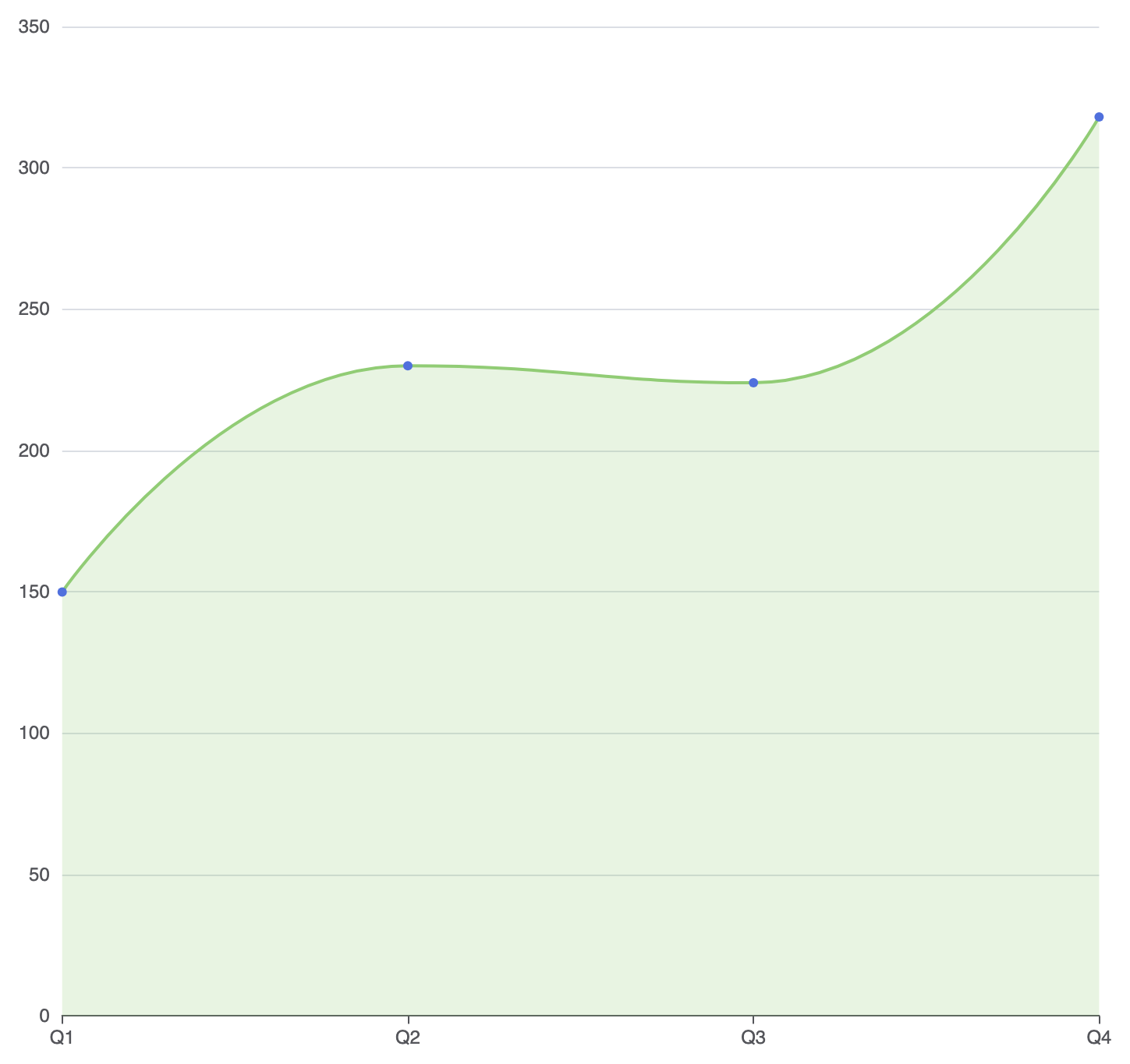
By setting boundaryGap: false on the category X-axis, the fill starts at the absolute left edge of the container grid and terminates cleanly at the far right:
option = {
    grid: {
        left: '3%',
        right: '4%',
        bottom: '3%',
        containLabel: true
    },
    xAxis: {
        type: 'category',
        boundaryGap: false,
        data: ['Q1', 'Q2', 'Q3', 'Q4']
    },
    yAxis: {
        type: 'value'
    },
    series: [
        {
            type: 'line',
            smooth: true,
            symbol: 'circle',
            symbolSize: 6,
            areaStyle: {
                color: 'rgba(145, 204, 117, 0.3)'
            },
            lineStyle: {
                color: '#91cc75',
                width: 2
            },
            data: [150, 230, 224, 318]
        }
    ]
};
Strategic Best Practices
- Use Low Fill Opacities: Solid area fills block underlying gridlines and overlapping series. Always maintain transparency levels around 20% to 50% for high contrast.
- Keep Series to 2 or 3: Too many overlapping area shapes cause visual confusion. For 4 or more cumulative continuous datasets, use a stacked area chart instead.
- Set
boundaryGap: false: Removing horizontal margins on time axes allows area fills to span the full grid width without leaving awkward empty gaps on the left and right edges.