


When analyzing activity density, continuous trends, or correlations across two discrete dimensions, the Heatmap Chart provides a powerful visual solution. By mapping data values to a dynamic color scale across a two-dimensional grid, heatmaps allow users to spot peak usage hours, seasonal bottlenecks, or matrix relationships instantly—such as server load by hour and day of the week, user activity logs, or cross-category correlation matrices.
The Mechanics of Heatmaps
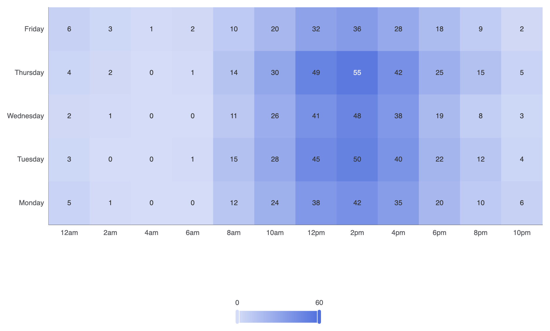
In Apache ECharts, heatmaps use type: 'heatmap' on a two-dimensional Cartesian grid. Each data point expects a 3-element array formatted as [xAxisIndex, yAxisIndex, value]. A required visualMap component maps numerical values to a continuous or piecewise color gradient.
1. Essential Setup
To build a basic heatmap chart, declare categorical axes for both horizontal (xAxis) and vertical (yAxis) scales, pass [xIndex, yIndex, value] arrays into your series data, and configure a visualMap component:
const hours = ['12am', '2am', '4am', '6am', '8am', '10am', '12pm', '2pm', '4pm', '6pm', '8pm', '10pm'];
const days = ['Monday', 'Tuesday', 'Wednesday', 'Thursday', 'Friday'];

// Data format: [xIndex, yIndex, value]
const data = [
    [0, 0, 5], [1, 0, 1], [2, 0, 0], [3, 0, 0], [4, 0, 12], [5, 0, 24], [6, 0, 38], [7, 0, 42], [8, 0, 35], [9, 0, 20], [10, 0, 10], [11, 0, 6],
    [0, 1, 3], [1, 1, 0], [2, 1, 0], [3, 1, 1], [4, 1, 15], [5, 1, 28], [6, 1, 45], [7, 1, 50], [8, 1, 40], [9, 1, 22], [10, 1, 12], [11, 1, 4],
    [0, 2, 2], [1, 2, 1], [2, 2, 0], [3, 2, 0], [4, 2, 11], [5, 2, 26], [6, 2, 41], [7, 2, 48], [8, 2, 38], [9, 2, 19], [10, 2, 8],  [11, 2, 3],
    [0, 3, 4], [1, 3, 2], [2, 3, 0], [3, 3, 1], [4, 3, 14], [5, 3, 30], [6, 3, 49], [7, 3, 55], [8, 3, 42], [9, 3, 25], [10, 3, 15], [11, 3, 5],
    [0, 4, 6], [1, 4, 3], [2, 4, 1], [3, 4, 2], [4, 4, 10], [5, 4, 20], [6, 4, 32], [7, 4, 36], [8, 4, 28], [9, 4, 18], [10, 4, 9],  [11, 4, 2]
];

option = {
    tooltip: {
        position: 'top'
    },
    grid: {
        height: '50%',
        top: '10%'
    },
    xAxis: {
        type: 'category',
        data: hours,
        splitArea: { show: true }
    },
    yAxis: {
        type: 'category',
        data: days,
        splitArea: { show: true }
    },
    visualMap: {
        min: 0,
        max: 60,
        calculable: true,
        orient: 'horizontal',
        left: 'center',
        bottom: '15%'
    },
    series: [
        {
            name: 'System Load',
            type: 'heatmap',
            data: data,
            label: {
                show: true
            },
            emphasis: {
                itemStyle: {
                    shadowBlur: 10,
                    shadowColor: 'rgba(0, 0, 0, 0.5)'
                }
            }
        }
    ]
};
Advanced Structural Techniques
Heatmaps can be customized with discrete color steps, distinct cell gaps, or combined with calendar coordinates to track activity over a full year.
1. Piecewise Color Mapping and Custom Cell Spacing
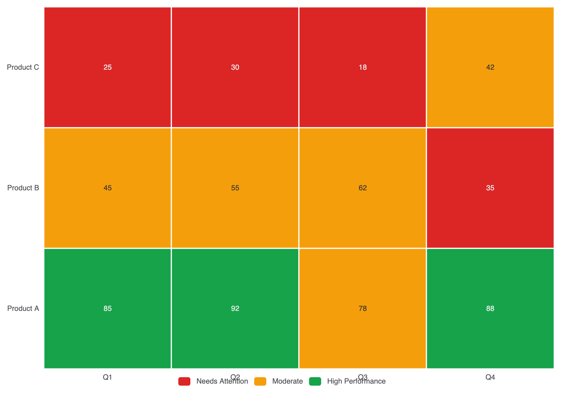
Instead of a continuous color gradient, use a piecewise visualMap to group values into distinct operational bands (e.g., Low, Medium, High):
option = {
    tooltip: { position: 'top' },
    xAxis: {
        type: 'category',
        data: ['Q1', 'Q2', 'Q3', 'Q4']
    },
    yAxis: {
        type: 'category',
        data: ['Product A', 'Product B', 'Product C']
    },
    visualMap: {
        type: 'piecewise',
        min: 0,
        max: 100,
        left: 'center',
        bottom: '5%',
        orient: 'horizontal',
        pieces: [
            { min: 80, label: 'High Performance', color: '#16a34a' },
            { min: 40, max: 79, label: 'Moderate', color: '#f59e0b' },
            { max: 39, label: 'Needs Attention', color: '#dc2626' }
        ]
    },
    series: [
        {
            type: 'heatmap',
            data: [
                [0, 0, 85], [1, 0, 92], [2, 0, 78], [3, 0, 88],
                [0, 1, 45], [1, 1, 55], [2, 1, 62], [3, 1, 35],
                [0, 2, 25], [1, 2, 30], [2, 2, 18], [3, 2, 42]
            ],
            label: { show: true },
            itemStyle: {
                borderColor: '#ffffff',
                borderWidth: 2
            }
        }
    ]
};
Fine-Tuning Layout and Color Gradients
Choosing legible color stops and enabling split areas makes large matrix grids effortless to scan.
1. Gradient Customization and Label Alignment
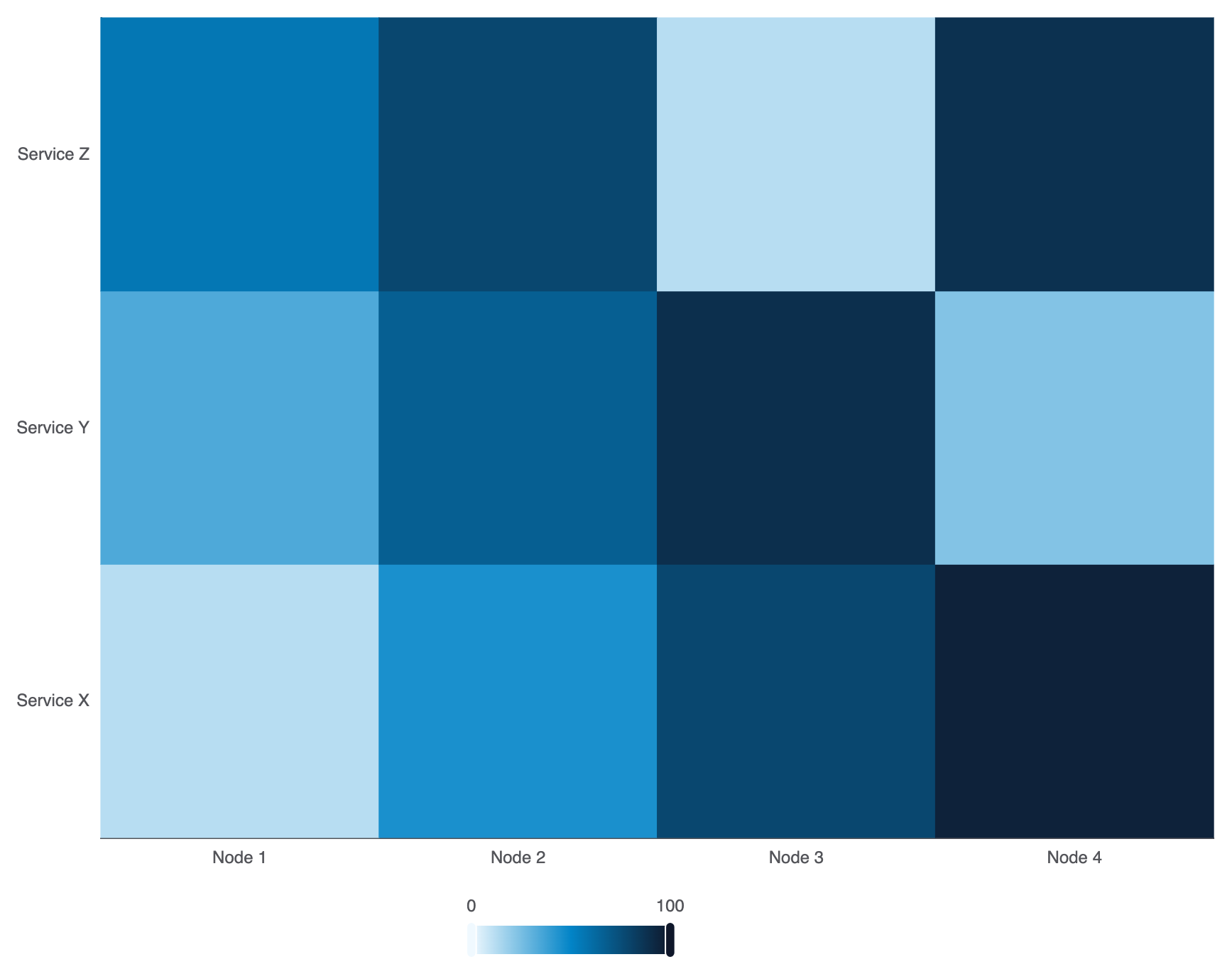
Configure custom multi-stop color ramps in visualMap.inRange to match your platform theme:
option = {
    grid: { containLabel: true },
    xAxis: {
        type: 'category',
        data: ['Node 1', 'Node 2', 'Node 3', 'Node 4']
    },
    yAxis: {
        type: 'category',
        data: ['Service X', 'Service Y', 'Service Z']
    },
    visualMap: {
        min: 0,
        max: 100,
        calculable: true,
        orient: 'horizontal',
        left: 'center',
        bottom: '0%',
        inRange: {
            color: ['#f0f9ff', '#0284c7', '#0f172a'] // Soft blue to dark slate gradient
        }
    },
    series: [
        {
            type: 'heatmap',
            data: [
                [0, 0, 12], [1, 0, 45], [2, 0, 78], [3, 0, 95],
                [0, 1, 34], [1, 1, 67], [2, 1, 89], [3, 1, 23],
                [0, 2, 56], [1, 2, 78], [2, 2, 12], [3, 2, 88]
            ]
        }
    ]
};
Strategic Best Practices
- Always Include a
visualMap: A heatmap without a visual legend forces users to guess what colors mean. Always place a continuous or piecewisevisualMapclearly near the canvas edge. - Use Grid Borders for Separation: Apply thin white borders using
itemStyle.borderColor: '#fff'andborderWidth: 1or2to keep individual cells visually distinct in dense matrices. - Ensure High-Contrast Text: If cell numerical labels are active (
label.show: true), test that text color remains readable against both the lightest and darkest steps in your color gradient.