


Horizontal Bar Charts are ideal for displaying ranking data, elongated category names, or progress metrics. By extending bars along the X-axis, this visual structure gives category labels plenty of horizontal room, eliminating the need to tilt or truncate text. Whether you are building top-10 leaderboard tables, survey response breakdowns, or horizontal performance comparisons, bar charts deliver clean readability across both desktop and mobile screens.
The Mechanics of Horizontal Bars
In Apache ECharts, column and bar charts use the exact same 'bar' series type. The transition to a horizontal layout occurs by assigning category data directly to the vertical axis (yAxis) and defining the horizontal axis (xAxis) as a numerical value axis. The chart engine rotates the rendering direction, drawing bars horizontally from left to right.
1. Essential Setup
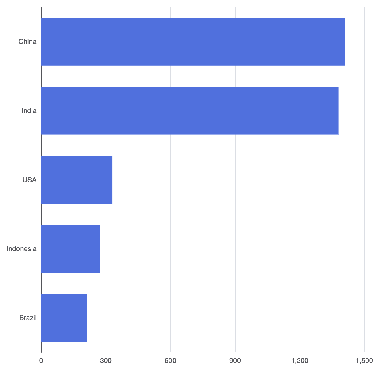
To build a basic horizontal bar chart, set type: 'category' on the yAxis and supply your data array, while setting type: 'value' on the xAxis:
option = {
    tooltip: {
        trigger: 'axis',
        axisPointer: { type: 'shadow' }
    },
    xAxis: {
        type: 'value'
    },
    yAxis: {
        type: 'category',
        data: ['Brazil', 'Indonesia', 'USA', 'India', 'China']
    },
    series: [
        {
            type: 'bar',
            data: [214, 273, 331, 1380, 1411]
        }
    ]
};
Advanced Structural Techniques
Horizontal bar charts support multiple data groups, targeted highlighting, and custom corner treatments for modern dashboard designs.
1. Multi-Series Horizontal Comparison
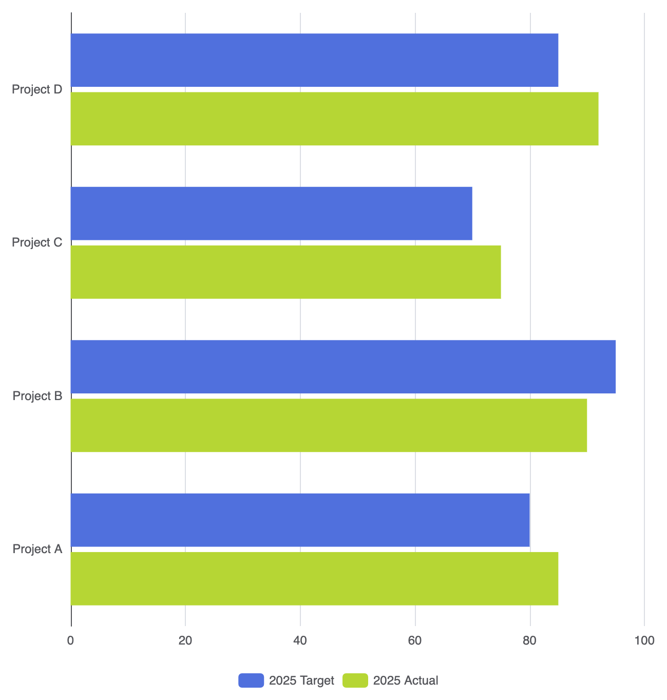
Place multiple objects in the series array to create grouped horizontal bars per category label:
option = {
    legend: {
        data: ['2025 Target', '2025 Actual']
    },
    xAxis: {
        type: 'value'
    },
    yAxis: {
        type: 'category',
        data: ['Project A', 'Project B', 'Project C', 'Project D']
    },
    series: [
        {
            name: '2025 Target',
            type: 'bar',
            data: [80, 95, 70, 85]
        },
        {
            name: '2025 Actual',
            type: 'bar',
            data: [85, 90, 75, 92]
        }
    ]
};
2. Rounded End Caps and Highlight Styling
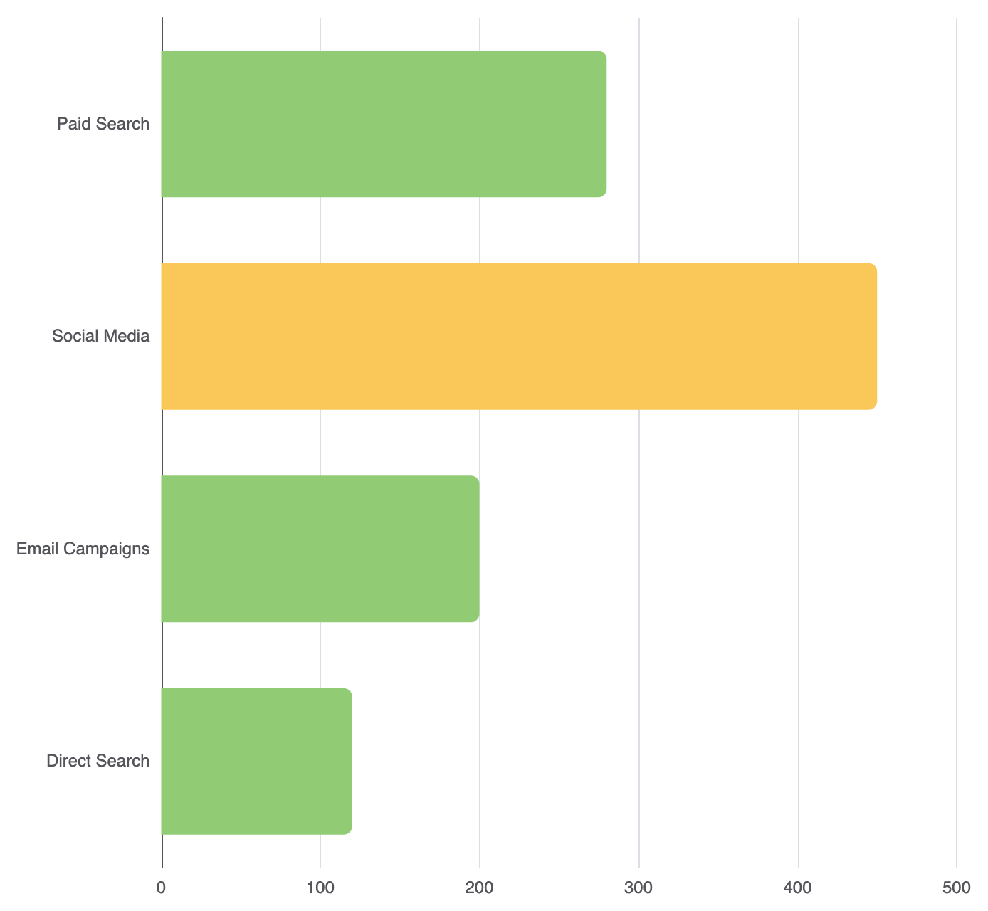
Apply rounded right corners using borderRadius on horizontal bars (specifying [top-right, bottom-right, bottom-left, top-left]):
option = {
    xAxis: {
        type: 'value'
    },
    yAxis: {
        type: 'category',
        data: ['Direct Search', 'Email Campaigns', 'Social Media', 'Paid Search']
    },
    series: [
        {
            type: 'bar',
            data: [
                120,
                200,
                {
                    value: 450,
                    itemStyle: {
                        color: '#fac858'
                    }
                },
                280
            ],
            itemStyle: {
                color: '#91cc75',
                borderRadius: [0, 6, 6, 0] // Round only the right end caps
            }
        }
    ]
};
Fine-Tuning Layout and Spacing
Because horizontal category labels vary in text length, adjusting left margins and label alignment prevents label clipping.
1. Container Grid Margins
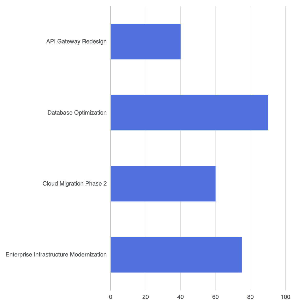
Use the grid configuration block to allocate enough space for long Y-axis labels:
option = {
    grid: {
        left: '15%',  // Increase left margin for lengthy category text
        right: '8%',
        bottom: '10%',
        containLabel: true
    },
    xAxis: {
        type: 'value'
    },
    yAxis: {
        type: 'category',
        data: [
            'Enterprise Infrastructure Modernization',
            'Cloud Migration Phase 2',
            'Database Optimization',
            'API Gateway Redesign'
        ]
    },
    series: [
        {
            type: 'bar',
            data: [75, 60, 90, 40],
            barWidth: '50%'
        }
    ]
};
Strategic Best Practices
- Sort Data Intentionally: Arrange horizontal bars in ascending or descending order whenever possible. Ranked lists make top performers immediately obvious to readers.
- Use
containLabel: true: Always includecontainLabel: trueinside thegridconfiguration to prevent long category titles from spilling off the canvas edge. - Direct Value Labels: For clean leaderboards, consider displaying data values directly at the end of each bar using
label: { show: true, position: 'right' }and hiding the numerical bottom axis entirely.