


When tracking financial markets and asset price movements over time, the Candlestick Chart is the industry-standard visualization tool. By combining four key price points—Open, High, Low, and Close (OHLC)—into a single visual bar, candlestick charts show price volatility, trading range, and market sentiment at a glance, making them essential for stock performance dashboards, crypto trackers, and commodity trading views.
The Mechanics of Candlesticks
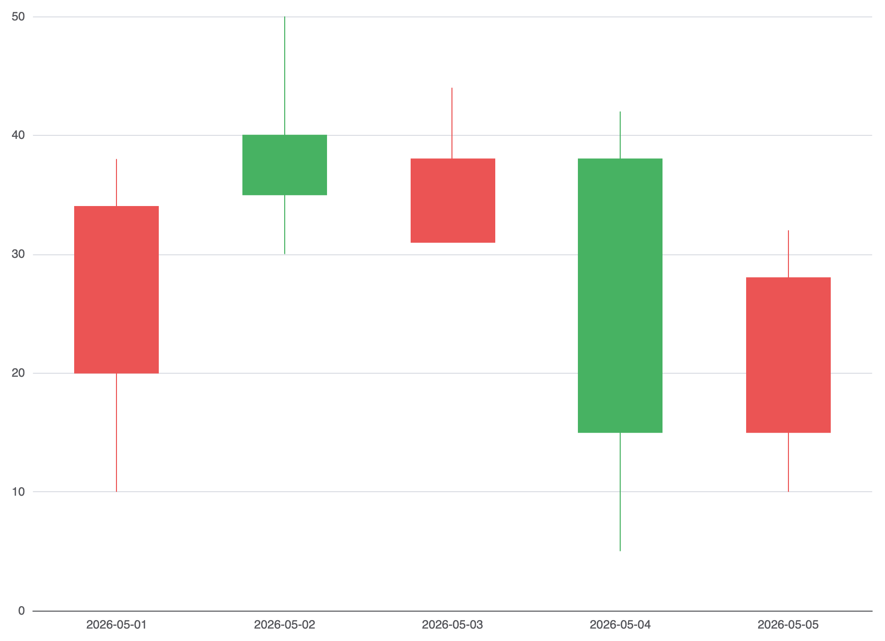
In Apache ECharts, candlestick series are rendered using type: 'candlestick' (or the alias 'k'). Each data point requires a 4-value array ordered explicitly as [Open, Close, Lowest, Highest]. The chart engine renders a solid or hollow body between Open and Close, with thin „wick“ lines extending to the Lowest and Highest prices.
1. Essential Setup
To build a basic candlestick chart, map time values along a continuous X-axis and pass [Open, Close, Lowest, Highest] arrays into your series data:
option = {
    tooltip: {
        trigger: 'axis',
        axisPointer: { type: 'cross' }
    },
    xAxis: {
        type: 'category',
        data: ['2026-05-01', '2026-05-02', '2026-05-03', '2026-05-04', '2026-05-05']
    },
    yAxis: {
        type: 'value',
        scale: true
    },
    series: [
        {
            type: 'candlestick',
            data: [
                [20, 34, 10, 38], // [Open, Close, Lowest, Highest] -> Bullish (Close > Open)
                [40, 35, 30, 50], // Bearish (Close < Open)
                [31, 38, 33, 44],
                [38, 15, 5, 42],
                [15, 28, 10, 32]
            ]
        }
    ]
};
Advanced Structural Techniques
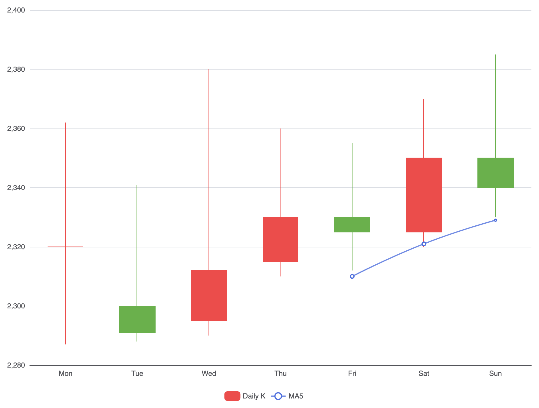
Candlestick charts can be customized with international color conventions, zoomed time ranges, or combined with moving averages.
1. Custom Colors and Moving Averages
Customize bullish (up) and bearish (down) bar colors using itemStyle, and overlay moving average lines by mixing line series with the candlestick series:
option = {
    tooltip: {
        trigger: 'axis',
        axisPointer: { type: 'cross' }
    },
    legend: {
        data: ['Daily K', 'MA5']
    },
    xAxis: {
        type: 'category',
        data: ['Mon', 'Tue', 'Wed', 'Thu', 'Fri', 'Sat', 'Sun']
    },
    yAxis: {
        type: 'value',
        scale: true
    },
    series: [
        {
            name: 'Daily K',
            type: 'candlestick',
            data: [
                [2320, 2320, 2287, 2362],
                [2300, 2291, 2288, 2341],
                [2295, 2312, 2290, 2380],
                [2315, 2330, 2310, 2360],
                [2330, 2325, 2312, 2355],
                [2325, 2350, 2320, 2370],
                [2350, 2340, 2330, 2385]
            ],
            itemStyle: {
                color: '#eb4d4b',       // Color for bullish (Close > Open)
                color0: '#6ab04c',      // Color for bearish (Close < Open)
                borderColor: '#eb4d4b',
                borderColor0: '#6ab04c'
            }
        },
        {
            name: 'MA5',
            type: 'line',
            smooth: true,
            data: [null, null, null, null, 2310, 2321, 2329],
            lineStyle: { opacity: 0.8, width: 2 }
        }
    ]
};
Fine-Tuning Layout and Interactive Zoom
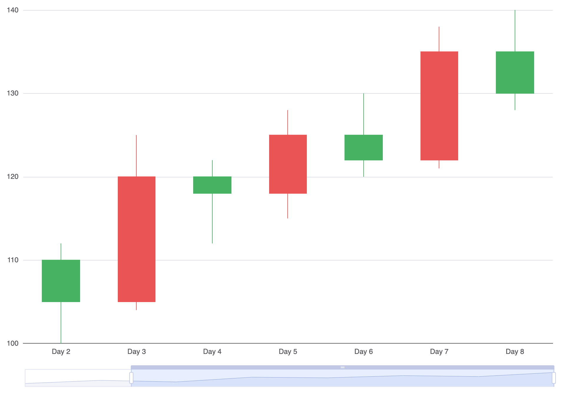
Adding time-series zoom controls gives users flexibility when navigating dense historical trading records.
1. Data Zoom and Axis Pointer Controls
Incorporate horizontal sliders and mouse-wheel zooming using the dataZoom configuration block:
option = {
    grid: {
        left: '10%',
        right: '10%',
        bottom: '15%'
    },
    xAxis: {
        type: 'category',
        data: ['Day 1', 'Day 2', 'Day 3', 'Day 4', 'Day 5', 'Day 6', 'Day 7', 'Day 8']
    },
    yAxis: {
        type: 'value',
        scale: true
    },
    dataZoom: [
        {
            type: 'inside', // Enables mouse wheel zooming
            start: 20,
            end: 100
        },
        {
            type: 'slider', // Visual bottom zoom slider
            show: true,
            top: '90%'
        }
    ],
    series: [
        {
            type: 'candlestick',
            data: [
                [100, 110, 95, 115],
                [110, 105, 100, 112],
                [105, 120, 104, 125],
                [120, 118, 112, 122],
                [118, 125, 115, 128],
                [125, 122, 120, 130],
                [122, 135, 121, 138],
                [135, 130, 128, 140]
            ]
        }
    ]
};
Strategic Best Practices
- Order Data Correctly: Double-check array structure! ECharts expects
[Open, Close, Lowest, Highest]—swapping Close and Lowest is a common source of rendering bugs. - Enable
scale: trueon Y-Axis: Always includescale: trueon numerical price axes so the chart auto-scales to the current price range instead of forcing the origin to zero. - Use Crosshair Axis Pointers: Set
tooltip.axisPointer.type = 'cross'to show continuous vertical and horizontal reference lines for easy price and timestamp alignment.