


When exploring relationships or correlations between two continuous variables, the Scatter Chart (or Scatter Plot) is the primary analytical tool. By plotting data points across a two-dimensional grid based on numeric X and Y coordinates, scatter charts help reveal clusters, outliers, trends, and correlations across complex datasets, such as marketing spend versus lead generation or employee experience versus salary.
The Mechanics of Scatter Charts
Unlike category-driven column or line charts, scatter charts use numeric value axes for both dimensions. In Apache ECharts, setting type: 'scatter' expects data formatted as two-element numerical coordinate arrays [x, y] or data objects mapped across numerical xAxis and yAxis configurations.
1. Essential Setup
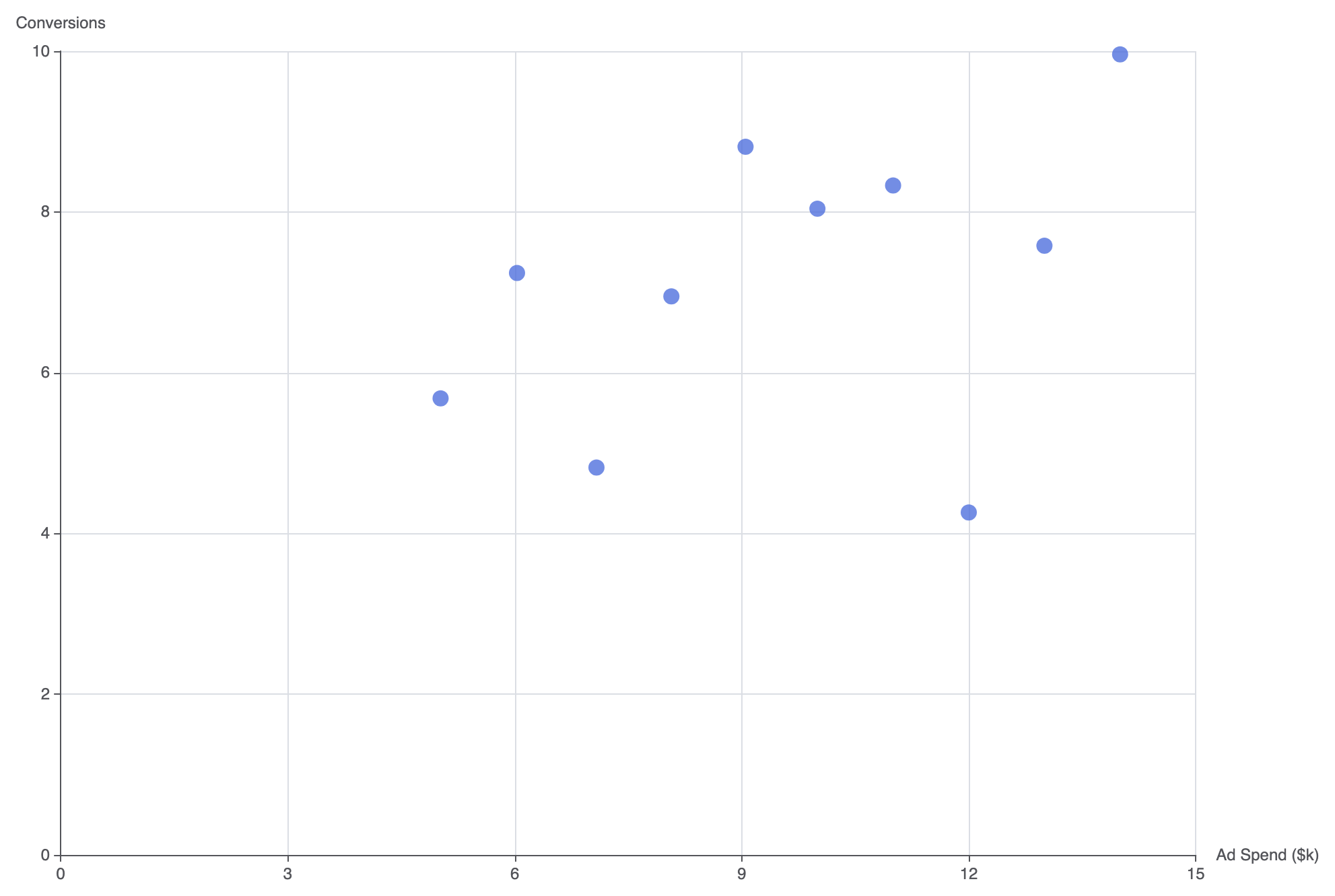
To build a basic scatter chart, define type: 'value' on both axes and provide numeric coordinate pairs within your series data array:
option = {
    tooltip: {
        trigger: 'item',
        formatter: 'X: {c0}
Y: {c1}'
    },
    xAxis: {
        type: 'value',
        name: 'Ad Spend ($k)'
    },
    yAxis: {
        type: 'value',
        name: 'Conversions'
    },
    series: [
        {
            type: 'scatter',
            symbolSize: 12,
            data: [
                [10.0, 8.04],
                [8.07, 6.95],
                [13.0, 7.58],
                [9.05, 8.81],
                [11.0, 8.33],
                [14.0, 9.96],
                [6.03, 7.24],
                [12.0, 4.26],
                [7.08, 4.82],
                [5.02, 5.68]
            ]
        }
    ]
};
Advanced Structural Techniques
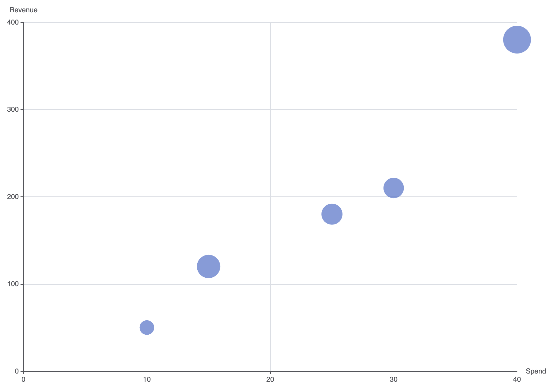
Scatter charts can incorporate dynamic sizing to represent a third variable (bubble chart) or display multi-category cluster overlays.
1. Variable Point Sizing (Bubble Effect)
Pass a custom function or data value mapping to symbolSize to encode a third quantitative metric into point size:
option = {
    tooltip: {
        trigger: 'item',
        formatter: function (param) {
            return 'Spend: $' + param.data[0] + 'k
' +
                   'Revenue: $' + param.data[1] + 'k
' +
                   'ROAS: ' + param.data[2] + 'x';
        }
    },
    xAxis: {
        type: 'value',
        name: 'Spend'
    },
    yAxis: {
        type: 'value',
        name: 'Revenue'
    },
    series: [
        {
            name: 'Campaigns',
            type: 'scatter',
            symbolSize: function (data) {
                return data[2] * 5; // Scale bubble size by third variable
            },
            data: [
                [15, 120, 8.0],
                [25, 180, 7.2],
                [10, 50, 5.0],
                [40, 380, 9.5],
                [30, 210, 7.0]
            ],
            itemStyle: {
                color: '#5470c6',
                opacity: 0.7
            }
        }
    ]
};
Fine-Tuning Layout and Styling
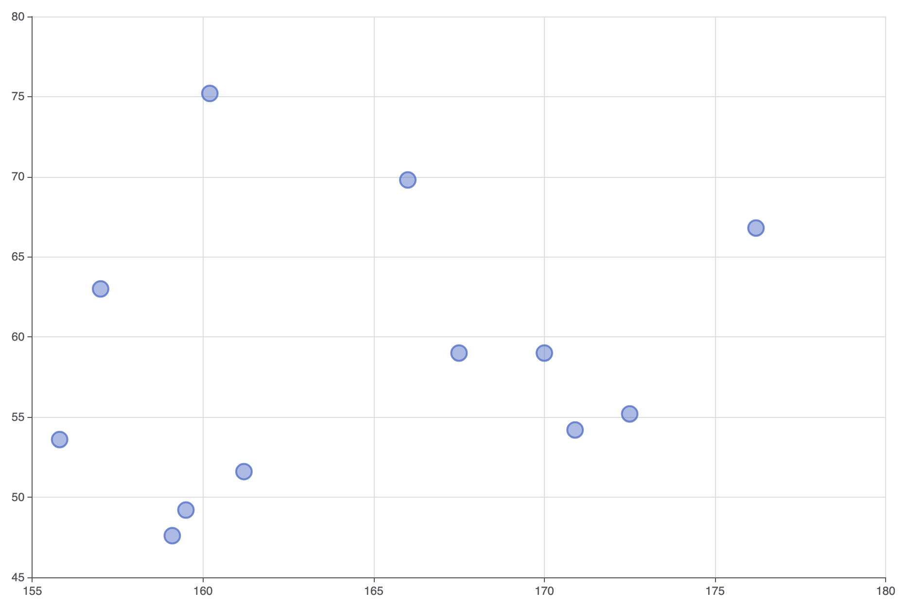
Controlling marker opacity and adding target trendlines prevents dense clusters from turning into solid visual blobs.
1. Translucent Markers and Cluster Styling
Applying border strokes and semi-transparent item fills keeps overlapping data points visible within high-density clusters:
option = {
    grid: {
        left: '10%',
        right: '10%',
        containLabel: true
    },
    xAxis: {
        type: 'value',
        scale: true // Auto-scale axis min/max to fit data tightly
    },
    yAxis: {
        type: 'value',
        scale: true
    },
    series: [
        {
            type: 'scatter',
            symbolSize: 16,
            itemStyle: {
                color: 'rgba(84, 112, 198, 0.6)',
                borderColor: '#5470c6',
                borderWidth: 2
            },
            data: [
                [161.2, 51.6], [167.5, 59.0], [159.5, 49.2], [157.0, 63.0],
                [155.8, 53.6], [170.0, 59.0], [159.1, 47.6], [166.0, 69.8],
                [176.2, 66.8], [160.2, 75.2], [172.5, 55.2], [170.9, 54.2]
            ]
        }
    ]
};
Strategic Best Practices
- Enable
scale: trueon Numeric Axes: Setscale: trueon both numeric axes so the plot auto-zooms to the relevant data range rather than forcing the origin at(0,0). - Use Fill Transparency for Overlaps: When plotting hundreds of points, reduce fill opacity to around 0.4–0.6 so dense overlap zones appear naturally darker.
- Provide Contextual Axis Labels: Always label X and Y axes explicitly with measurement units (e.g., „$ in Thousands“ or „Latency in ms“) so values are immediately clear without checking tooltips.