


當追蹤多個連續類別隨時間的演變時——例如季度間的產品銷售、新聞報導中主題趨勢的變化,或媒體消費模式——主題河圖(一種專門的流圖形式)提供直觀且視覺上引人注目的呈現方式。與依附於平坦基線的標準堆疊面積圖不同,主題河圖沿著中心軸水平流動,創造出一種自然的、類似河流的視覺效果,其中各個流動線條的寬度會根據數值變化的大小而擴張或收縮。
主題河圖的運作機制
在 Apache ECharts 中,主題河圖使用type: 'themeRiver'。與依賴傳統xAxis與yAxis配置不同,此圖表運作於單一水平singleAxis,並設定type: 'time'或type: 'value'。資料項目以陣列元組格式傳遞,格式為[time, value, categoryName].
1. 基本設定
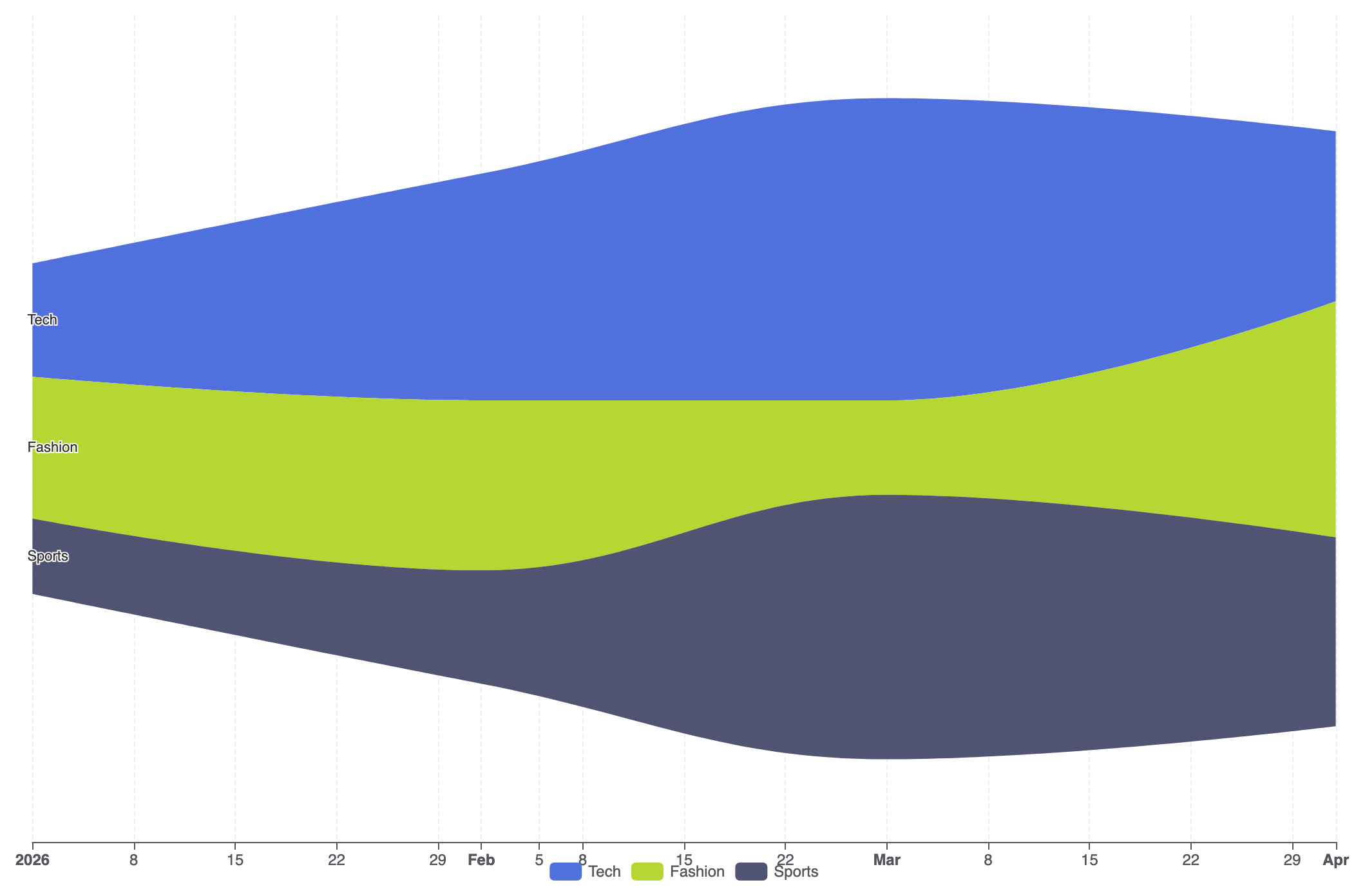
要建立基本的主題河圖,請設定一個singleAxis類型為'time',在系列中指定type: 'themeRiver',並在data陣列中提供您的流動觀察資料:
ECharts
在 VPasCode 中編輯 ECharts
ECharts
Edit ECharts in VPasCode
option = {
    tooltip: {
        trigger: 'axis',
        axisPointer: {
            type: 'line',
            lineStyle: {
                color: 'rgba(0,0,0,0.2)',
                width: 1,
                type: 'solid'
            }
        }
    },
    legend: {
        data: ['科技', '時尚', '運動']
    },
    singleAxis: {
        top: 50,
        bottom: 50,
        axisTick: {},
        axisLabel: {},
        type: 'time',
        axisPointer: {
            animation: true,
            label: { show: true }
        },
        splitLine: {
            show: true,
            lineStyle: {
                type: 'dashed',
                opacity: 0.5
            }
        }
    },
    series: [
        {
            type: 'themeRiver',
            emphasis: {
                itemStyle: {
                    shadowBlur: 20,
                    shadowColor: 'rgba(0, 0, 0, 0.3)'
                }
            },
            data: [
                ['2026-01-01', 12, '科技'],
                ['2026-02-01', 24, '科技'],
                ['2026-03-01', 32, '科技'],
                ['2026-04-01', 18, '科技'],
                ['2026-01-01', 15, '時尚'],
                ['2026-02-01', 18, '時尚'],
                ['2026-03-01', 10, '時尚'],
                ['2026-04-01', 25, '時尚'],
                ['2026-01-01', 8, '運動'],
                ['2026-02-01', 12, '運動'],
                ['2026-03-01', 28, '運動'],
                ['2026-04-01', 20, '運動']
            ]
        }
    ]
};
進階結構技術
主題河流圖在監控長時間序列中複雜的多類別事件時表現出色,特別是搭配自訂提示工具和風格化類別調色盤時。
1. 多流媒體流量
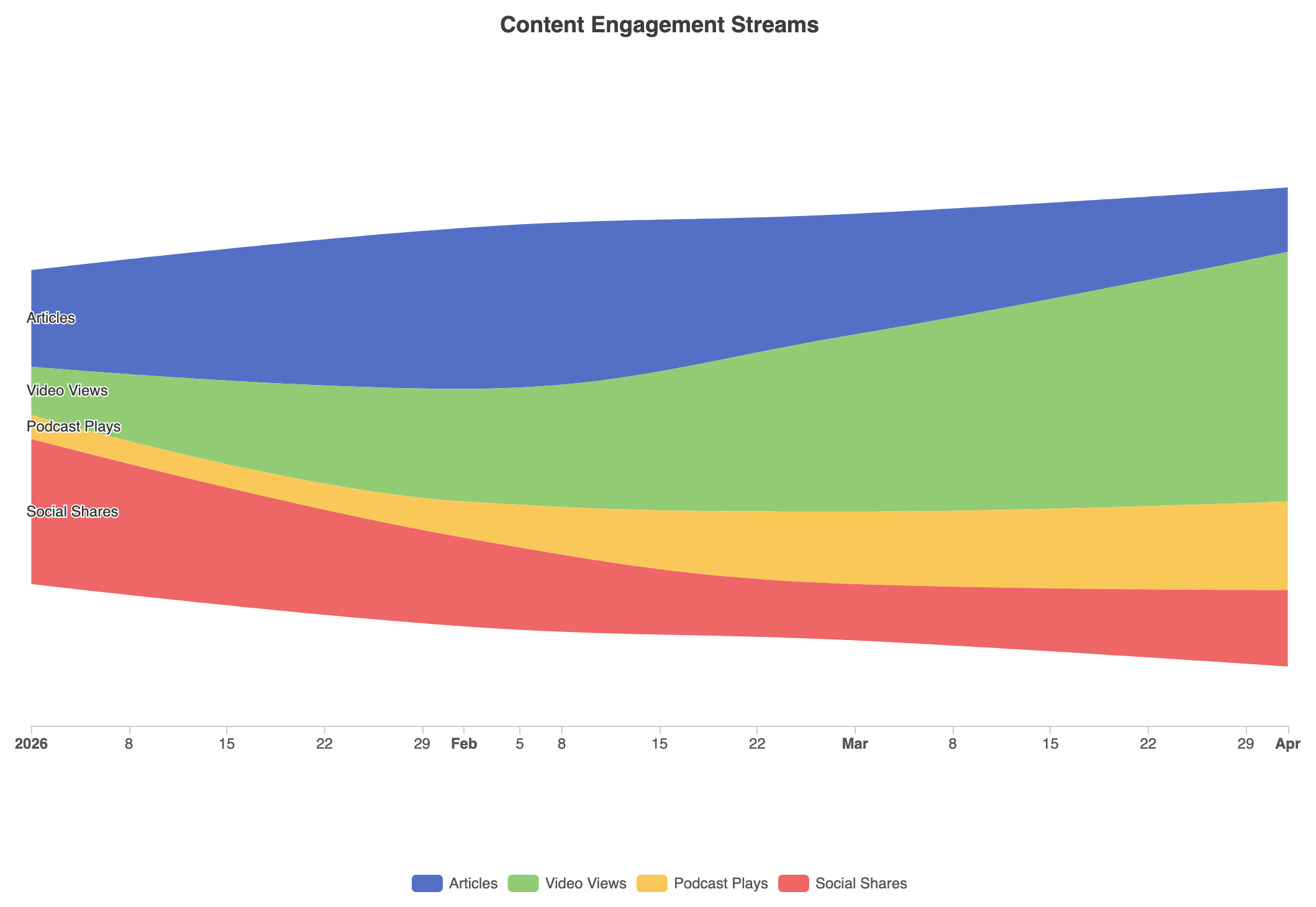
透過明確的調色盤映射和自訂座標軸提示工具來自訂流動顏色,可將原始事件記錄轉換為清晰的活動時間軸:
ECharts
在 VPasCode 中編輯 ECharts
ECharts
Edit ECharts in VPasCode
const categories = ['文章', '影片觀看次數', '播客播放次數', '社群分享'];

option = {
    title: {
        text: '內容參與度流',
        left: 'center'
    },
    tooltip: {
        trigger: 'axis',
        axisPointer: {
            type: 'line',
            lineStyle: {
                color: '#333',
                width: 1
            }
        }
    },
    legend: {
        data: categories,
        bottom: 10
    },
    color: ['#5470c6', '#91cc75', '#fac858', '#ee6666'],
    singleAxis: {
        top: '15%',
        bottom: '20%',
        type: 'time',
        axisLine: { lineStyle: { color: '#ccc' } },
        splitLine: { show: false }
    },
    series: [
        {
            type: 'themeRiver',
            label: {
                show: true,
                position: 'left',
                fontSize: 12
            },
            data: [
                ['2026-01-01', 120, '文章'], ['2026-02-01', 200, '文章'], ['2026-03-01', 150, '文章'], ['2026-04-01', 80, '文章'],
                ['2026-01-01', 60, '影片觀看次數'], ['2026-02-01', 140, '影片觀看次數'], ['2026-03-01', 220, '影片觀看次數'], ['2026-04-01', 310, '影片觀看次數'],
                ['2026-01-01', 30, '播客播放次數'], ['2026-02-01', 45, '播客播放次數'], ['2026-03-01', 90, '播客播放次數'], ['2026-04-01', 110, '播客播放次數'],
                ['2026-01-01', 180, '社群分享'], ['2026-02-01', 110, '社群分享'], ['2026-03-01', 70, '社群分享'], ['2026-04-01', 95, '社群分享']
            ]
        }
    ]
};
戰略最佳實務
- 正確格式化資料元組: 數組中的每一筆資料都必須遵循以下順序
data[日期, 數值, 類別名稱]以便 ECharts 能正確地切分與堆疊連續的資料流。 - 限制類別過度擴散: 將不同類別的數量控制在 3 到 7 個之間。過多的資料流會導致各個帶狀區域過窄,難以在時間點之間追蹤。
- 善用
singleAxis的尺寸設定: 調整top和bottom在singleAxis屬性用於控制垂直內邊距,並防止外部流標籤與容器邊緣發生裁剪。