


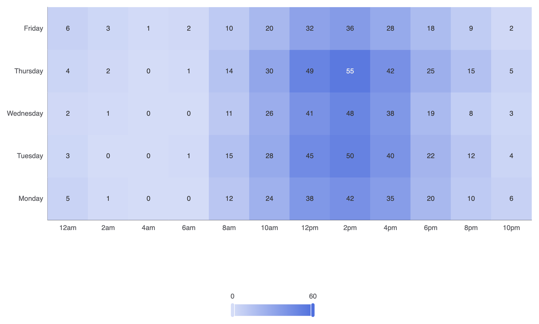
在分析活動密度、連續趨勢或兩個離散維度之間的相關性時,熱力圖提供了一種強大的視覺解決方案。透過將數據值映射到二維網格上的動態顏色尺度,熱力圖讓使用者能夠迅速識別使用高峰時段、季節性瓶頸或矩陣關係——例如按小時和星期幾的伺服器負載、使用者活動記錄,或跨類別相關性矩陣。
熱力圖的運作原理
在 Apache ECharts 中,熱力圖使用type: 'heatmap'於二維笛卡兒網格上。每個資料點都期望以三元素陣列格式輸入,格式為[xAxisIndex, yAxisIndex, value]。必需的visualMap元件會將數值映射到連續或分段的顏色漸變。
1. 基本設定
要建立基本的熱力圖,請為水平(xAxis)和垂直(yAxis)軸,傳入[xIndex, yIndex, value]陣列至您的系列資料,並設定一個visualMap元件:
ECharts
在 VPasCode 中編輯 ECharts
ECharts
Edit ECharts in VPasCode
const hours = ['12am', '2am', '4am', '6am', '8am', '10am', '12pm', '2pm', '4pm', '6pm', '8pm', '10pm'];
const days = ['星期一', '星期二', '星期三', '星期四', '星期五'];

// 資料格式:[xIndex, yIndex, value]
const data = [
    [0, 0, 5], [1, 0, 1], [2, 0, 0], [3, 0, 0], [4, 0, 12], [5, 0, 24], [6, 0, 38], [7, 0, 42], [8, 0, 35], [9, 0, 20], [10, 0, 10], [11, 0, 6],
    [0, 1, 3], [1, 1, 0], [2, 1, 0], [3, 1, 1], [4, 1, 15], [5, 1, 28], [6, 1, 45], [7, 1, 50], [8, 1, 40], [9, 1, 22], [10, 1, 12], [11, 1, 4],
    [0, 2, 2], [1, 2, 1], [2, 2, 0], [3, 2, 0], [4, 2, 11], [5, 2, 26], [6, 2, 41], [7, 2, 48], [8, 2, 38], [9, 2, 19], [10, 2, 8],  [11, 2, 3],
    [0, 3, 4], [1, 3, 2], [2, 3, 0], [3, 3, 1], [4, 3, 14], [5, 3, 30], [6, 3, 49], [7, 3, 55], [8, 3, 42], [9, 3, 25], [10, 3, 15], [11, 3, 5],
    [0, 4, 6], [1, 4, 3], [2, 4, 1], [3, 4, 2], [4, 4, 10], [5, 4, 20], [6, 4, 32], [7, 4, 36], [8, 4, 28], [9, 4, 18], [10, 4, 9],  [11, 4, 2]
];

option = {
    tooltip: {
        position: 'top'
    },
    grid: {
        height: '50%',
        top: '10%'
    },
    xAxis: {
        type: 'category',
        data: hours,
        splitArea: { show: true }
    },
    yAxis: {
        type: 'category',
        data: days,
        splitArea: { show: true }
    },
    visualMap: {
        min: 0,
        max: 60,
        calculable: true,
        orient: 'horizontal',
        left: 'center',
        bottom: '15%'
    },
    series: [
        {
            name: '系統負載',
            type: 'heatmap',
            data: data,
            label: {
                show: true
            },
            emphasis: {
                itemStyle: {
                    shadowBlur: 10,
                    shadowColor: 'rgba(0, 0, 0, 0.5)'
                }
            }
        }
    ]
};
進階結構技術
熱力圖可透過離散的顏色步驟、明顯的單元格間距進行自訂,或與日曆座標結合,以追蹤一整年的活動情況。
1. 分段色彩映射與自訂單元格間距
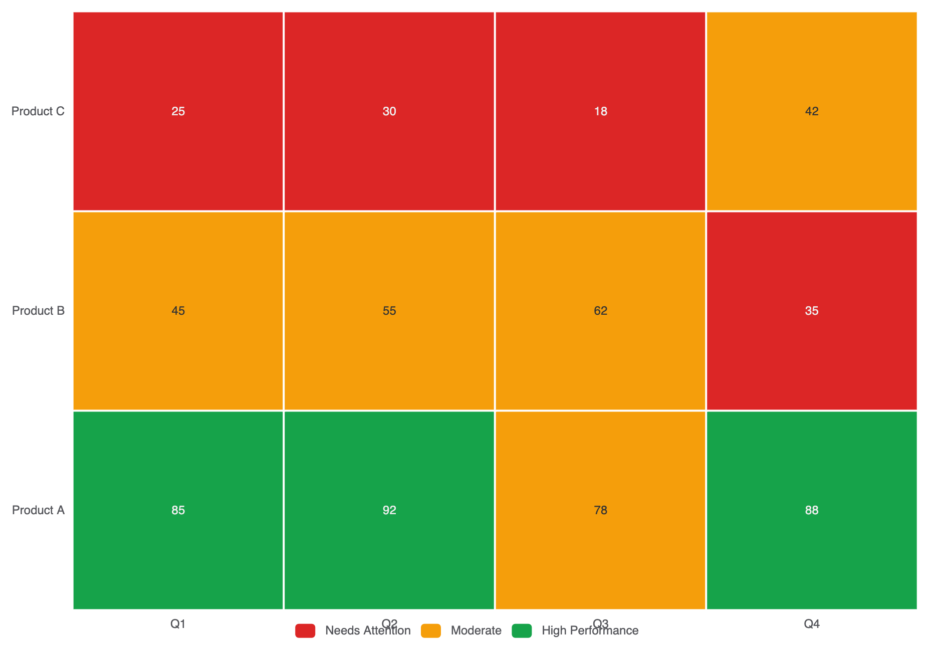
與連續色彩漸變不同,請使用分段visualMap將數值分組為明確的操作區間(例如:低、中、高):
ECharts
在 VPasCode 中編輯 ECharts
ECharts
Edit ECharts in VPasCode
option = {
    tooltip: { position: 'top' },
    xAxis: {
        type: 'category',
        data: ['Q1', 'Q2', 'Q3', 'Q4']
    },
    yAxis: {
        type: 'category',
        data: ['產品 A', '產品 B', '產品 C']
    },
    visualMap: {
        type: 'piecewise',
        min: 0,
        max: 100,
        left: 'center',
        bottom: '5%',
        orient: 'horizontal',
        pieces: [
            { min: 80, label: '高表現', color: '#16a34a' },
            { min: 40, max: 79, label: '中等', color: '#f59e0b' },
            { max: 39, label: '需關注', color: '#dc2626' }
        ]
    },
    series: [
        {
            type: 'heatmap',
            data: [
                [0, 0, 85], [1, 0, 92], [2, 0, 78], [3, 0, 88],
                [0, 1, 45], [1, 1, 55], [2, 1, 62], [3, 1, 35],
                [0, 2, 25], [1, 2, 30], [2, 2, 18], [3, 2, 42]
            ],
            label: { show: true },
            itemStyle: {
                borderColor: '#ffffff',
                borderWidth: 2
            }
        }
    ]
};
微調佈局與色彩漸變
選擇清晰可辨的色彩停點並啟用分區顯示,可讓大型矩陣網格輕鬆掃描。
1. 漸變自訂與標籤對齊
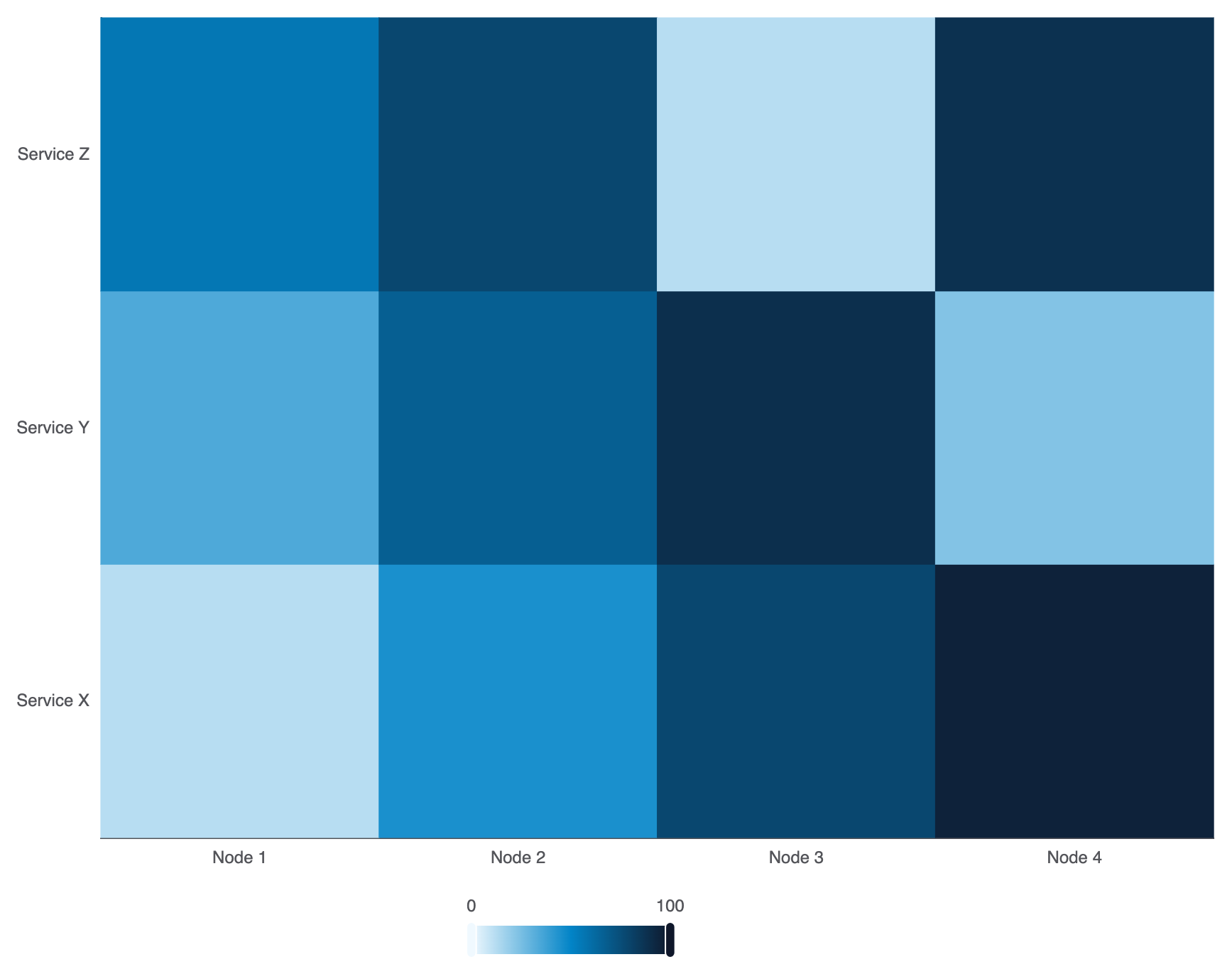
在visualMap.inRange中設定自訂多停點色彩漸變,以符合您的平台主題:
ECharts
在 VPasCode 中編輯 ECharts
ECharts
Edit ECharts in VPasCode
option = {
    grid: { containLabel: true },
    xAxis: {
        type: 'category',
        data: ['節點 1', '節點 2', '節點 3', '節點 4']
    },
    yAxis: {
        type: 'category',
        data: ['服務 X', '服務 Y', '服務 Z']
    },
    visualMap: {
        min: 0,
        max: 100,
        calculable: true,
        orient: 'horizontal',
        left: 'center',
        bottom: '0%',
        inRange: {
            color: ['#f0f9ff', '#0284c7', '#0f172a'] // 柔和藍色至深灰藍色漸變
        }
    },
    series: [
        {
            type: 'heatmap',
            data: [
                [0, 0, 12], [1, 0, 45], [2, 0, 78], [3, 0, 95],
                [0, 1, 34], [1, 1, 67], [2, 1, 89], [3, 1, 23],
                [0, 2, 56], [1, 2, 78], [2, 2, 12], [3, 2, 88]
            ]
        }
    ]
};
策略性最佳實務
- 務必包含一個
visualMap:若熱力圖缺少視覺圖例,使用者將被迫猜測顏色的含義。務必在畫布邊緣清楚地放置連續或分段visualMap以確保清晰可見。 - 使用網格邊框進行區隔:使用
itemStyle.borderColor: '#fff'與borderWidth: 1或2以在密集矩陣中保持單個單元格的視覺區分度。 - 確保高對比度文字: 如果單元格數值標籤已啟用(
label.show: true),測試文字顏色是否在您的色彩漸變中最亮和最暗的階段上仍保持可讀性。