


追蹤每日習慣、網站流量、伺服器活動記錄或完整日曆年度的銷售強度時,日曆圖表提供一種有效且基於網格的視覺布局。以貢獻圖和季節性熱力圖為模型,日曆圖表將連續的定量指標映射到特定的日曆日期上,幫助使用者一目了然地識別高活動峰值、週末變化以及跨月的季節性模式。
日曆圖表的運作機制
在 Apache ECharts 中,日曆圖表使用專用的日曆座標系統,並搭配熱力圖或散點圖圖表類型。與標準的笛卡兒 X 和 Y 軸不同,ECharts 使用日期字串自動計算日期與月份的網格位置。
1. 基本設定
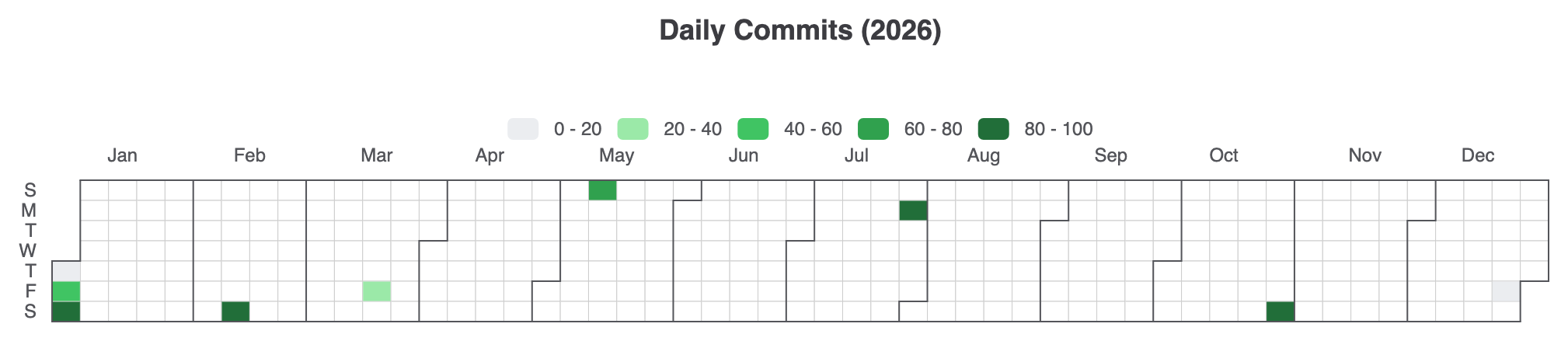
要建立基本的年度日曆熱力圖,請定義一個日曆組件並指定範圍(例如,'2026'),附加一個視覺映射以控制指標的顏色漸變,並傳遞格式為['YYYY-MM-DD', 值]:
ECharts
在 VPasCode 中編輯 ECharts
ECharts
Edit ECharts in VPasCode
option = {
    title: {
        top: 10,
        left: 'center',
        text: '每日提交次數 (2026)'
    },
    tooltip: {
        formatter: function (params) {
            return params.value[0] + ': ' + params.value[1] + ' 次提交';
        }
    },
    visualMap: {
        min: 0,
        max: 100,
        type: 'piecewise',
        orient: 'horizontal',
        left: 'center',
        top: 65,
        inRange: {
            color: ['#ebedf0', '#9be9a8', '#40c463', '#30a14e', '#216e39']
        }
    },
    calendar: {
        top: 120,
        left: 30,
        right: 30,
        cellSize: ['auto', 13],
        range: '2026',
        itemStyle: {
            borderWidth: 0.5,
            borderColor: '#ccc'
        },
        yearLabel: { show: false }
    },
    series: {
        type: 'heatmap',
        coordinateSystem: 'calendar',
        data: [
            ['2026-01-01', 12], ['2026-01-02', 45], ['2026-01-03', 88],
            ['2026-02-14', 95], ['2026-03-20', 30], ['2026-05-10', 65],
            ['2026-07-27', 82], ['2026-10-31', 99], ['2026-12-25', 10]
        ]
    }
};
進階結構技術
日曆圖表可調整為垂直滾動佈局,或透過散點表示法進行自訂,以視覺化離散的每日指標。
1. 垂直多月日曆檢視
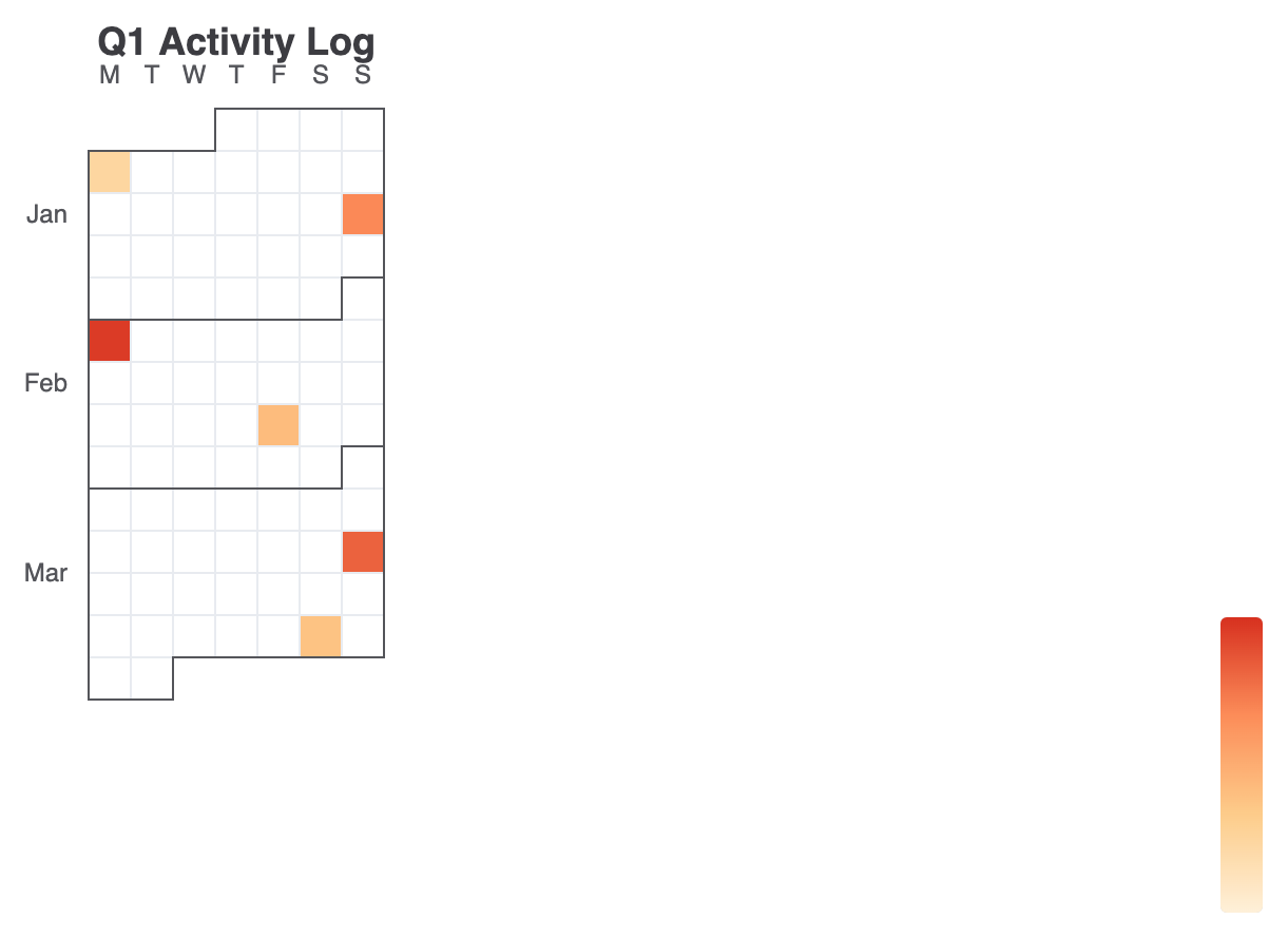
變更orient: 'vertical'在日曆組件上設定以垂直堆疊月份——非常適合高型儀表板小部件或行動裝置介面:
ECharts
在 VPasCode 中編輯 ECharts
ECharts
Edit ECharts in VPasCode
option = {
    title: {
        text: 'Q1 活動記錄',
        left: 'center'
    },
    tooltip: {},
    visualMap: {
        min: 0,
        max: 500,
        type: 'continuous',
        orient: 'vertical',
        right: 10,
        top: 'center',
        inRange: {
            color: ['#fef0d9', '#fdcc8a', '#fc8d59', '#d7301f']
        }
    },
    calendar: {
        top: 60,
        left: 'center',
        orient: 'vertical',
        range: ['2026-01-01', '2026-03-31'],
        cellSize: [20, 20],
        yearLabel: { show: false },
        dayLabel: {
            firstDay: 1, // 週從星期一開始
            nameMap: 'en'
        },
        monthLabel: { nameMap: 'en' }
    },
    series: {
        type: 'heatmap',
        coordinateSystem: 'calendar',
        data: [
            ['2026-01-05', 120], ['2026-01-18', 340], ['2026-02-02', 480],
            ['2026-02-20', 210], ['2026-03-15', 410], ['2026-03-28', 190]
        ]
    }
};
微調佈局與樣式
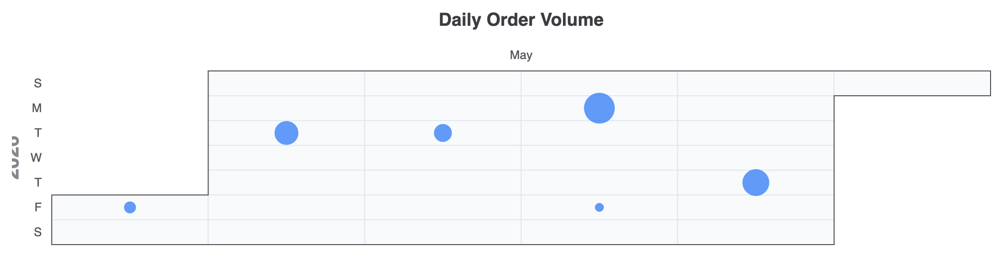
將日曆座標系統與散點系列結合,可根據強度來調整點的大小,而不僅僅依賴顏色方塊。
1. 散點氣泡日曆
使用 type: 'scatter'於 日曆座標系統可創建互動式的氣泡風格每日指標:
ECharts
在 VPasCode 中編輯 ECharts
ECharts
Edit ECharts in VPasCode
option = {
    title: {
        text: '每日訂單數量',
        left: 'center'
    },
    tooltip: {
        formatter: function (params) {
            return params.value[0] + ': ' + params.value[1] + ' 個訂單';
        }
    },
    calendar: {
        top: 80,
        left: 40,
        right: 40,
        range: '2026-05',
        cellSize: ['auto', 25],
        itemStyle: {
            color: '#f8fafc',
            borderWidth: 1,
            borderColor: '#e2e8f0'
        }
    },
    series: {
        type: 'scatter',
        coordinateSystem: 'calendar',
        symbolSize: function (val) {
            return val[1] / 10; // 根據訂單數量調整氣泡大小
        },
        itemStyle: {
            color: '#3b82f6',
            opacity: 0.8
        },
        data: [
            ['2026-05-01', 120], ['2026-05-05', 240], ['2026-05-12', 180],
            ['2026-05-18', 310], ['2026-05-22', 90], ['2026-05-28', 270]
        ]
    }
};
戰略最佳實務
- 日期格式應符合 ISO 標準: 請確保系列資料陣列中的日期遵循標準
'YYYY-MM-DD'字串格式,以確保日曆網格能準確對應記錄。 - 設定
firstDay以確保區域一致性: 使用dayLabel.firstDay(設定為0用於星期日或1用於星期一)以符合您的受眾當地的日曆慣例。 - 搭配分段式 VisualMap 用於貢獻: 當渲染 GitHub 風格的提交圖表時,請使用
分段式視覺地圖類型,搭配離散的顏色停點,而非連續漸變,以獲得更清晰的分類視覺步驟。