What is a Quadrant Chart?
A Quadrant Chart is a strategic visualization tool used to categorize items into four distinct zones based on two continuous variables (e.g., Effort vs. Impact, or Importance vs. Urgency). By placing data points onto a 2D coordinate plane divided by X and Y axes, you can clearly distinguish high-priority “quick wins” from low-priority “distractions” or long-term “strategic bets.” With Mermaid.js, you can define your quadrants, axis titles, and data point positions using a simple declarative block, allowing you to generate professional decision matrices instantly.Core Syntax Guide: Elements and Constructs
To design a valid, fully runnable quadrant chart in Mermaid, you must master the coordinate system, axis labeling, and data point placement.1. Initializing the Quadrant Canvas
You initialize a quadrant chart canvas on line one using thequadrantChart keyword. You then define the labels for your four quadrants and the titles for your X and Y axes.
Mermaid
Edit Mermaid in VPasCode
quadrantChart
    title Project Prioritization Matrix
    x-axis "Low Effort" --> "High Effort"
    y-axis "Low Impact" --> "High Impact"
    quadrant-1 "Strategic Bets"
    quadrant-2 "Quick Wins"
    quadrant-3 "Distractions"
    quadrant-4 "Major Projects"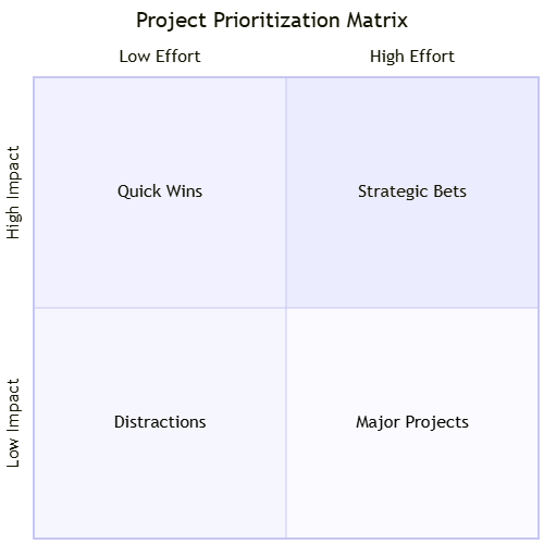
2. Placing Data Points
You add items to the chart by providing their display name followed by their X and Y coordinates (normalized between 0 and 1).0.0is the start of the axis.1.0is the end of the axis.
Mermaid
Edit Mermaid in VPasCode
quadrantChart
    title Impact vs Effort Matrix
    x-axis "Low Effort" --> "High Effort"
    y-axis "Low Impact" --> "High Impact"
    quadrant-1 "Strategic Bets"
    quadrant-2 "Quick Wins"
    quadrant-3 "Distractions"
    quadrant-4 "Major Projects"
    "Task A": [0.2, 0.8]
    "Task B": [0.7, 0.2]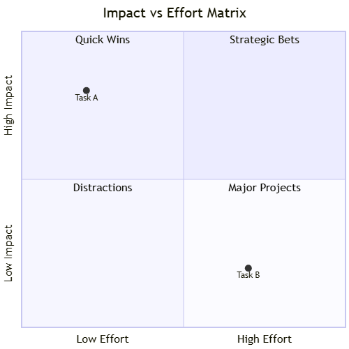
Best Practices for Matrix Mapping
- Normalize Your Data: Since Mermaid coordinates are scaled from 0.0 to 1.0, map your raw data values into this percentage range before plugging them into the script.
- Clear Axis Labels: Always include descriptive axis labels that explicitly define what the X and Y axes represent (e.g., “Cost” vs. “ROI”). A matrix without defined axes is just a random scatter plot.
- Limit Point Density: If you have more than 15-20 points on a single quadrant chart, it will become cluttered and unreadable. If you have a larger data set, consider breaking it into multiple thematic charts.
Real-World Mermaid.js Quadrant Chart Examples
Example: Product Feature Prioritization Matrix
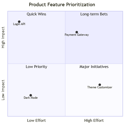
This functional blueprint helps product teams categorize features based on their development effort and potential business impact.
Mermaid
Edit Mermaid in VPasCode
quadrantChart
    title Product Feature Prioritization
    x-axis "Low Effort" --> "High Effort"
    y-axis "Low Impact" --> "High Impact"
    quadrant-1 "Long-term Bets"
    quadrant-2 "Quick Wins"
    quadrant-3 "Low Priority"
    quadrant-4 "Major Initiatives"
    "Login API": [0.1, 0.9]
    "Theme Customizer": [0.8, 0.3]
    "Payment Gateway": [0.6, 0.8]
    "Dark Mode": [0.2, 0.2]