


xychart-beta rendering engine dynamically processes custom numerical datasets, auto-scales responsive structural grids, and supports displaying multiple independent overlapping data series at the same time.
Basic Syntax Structure
Every XY Chart begins with thexychart-beta declaration header. It is followed by configuring a horizontal X-axis category array, a vertical Y-axis title or data range limit, and at least one explicit data plotting series (such as a line or bar block).
Mermaid
Edit Mermaid in VPasCode
xychart-beta
  title "Sample Performance Chart"
  x-axis [Jan, Feb, Mar, Apr]
  y-axis "Revenue (USD)"
  bar [4500, 5200, 6100, 5800]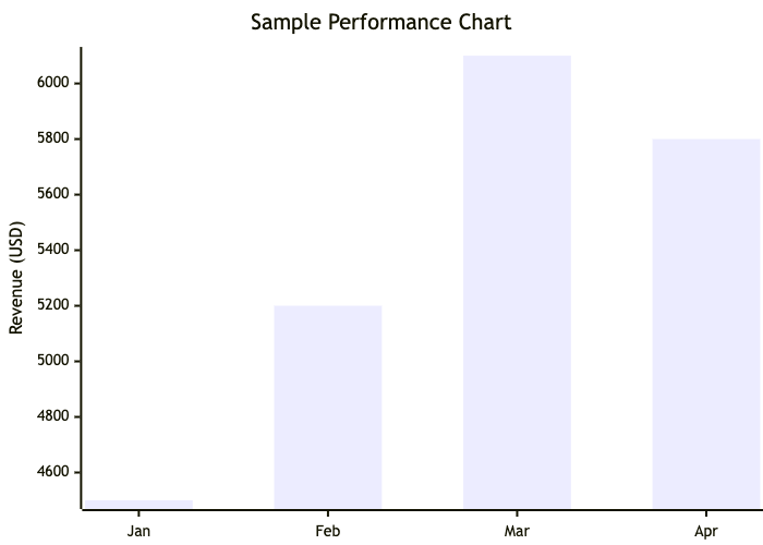
Syntax Reference
The table below breaks down the primary data definitions and configuration keys required to structure an XY Chart correctly in Mermaid.js.| Syntax Component | Accepted Formats | Description & Usage Rules |
|---|---|---|
| Declaration | Keyword | Initializes the 2D layout chart workspace. Must use the exact xychart-beta string block. |
| Title | Quoted String | An optional global heading displayed centered immediately above the chart canvas grid. |
| X-Axis Configuration | Bracketed List / Range | Defines horizontal scale labels. Accepts categorical text strings inside brackets [A, B, C] or numerical point ranges [100 --> 500]. |
| Y-Axis Configuration | Title String / Scale Bounds | Sets up the vertical scale parameters. Can simply be an axis title string, or customized to limit lower/upper value ranges using "Title" 0 --> 100. |
| Bar Plotting Series | Numeric Array | Renders datasets as vertical bars. The count of elements inside the data array must perfectly match your X-axis category length. |
| Line Plotting Series | Numeric Array | Renders datasets as continuous lines connecting data points across the grid workspace. |
Advanced Data Customization (Directives)
You can fine-tune your chart workspace’s visual look by embedding a frontmatter configuration block at the absolute top of your document code snippet. This gives you complete layout control over custom hex colors, plot series line weights, and grid display visibility fields.XY Chart Configuration Attribute Matrix
| Property Configuration Key | Value Options | Visual Result |
|---|---|---|
showLine |
true | false |
Toggles whether the background structural axis line grid strokes display across coordinates. |
chartWidth |
Integer (Pixels) | Sets the fixed bounding canvas layout width of the grid system. |
chartHeight |
Integer (Pixels) | Sets the fixed bounding canvas layout height of the grid system. |
themeVariables.xyChart |
Color Mapping Arrays | Injects explicit hex styling color blocks (e.g., backgroundColor, titleColor, or custom color list slots plotColorPalette) into your plots. |
Real-World Blueprint: Multi-Series Technical Comparison
This comprehensive blueprint tracks an infrastructure performance review. It utilizes a custom config directive to fix the canvas dimension sizes, show background grid line paths, and inject an explicit hex color palette. It maps four distinct quarterly phases, rendering them as a combined visual combination chart (overlapping bar series and line series charts together).
Mermaid
Edit Mermaid in VPasCode
---
config:
  xychart:
    chartWidth: 700
    chartHeight: 400
    showLine: true
  themeVariables:
    xychart:
      titleColor: "#0072B1"
      plotColorPalette: "#0072B1, #E06000"
---
xychart-beta
  title "Q1-Q4 Resource vs Execution Metrics"
  x-axis ["Quarter 1", "Quarter 2", "Quarter 3", "Quarter 4"]
  y-axis "Performance Metric Units" 0 --> 100
  bar [45, 65, 80, 95]
  line [55, 60, 72, 88]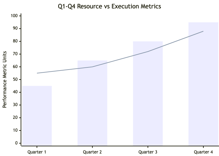
Syntax Tip: When overlaying multiple data plots (such as running a
bar dataset and a line dataset inside the same layout canvas), the rendering engine will stack or draw them sequentially in the order they are written in the text script. Arrange your data blocks intentionally to avoid visual clipping on the canvas lines.
Common Syntax Pitfalls & System Constraints
When compiling dimensional matrix paths, a few subtle configuration slips will disrupt coordinates calculations. Keep these troubleshooting parameters in mind:- Data Length Mismatch: Every single
barorlinedata series array *must* contain the exact same number of entries as defined in yourx-axislist parameter. Having 4 categories on your X-axis but providing a data list of 5 numbers will completely break chart compilation. - Quotation Boundaries: When specifying categories inside an axis list brackets, text blocks that contain spaces or special punctuation characters must be enclosed cleanly in double quotation marks (e.g.,
["Phase 1", "Phase 2"]). - Numerical Coordinate Bounds: When setting manual ranges on an axis scale (such as
0 --> 500), you must explicitly use two dashes followed by a greater-than symbol (-->). Forgetting a dash or separating the operator characters with spaces will trigger a processing layout error. - Positive Integer Weights: Scale values map to linear space blocks. Ensure values passed to your series do not contain unescaped character elements or empty parameter null voids inside arrays.