


The Mechanics of Gauge Charts
In Apache ECharts, gauge charts usetype: 'gauge'. Unlike multi-category charts, a gauge chart typically displays a single value or a small set of pointers along a radial arc. The axis scale is defined using min and max properties, while axisLine.lineStyle.color breaks the perimeter arc into distinct warning bands (e.g., green, yellow, red).
1. Essential Setup
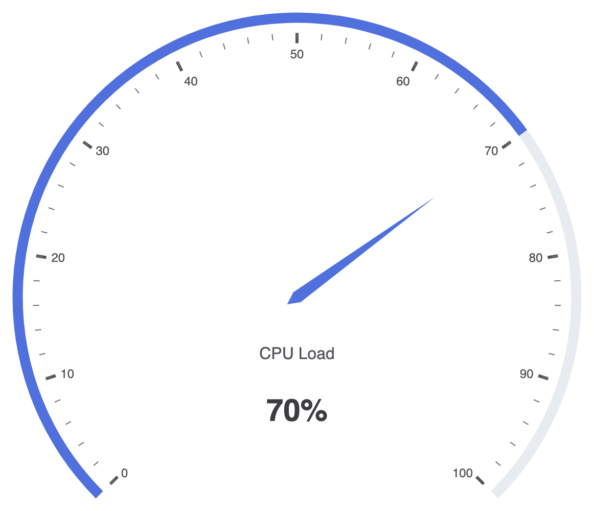
To construct a basic gauge chart, setmin, max, and supply a single value entry inside your series data array:
ECharts
Edit ECharts in VPasCode
option = {
    tooltip: {
        formatter: '{a}
{b} : {c}%'
    },
    series: [
        {
            name: 'System Health',
            type: 'gauge',
            progress: {
                show: true
            },
            detail: {
                valueAnimation: true,
                formatter: '{value}%'
            },
            data: [
                {
                    value: 70,
                    name: 'CPU Load'
                }
            ]
        }
    ]
};
Advanced Structural Techniques
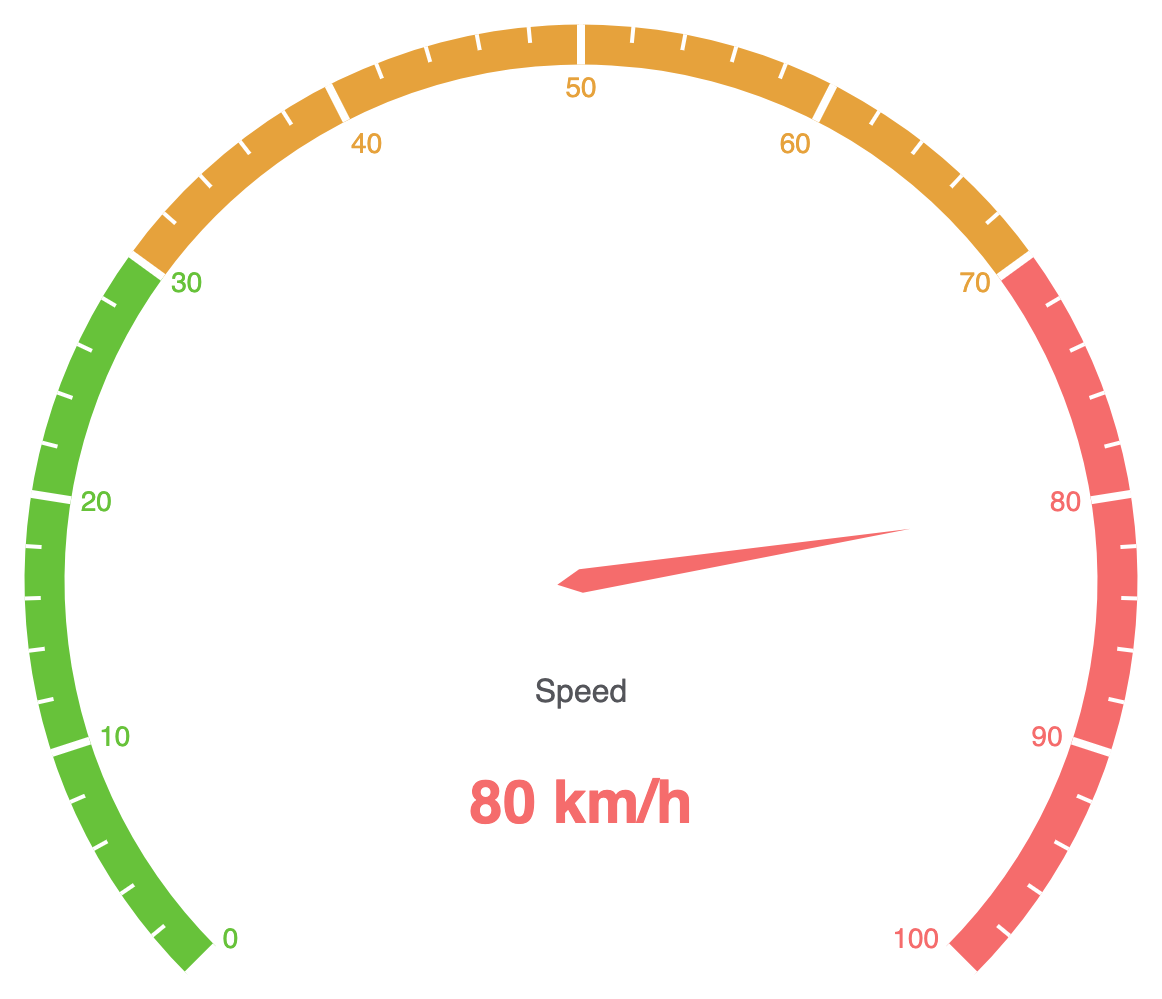
Gauge charts can be styled with multi-colored axis bands, custom progress fills, or multiple needles to compare actual versus target values on a single dial.1. Color-Coded Threshold Bands and Custom Pointers
Define explicit color stops along the circular axis usingaxisLine.lineStyle.color to mark warning zones (e.g., Safe, Warning, Critical):
ECharts
Edit ECharts in VPasCode
option = {
    series: [
        {
            type: 'gauge',
            axisLine: {
                lineStyle: {
                    width: 20,
                    color: [
                        [0.3, '#67c23a'], // Green up to 30%
                        [0.7, '#e6a23c'], // Orange up to 70%
                        [1, '#f56c6c']    // Red up to 100%
                    ]
                }
            },
            pointer: {
                itemStyle: {
                    color: 'auto'
                }
            },
            axisTick: {
                distance: -20,
                length: 8,
                lineStyle: {
                    color: '#fff',
                    width: 2
                }
            },
            splitLine: {
                distance: -20,
                length: 20,
                lineStyle: {
                    color: '#fff',
                    width: 4
                }
            },
            axisLabel: {
                color: 'inherit',
                distance: 25,
                fontSize: 14
            },
            detail: {
                valueAnimation: true,
                formatter: '{value} km/h',
                color: 'inherit'
            },
            data: [
                {
                    value: 80,
                    name: 'Speed'
                }
            ]
        }
    ]
};
Fine-Tuning Layout and Center Metrics
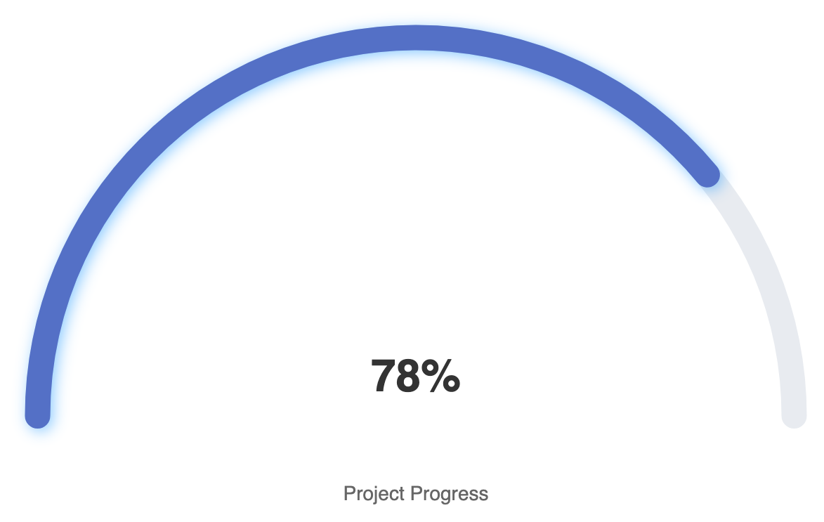
Applying modern rounded progress rings and custom center label typography transforms standard gauges into sleek dashboard cards.1. Sleek Ring Gauge with Center Label Display
Hide traditional needles and use a thick, rounded progress ring paired with large centered text for a clean, modern UI component:
ECharts
Edit ECharts in VPasCode
option = {
    series: [
        {
            type: 'gauge',
            startAngle: 180,
            endAngle: 0,
            min: 0,
            max: 100,
            splitNumber: 5,
            itemStyle: {
                color: '#5470c6',
                shadowColor: 'rgba(0,138,255,0.45)',
                shadowBlur: 10,
                shadowOffsetX: 2,
                shadowOffsetY: 2
            },
            progress: {
                show: true,
                roundCap: true,
                width: 18
            },
            pointer: {
                show: false // Hides pointer needle for clean ring display
            },
            axisLine: {
                roundCap: true,
                lineStyle: {
                    width: 18
                }
            },
            axisTick: { show: false },
            splitLine: { show: false },
            axisLabel: { show: false },
            title: {
                offsetCenter: [0, '20%'],
                fontSize: 14,
                color: '#666'
            },
            detail: {
                offsetCenter: [0, '-10%'],
                valueAnimation: true,
                formatter: '{value}%',
                fontSize: 32,
                fontWeight: 'bold',
                color: '#333'
            },
            data: [
                {
                    value: 78,
                    name: 'Project Progress'
                }
            ]
        }
    ]
};
Strategic Best Practices
- Keep Scope Focused: Gauges take up significant visual space to show a single metric. Reserve them for key high-priority metrics that require immediate status evaluation.
- Use Color Meaningfully: Align threshold color bands with universal standards (e.g., green for safe, orange/yellow for caution, red for danger) so users can assess status without reading exact numbers.
- Consider Pointer-less Ring Layouts: For digital dashboards and mobile screens, pointer-less arc progress gauges often look cleaner and take up less vertical height than traditional needle meters.