


The Mechanics of Radar Charts
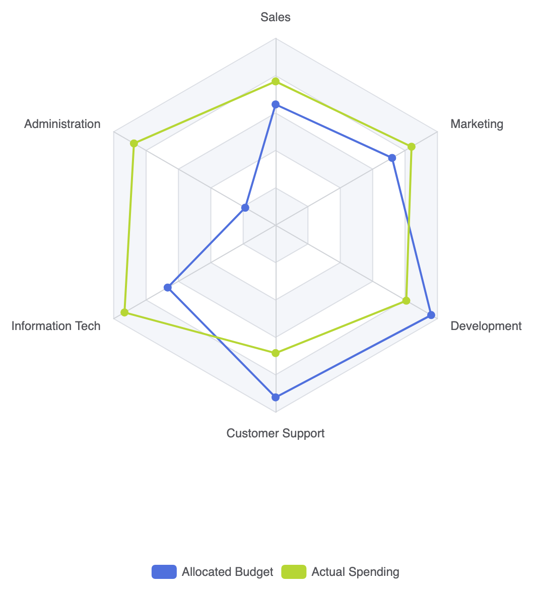
In Apache ECharts, radar charts rely on a dedicatedradar configuration block that defines the radial axes, known as indicator keys. The series object sets type: 'radar' and maps numeric array values corresponding to each declared indicator scale.
1. Essential Setup
To build a basic radar chart, define your dimension thresholds insideradar.indicator and pass numeric arrays within your series data:
ECharts
Edit ECharts in VPasCode
option = {
    tooltip: {
        trigger: 'item'
    },
    legend: {
        data: ['Allocated Budget', 'Actual Spending']
    },
    radar: {
        indicator: [
            { name: 'Sales', max: 6500 },
            { name: 'Administration', max: 16000 },
            { name: 'Information Tech', max: 30000 },
            { name: 'Customer Support', max: 38000 },
            { name: 'Development', max: 52000 },
            { name: 'Marketing', max: 25000 }
        ]
    },
    series: [
        {
            name: 'Budget vs Spending',
            type: 'radar',
            data: [
                {
                    value: [4200, 3000, 20000, 35000, 50000, 18000],
                    name: 'Allocated Budget'
                },
                {
                    value: [5000, 14000, 28000, 26000, 42000, 21000],
                    name: 'Actual Spending'
                }
            ]
        }
    ]
};
Advanced Structural Techniques
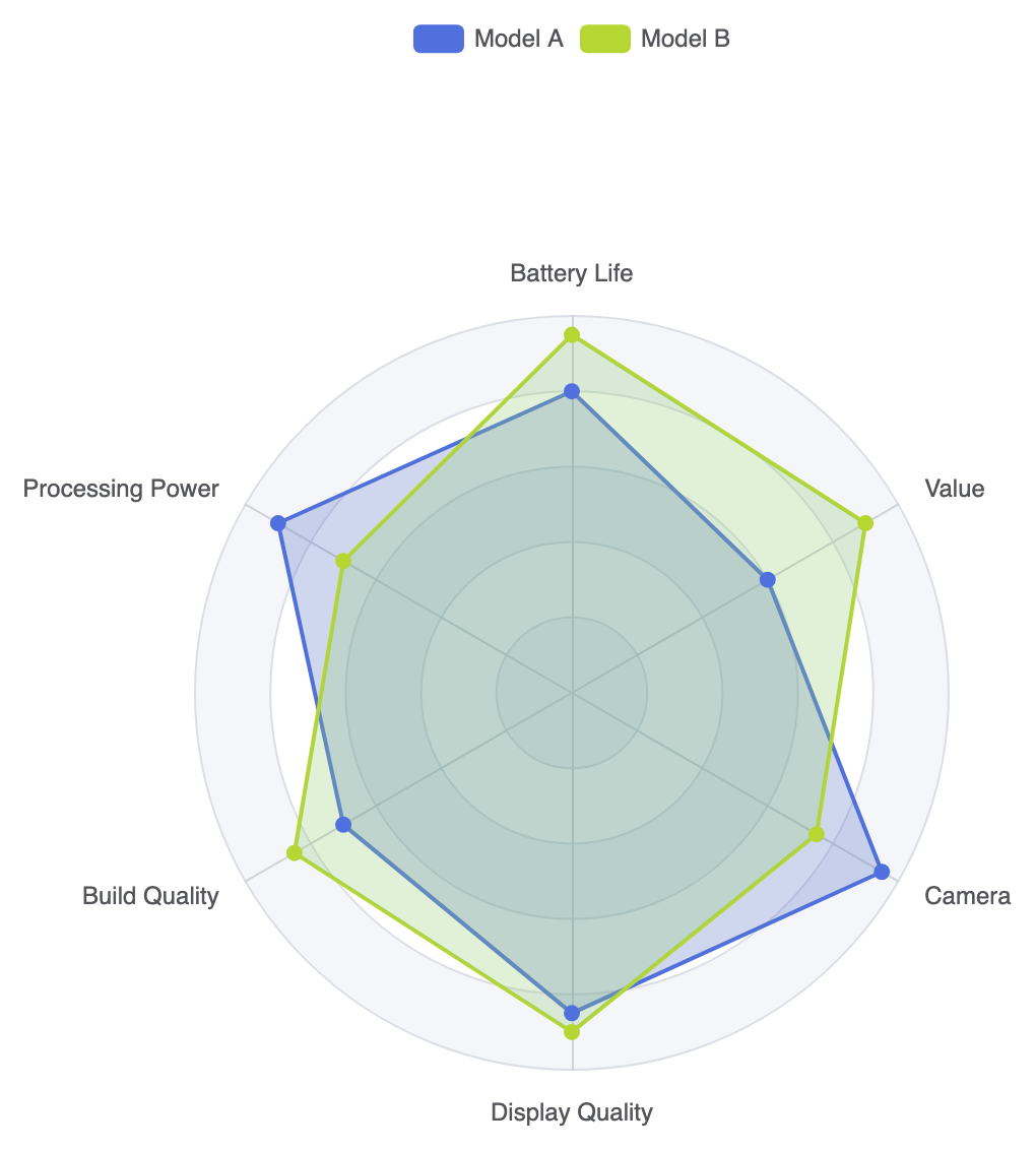
Radar charts can be styled using filled area polygons, circle grid shapes, or distinct color themes to make profile overlapping easier to read.1. Polygon Area Fill with Custom Grid Shapes
Switching the background web grid from polygon to circle and applying transparent area fills highlights the overall footprint of each metric profile:
ECharts
Edit ECharts in VPasCode
option = {
    tooltip: {
        trigger: 'item'
    },
    legend: {
        top: '5%',
        data: ['Model A', 'Model B']
    },
    radar: {
        shape: 'circle', // Circular background web
        indicator: [
            { name: 'Battery Life', max: 100 },
            { name: 'Processing Power', max: 100 },
            { name: 'Build Quality', max: 100 },
            { name: 'Display Quality', max: 100 },
            { name: 'Camera', max: 100 },
            { name: 'Value', max: 100 }
        ]
    },
    series: [
        {
            type: 'radar',
            data: [
                {
                    value: [80, 90, 70, 85, 95, 60],
                    name: 'Model A',
                    areaStyle: {
                        color: 'rgba(84, 112, 198, 0.4)'
                    }
                },
                {
                    value: [95, 70, 85, 90, 75, 90],
                    name: 'Model B',
                    areaStyle: {
                        color: 'rgba(145, 204, 117, 0.4)'
                    }
                }
            ]
        }
    ]
};
Fine-Tuning Layout and Styling
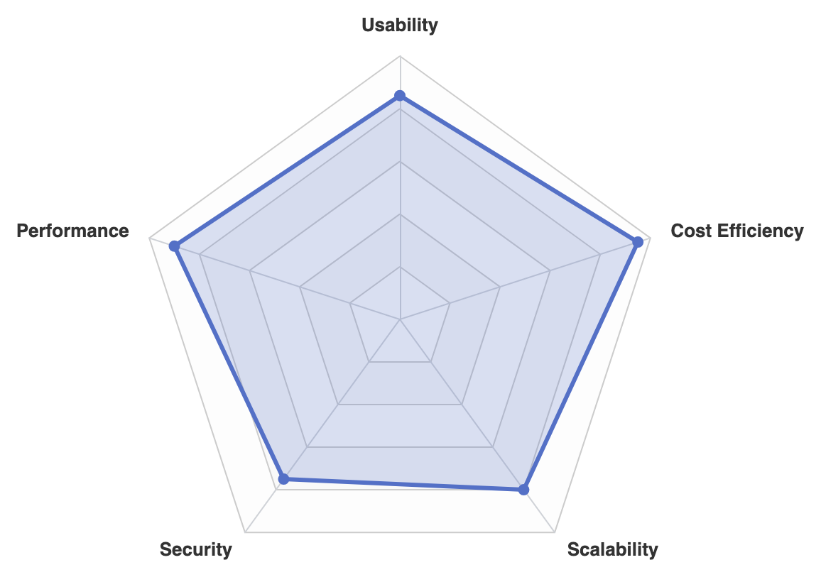
Adjusting indicator text colors, split lines, and symbol sizes prevents multi-axis web lines from overwhelming the data.1. Custom Web Grid and Label Formatting
Style axis lines, split areas, and outer labels to maintain clean visual contrast on dark or light interfaces:
ECharts
Edit ECharts in VPasCode
option = {
    radar: {
        indicator: [
            { name: 'Usability', max: 10 },
            { name: 'Performance', max: 10 },
            { name: 'Security', max: 10 },
            { name: 'Scalability', max: 10 },
            { name: 'Cost Efficiency', max: 10 }
        ],
        axisName: {
            color: '#333',
            fontSize: 13,
            fontWeight: 'bold'
        },
        splitArea: {
            areaStyle: {
                color: ['rgba(250,250,250,0.3)', 'rgba(200,200,200,0.1)']
            }
        },
        splitLine: {
            lineStyle: {
                color: '#ccc'
            }
        }
    },
    series: [
        {
            type: 'radar',
            symbolSize: 8,
            lineStyle: {
                width: 3
            },
            data: [
                {
                    value: [8.5, 9.0, 7.5, 8.0, 9.5],
                    name: 'Platform Score',
                    itemStyle: {
                        color: '#5470c6'
                    },
                    areaStyle: {
                        color: 'rgba(84, 112, 198, 0.3)'
                    }
                }
            ]
        }
    ]
};
Strategic Best Practices
- Standardize Axis Scales: Ensure all indicators use normalized scale ranges (e.g., 0 to 100 or 1 to 10) whenever possible so outer polygon areas reflect balanced comparisons.
- Keep Series Overlays Low: Limit radar comparison shapes to 2 or 3 per chart. Overlapping 4 or more filled polygons makes individual shape boundaries hard to isolate.
- Use Low Opacity Area Fills: Always apply transparent fills (around 0.2–0.4 opacity) so underlying gridlines and intersecting profiles remain visible underneath top layers.