


The Mechanics of Parallel Charts
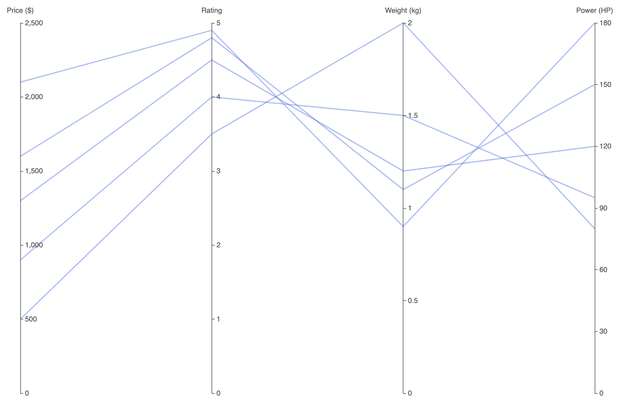
In Apache ECharts, parallel coordinates plots rely on a dedicatedparallelAxis configuration block that defines each parallel scale (its axis index, dimension name, and data type). The chart series sets type: 'parallel' and maps rows of multi-element value arrays to each corresponding axis index.
1. Essential Setup
To construct a basic parallel chart, define your dimensions in theparallelAxis array and pass corresponding coordinate arrays inside your series data:
ECharts
Edit ECharts in VPasCode
option = {
    parallelAxis: [
        { dim: 0, name: 'Price ($)' },
        { dim: 1, name: 'Rating' },
        { dim: 2, name: 'Weight (kg)' },
        { dim: 3, name: 'Power (HP)' }
    ],
    series: [
        {
            type: 'parallel',
            lineStyle: {
                width: 2
            },
            data: [
                [1299, 4.5, 1.2, 120],
                [899, 4.0, 1.5, 95],
                [1599, 4.8, 1.1, 150],
                [499, 3.5, 2.0, 80],
                [2100, 4.9, 0.9, 180]
            ]
        }
    ]
};
Advanced Structural Techniques
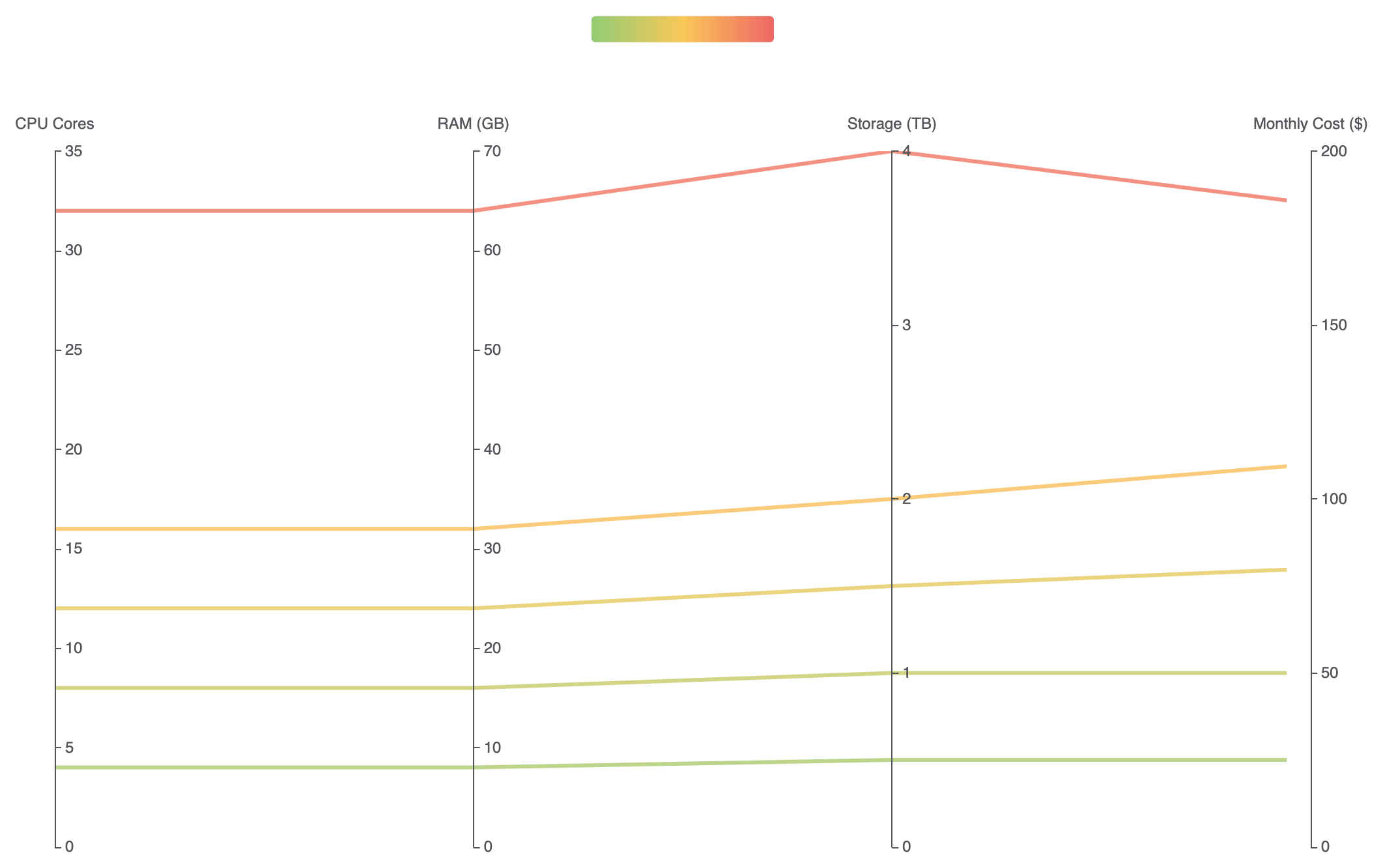
Parallel charts can be combined with visual color gradients or mixed categorical scales to evaluate complex trade-offs across distinct product categories.1. Visual Map Color Gradients Across Dimensions
Pair avisualMap component with a key axis dimension (e.g., mapping line color to performance ratings) to instantly highlight top-tier performers across all parallel axes:
ECharts
Edit ECharts in VPasCode
option = {
    parallelAxis: [
        { dim: 0, name: 'CPU Cores' },
        { dim: 1, name: 'RAM (GB)' },
        { dim: 2, name: 'Storage (TB)' },
        { dim: 3, name: 'Monthly Cost ($)', min: 0, max: 200 }
    ],
    visualMap: {
        show: true,
        type: 'continuous',
        min: 0,
        max: 200,
        dimension: 3, // Color line paths based on dimension index 3 (Monthly Cost)
        inRange: {
            color: ['#91cc75', '#fac858', '#ee6666'] // Green (Low Cost) to Red (High Cost)
        },
        orient: 'horizontal',
        top: '2%',
        left: 'center'
    },
    parallel: {
        top: '18%',
        bottom: '10%'
    },
    series: [
        {
            type: 'parallel',
            lineStyle: {
                width: 3,
                opacity: 0.8
            },
            data: [
                [4, 8, 0.5, 25],
                [8, 16, 1.0, 50],
                [16, 32, 2.0, 110],
                [32, 64, 4.0, 185],
                [12, 24, 1.5, 80]
            ]
        }
    ]
};
Fine-Tuning Layout and Interactive Filtering
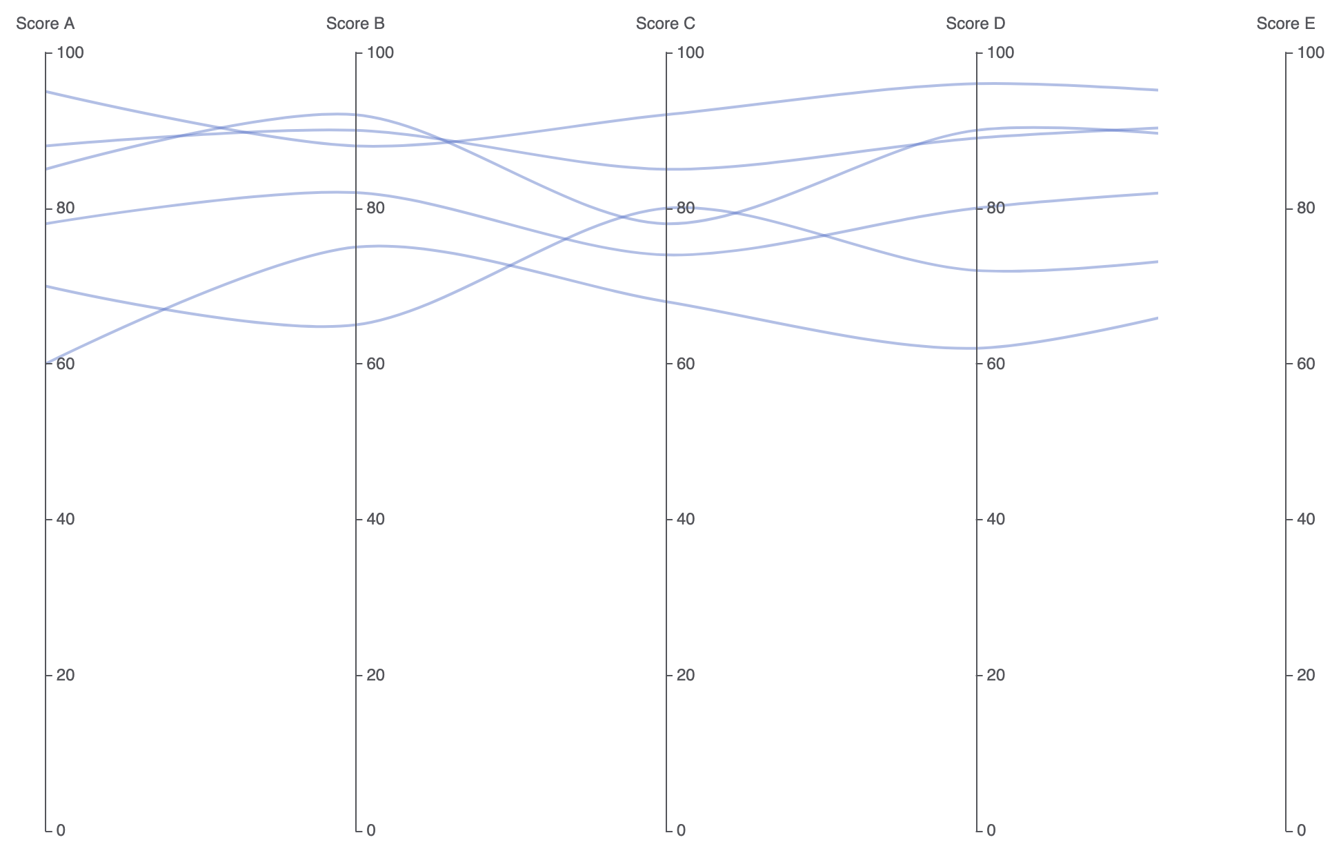
Adding smooth curves and line opacity prevents dense, crisscrossing data threads from overwhelming the user interface.1. Smooth Curve Paths and Low-Opacity Threads
Setsmooth: true and lower line opacity to make high-density data overlaps and clusters naturally visible:
ECharts
Edit ECharts in VPasCode
option = {
    parallelAxis: [
        { dim: 0, name: 'Score A' },
        { dim: 1, name: 'Score B' },
        { dim: 2, name: 'Score C' },
        { dim: 3, name: 'Score D' },
        { dim: 4, name: 'Score E' }
    ],
    parallel: {
        left: '10%',
        right: '10%',
        bottom: '12%',
        top: '12%'
    },
    series: [
        {
            type: 'parallel',
            smooth: true, // Curves line paths for cleaner visuals
            lineStyle: {
                color: '#5470c6',
                width: 2,
                opacity: 0.45
            },
            data: [
                [85, 92, 78, 90, 88],
                [70, 65, 80, 72, 75],
                [95, 88, 92, 96, 94],
                [60, 75, 68, 62, 70],
                [88, 90, 85, 89, 91],
                [78, 82, 74, 80, 83]
            ]
        }
    ]
};
Strategic Best Practices
- Arrange Axes Thoughtfully: Place strongly correlated or directly comparable metrics on adjacent axes so relationships and cross-over trends are easier to spot.
- Use Lower Opacity for High Data Volume: When plotting dozens or hundreds of lines, reduce
lineStyle.opacityto0.2–0.5so overlapping trends create darker, high-density bands naturally. - Enable
smooth: truefor Complex Datasets: Applying subtle curvature to line paths reduces sharp visual angles when threads cross multiple parallel axes in quick succession.