


The Mechanics of Theme River Charts
In Apache ECharts, Theme River charts usetype: 'themeRiver'. Instead of relying on traditional xAxis and yAxis configurations, the chart operates on a single horizontal singleAxis with type: 'time' or type: 'value'. Data items are passed as array tuples formatted as [time, value, categoryName].
1. Essential Setup
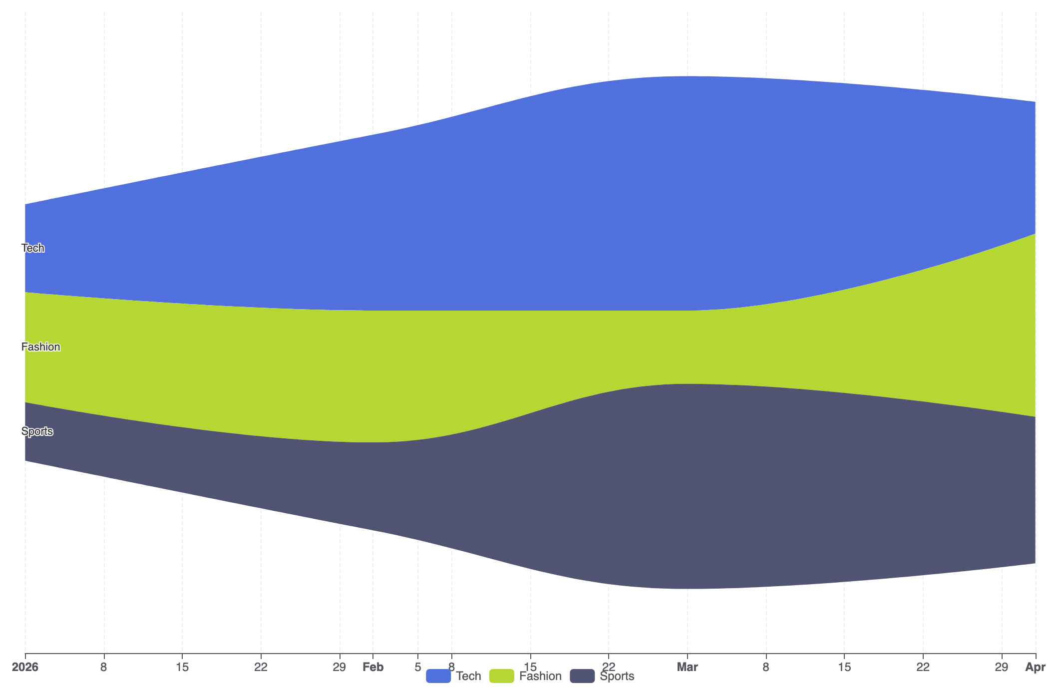
To create a basic Theme River chart, configure asingleAxis of type 'time', specify type: 'themeRiver' in your series, and supply your flow observations in the data array:
ECharts
Edit ECharts in VPasCode
option = {
    tooltip: {
        trigger: 'axis',
        axisPointer: {
            type: 'line',
            lineStyle: {
                color: 'rgba(0,0,0,0.2)',
                width: 1,
                type: 'solid'
            }
        }
    },
    legend: {
        data: ['Tech', 'Fashion', 'Sports']
    },
    singleAxis: {
        top: 50,
        bottom: 50,
        axisTick: {},
        axisLabel: {},
        type: 'time',
        axisPointer: {
            animation: true,
            label: { show: true }
        },
        splitLine: {
            show: true,
            lineStyle: {
                type: 'dashed',
                opacity: 0.5
            }
        }
    },
    series: [
        {
            type: 'themeRiver',
            emphasis: {
                itemStyle: {
                    shadowBlur: 20,
                    shadowColor: 'rgba(0, 0, 0, 0.3)'
                }
            },
            data: [
                ['2026-01-01', 12, 'Tech'],
                ['2026-02-01', 24, 'Tech'],
                ['2026-03-01', 32, 'Tech'],
                ['2026-04-01', 18, 'Tech'],
                ['2026-01-01', 15, 'Fashion'],
                ['2026-02-01', 18, 'Fashion'],
                ['2026-03-01', 10, 'Fashion'],
                ['2026-04-01', 25, 'Fashion'],
                ['2026-01-01', 8, 'Sports'],
                ['2026-02-01', 12, 'Sports'],
                ['2026-03-01', 28, 'Sports'],
                ['2026-04-01', 20, 'Sports']
            ]
        }
    ]
};
Advanced Structural Techniques
Theme River charts excel when monitoring complex multi-category events across long timeline sequences with custom tooltips and styled category palettes.1. Multi-Stream Media Volume Flow
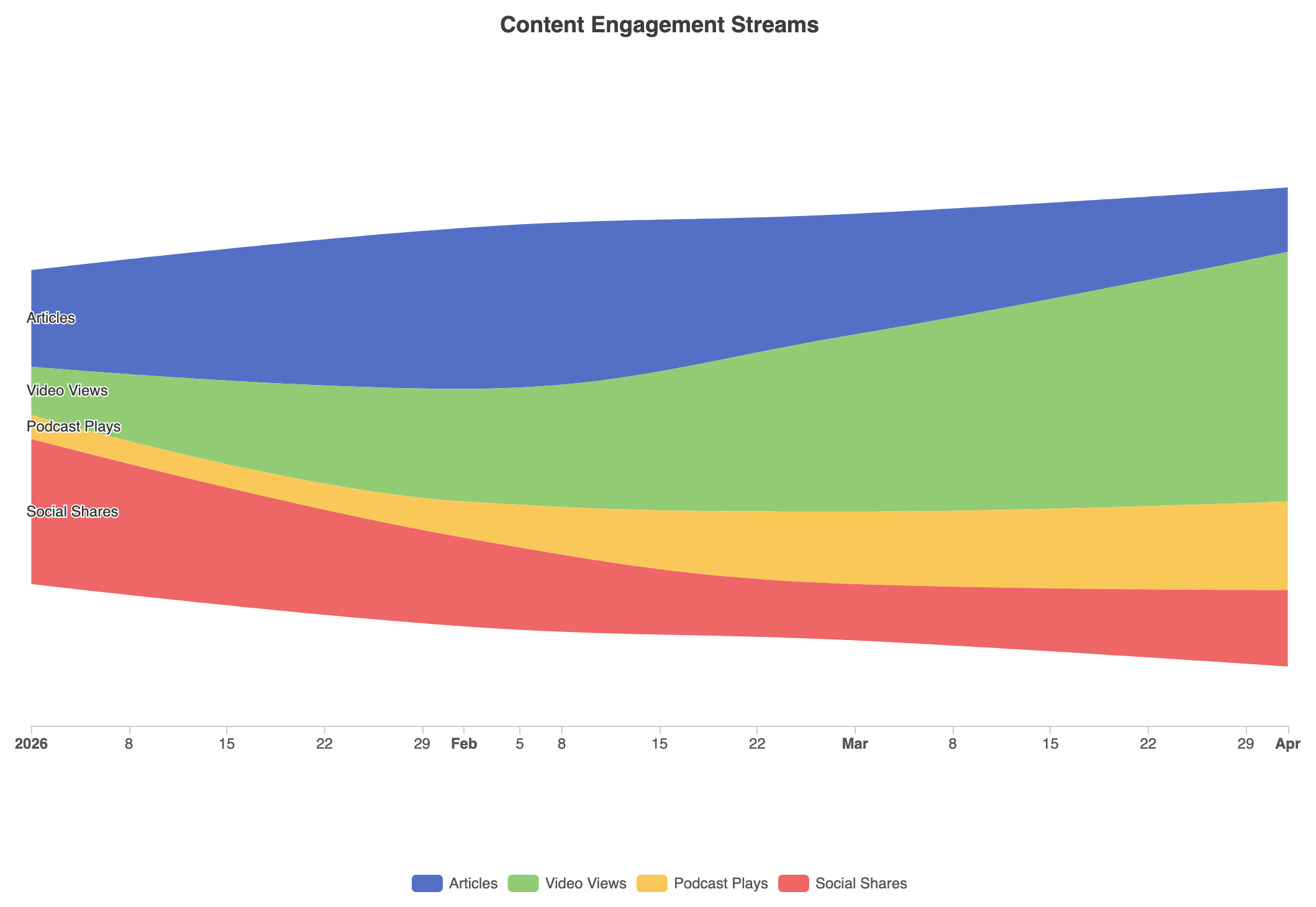
Customizing stream colors with explicit palette mappings and custom axis tooltips turns raw event logs into a clean activity timeline:
ECharts
Edit ECharts in VPasCode
const categories = ['Articles', 'Video Views', 'Podcast Plays', 'Social Shares'];

option = {
    title: {
        text: 'Content Engagement Streams',
        left: 'center'
    },
    tooltip: {
        trigger: 'axis',
        axisPointer: {
            type: 'line',
            lineStyle: {
                color: '#333',
                width: 1
            }
        }
    },
    legend: {
        data: categories,
        bottom: 10
    },
    color: ['#5470c6', '#91cc75', '#fac858', '#ee6666'],
    singleAxis: {
        top: '15%',
        bottom: '20%',
        type: 'time',
        axisLine: { lineStyle: { color: '#ccc' } },
        splitLine: { show: false }
    },
    series: [
        {
            type: 'themeRiver',
            label: {
                show: true,
                position: 'left',
                fontSize: 12
            },
            data: [
                ['2026-01-01', 120, 'Articles'], ['2026-02-01', 200, 'Articles'], ['2026-03-01', 150, 'Articles'], ['2026-04-01', 80, 'Articles'],
                ['2026-01-01', 60, 'Video Views'], ['2026-02-01', 140, 'Video Views'], ['2026-03-01', 220, 'Video Views'], ['2026-04-01', 310, 'Video Views'],
                ['2026-01-01', 30, 'Podcast Plays'], ['2026-02-01', 45, 'Podcast Plays'], ['2026-03-01', 90, 'Podcast Plays'], ['2026-04-01', 110, 'Podcast Plays'],
                ['2026-01-01', 180, 'Social Shares'], ['2026-02-01', 110, 'Social Shares'], ['2026-03-01', 70, 'Social Shares'], ['2026-04-01', 95, 'Social Shares']
            ]
        }
    ]
};
Strategic Best Practices
- Format Data Tuples Correctly: Each entry in the
dataarray must follow the exact order[date, value, categoryName]for ECharts to properly slice and stack continuous streams. - Limit Category Sprawl: Keep the number of distinct categories between 3 and 7. Too many streams make individual bands narrow and hard to trace across time points.
- Leverage
singleAxisSizing: Adjusttopandbottomon thesingleAxisproperty to control vertical padding and prevent outer stream labels from clipping against the container edges.