


The Mechanics of Scatter Charts
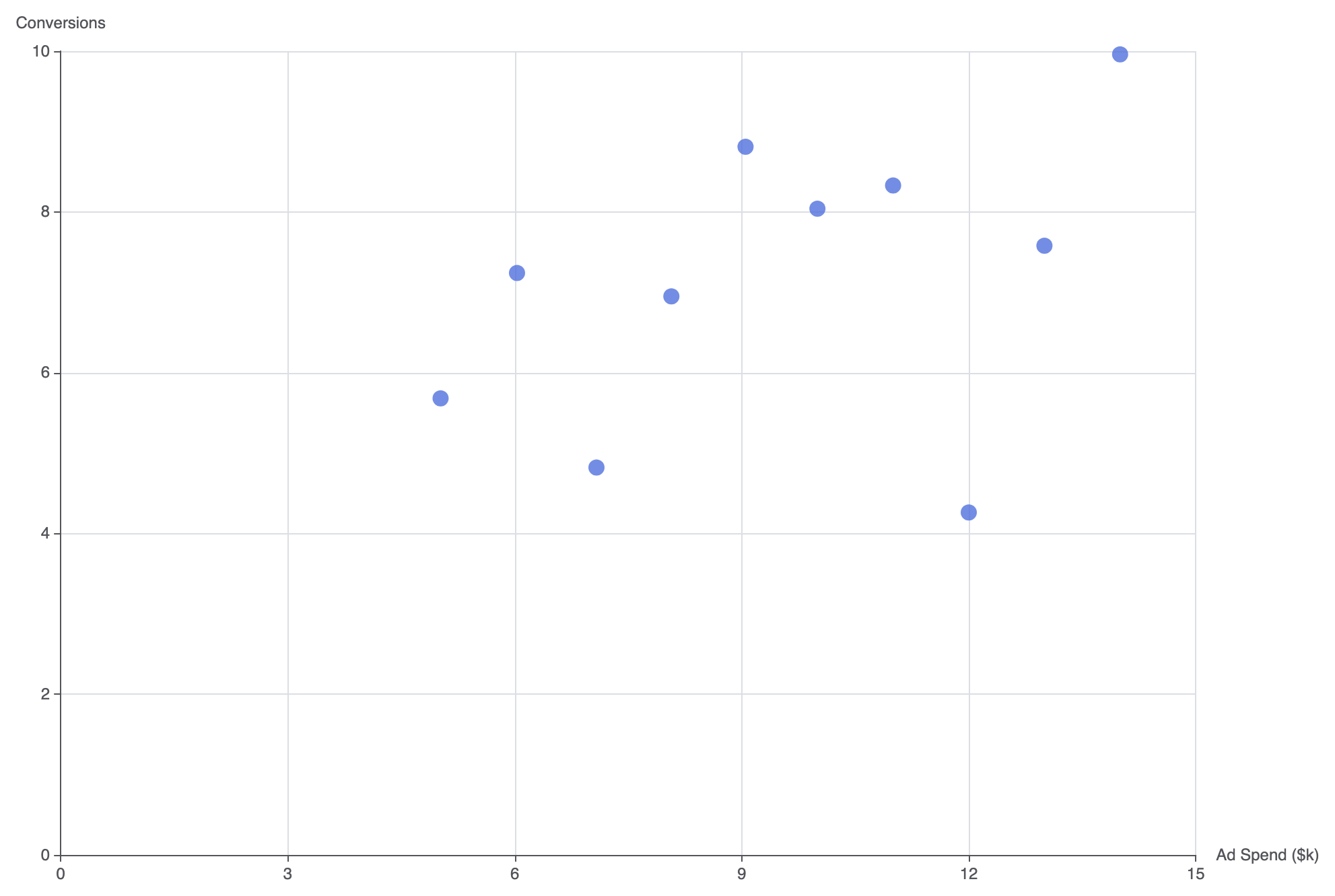
Unlike category-driven column or line charts, scatter charts use numeric value axes for both dimensions. In Apache ECharts, settingtype: 'scatter' expects data formatted as two-element numerical coordinate arrays [x, y] or data objects mapped across numerical xAxis and yAxis configurations.
1. Essential Setup
To build a basic scatter chart, definetype: 'value' on both axes and provide numeric coordinate pairs within your series data array:
ECharts
Edit ECharts in VPasCode
option = {
    tooltip: {
        trigger: 'item',
        formatter: 'X: {c0}
Y: {c1}'
    },
    xAxis: {
        type: 'value',
        name: 'Ad Spend ($k)'
    },
    yAxis: {
        type: 'value',
        name: 'Conversions'
    },
    series: [
        {
            type: 'scatter',
            symbolSize: 12,
            data: [
                [10.0, 8.04],
                [8.07, 6.95],
                [13.0, 7.58],
                [9.05, 8.81],
                [11.0, 8.33],
                [14.0, 9.96],
                [6.03, 7.24],
                [12.0, 4.26],
                [7.08, 4.82],
                [5.02, 5.68]
            ]
        }
    ]
};
Advanced Structural Techniques
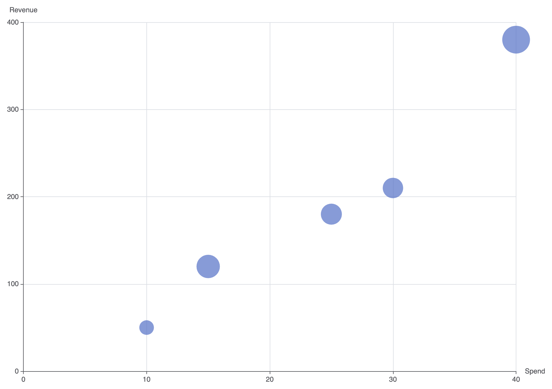
Scatter charts can incorporate dynamic sizing to represent a third variable (bubble chart) or display multi-category cluster overlays.1. Variable Point Sizing (Bubble Effect)
Pass a custom function or data value mapping tosymbolSize to encode a third quantitative metric into point size:
ECharts
Edit ECharts in VPasCode
option = {
    tooltip: {
        trigger: 'item',
        formatter: function (param) {
            return 'Spend: $' + param.data[0] + 'k
' +
                   'Revenue: $' + param.data[1] + 'k
' +
                   'ROAS: ' + param.data[2] + 'x';
        }
    },
    xAxis: {
        type: 'value',
        name: 'Spend'
    },
    yAxis: {
        type: 'value',
        name: 'Revenue'
    },
    series: [
        {
            name: 'Campaigns',
            type: 'scatter',
            symbolSize: function (data) {
                return data[2] * 5; // Scale bubble size by third variable
            },
            data: [
                [15, 120, 8.0],
                [25, 180, 7.2],
                [10, 50, 5.0],
                [40, 380, 9.5],
                [30, 210, 7.0]
            ],
            itemStyle: {
                color: '#5470c6',
                opacity: 0.7
            }
        }
    ]
};
Fine-Tuning Layout and Styling
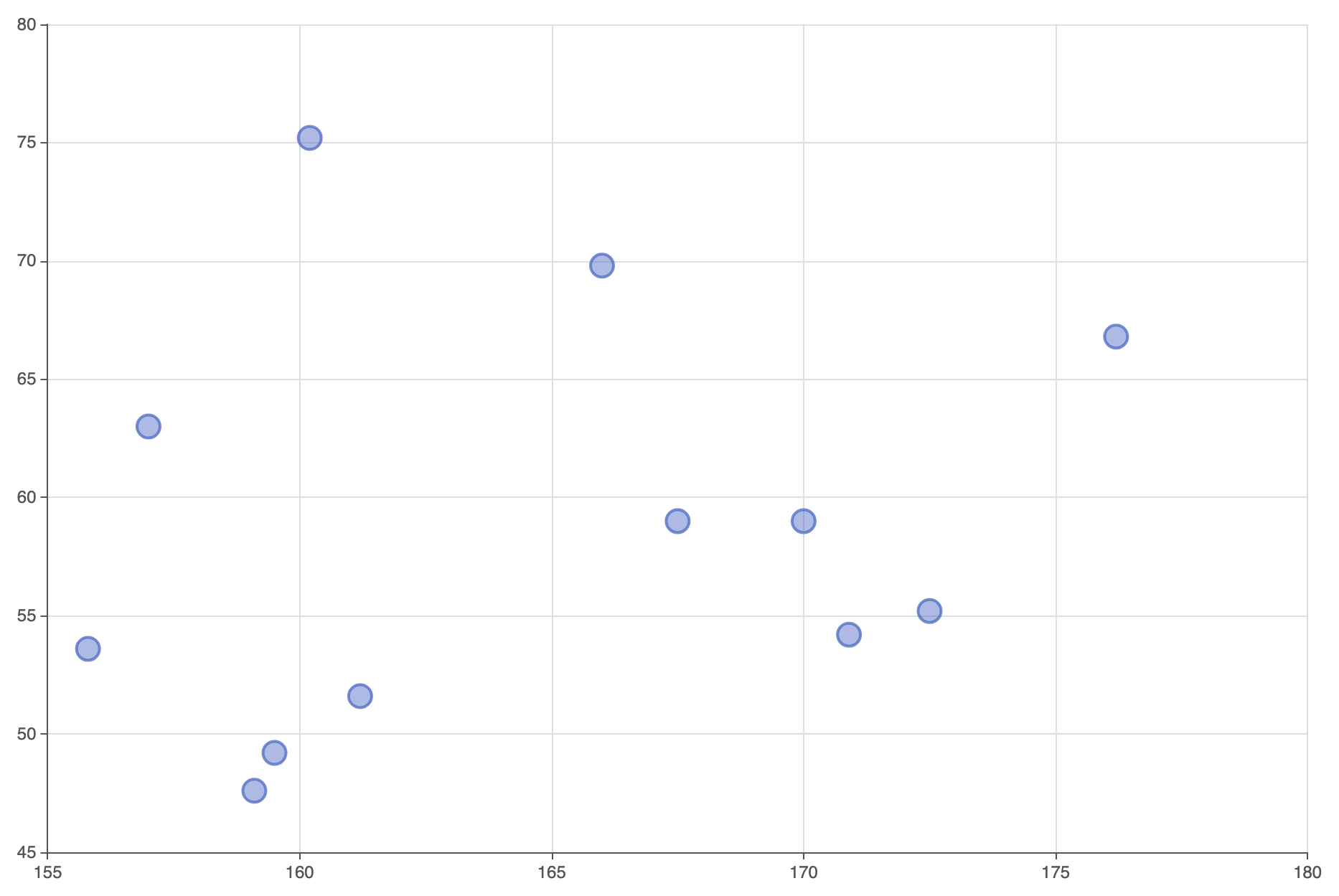
Controlling marker opacity and adding target trendlines prevents dense clusters from turning into solid visual blobs.1. Translucent Markers and Cluster Styling
Applying border strokes and semi-transparent item fills keeps overlapping data points visible within high-density clusters:
ECharts
Edit ECharts in VPasCode
option = {
    grid: {
        left: '10%',
        right: '10%',
        containLabel: true
    },
    xAxis: {
        type: 'value',
        scale: true // Auto-scale axis min/max to fit data tightly
    },
    yAxis: {
        type: 'value',
        scale: true
    },
    series: [
        {
            type: 'scatter',
            symbolSize: 16,
            itemStyle: {
                color: 'rgba(84, 112, 198, 0.6)',
                borderColor: '#5470c6',
                borderWidth: 2
            },
            data: [
                [161.2, 51.6], [167.5, 59.0], [159.5, 49.2], [157.0, 63.0],
                [155.8, 53.6], [170.0, 59.0], [159.1, 47.6], [166.0, 69.8],
                [176.2, 66.8], [160.2, 75.2], [172.5, 55.2], [170.9, 54.2]
            ]
        }
    ]
};
Strategic Best Practices
- Enable
scale: trueon Numeric Axes: Setscale: trueon both numeric axes so the plot auto-zooms to the relevant data range rather than forcing the origin at(0,0). - Use Fill Transparency for Overlaps: When plotting hundreds of points, reduce fill opacity to around 0.4–0.6 so dense overlap zones appear naturally darker.
- Provide Contextual Axis Labels: Always label X and Y axes explicitly with measurement units (e.g., “$ in Thousands” or “Latency in ms”) so values are immediately clear without checking tooltips.