


The Mechanics of Heatmaps
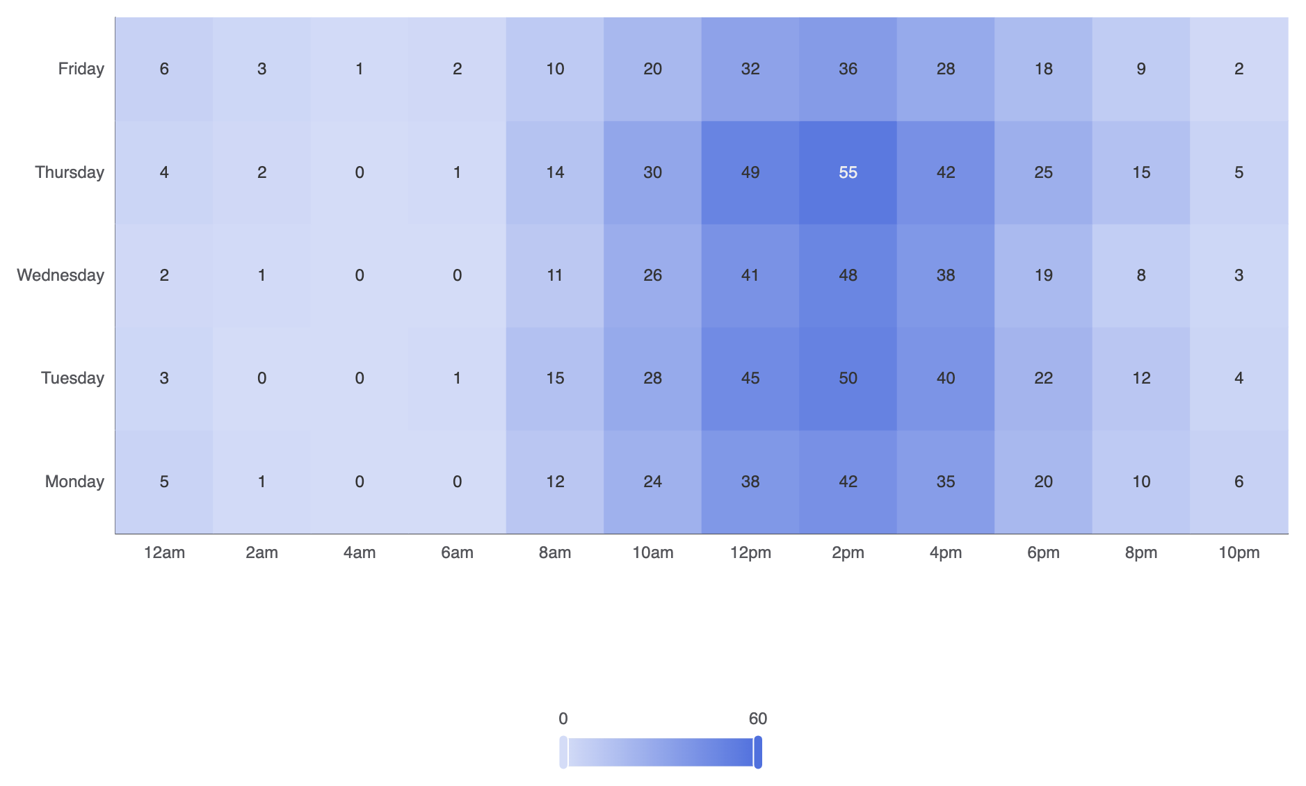
In Apache ECharts, heatmaps usetype: 'heatmap' on a two-dimensional Cartesian grid. Each data point expects a 3-element array formatted as [xAxisIndex, yAxisIndex, value]. A required visualMap component maps numerical values to a continuous or piecewise color gradient.
1. Essential Setup
To build a basic heatmap chart, declare categorical axes for both horizontal (xAxis) and vertical (yAxis) scales, pass [xIndex, yIndex, value] arrays into your series data, and configure a visualMap component:
ECharts
Edit ECharts in VPasCode
const hours = ['12am', '2am', '4am', '6am', '8am', '10am', '12pm', '2pm', '4pm', '6pm', '8pm', '10pm'];
const days = ['Monday', 'Tuesday', 'Wednesday', 'Thursday', 'Friday'];

// Data format: [xIndex, yIndex, value]
const data = [
    [0, 0, 5], [1, 0, 1], [2, 0, 0], [3, 0, 0], [4, 0, 12], [5, 0, 24], [6, 0, 38], [7, 0, 42], [8, 0, 35], [9, 0, 20], [10, 0, 10], [11, 0, 6],
    [0, 1, 3], [1, 1, 0], [2, 1, 0], [3, 1, 1], [4, 1, 15], [5, 1, 28], [6, 1, 45], [7, 1, 50], [8, 1, 40], [9, 1, 22], [10, 1, 12], [11, 1, 4],
    [0, 2, 2], [1, 2, 1], [2, 2, 0], [3, 2, 0], [4, 2, 11], [5, 2, 26], [6, 2, 41], [7, 2, 48], [8, 2, 38], [9, 2, 19], [10, 2, 8],  [11, 2, 3],
    [0, 3, 4], [1, 3, 2], [2, 3, 0], [3, 3, 1], [4, 3, 14], [5, 3, 30], [6, 3, 49], [7, 3, 55], [8, 3, 42], [9, 3, 25], [10, 3, 15], [11, 3, 5],
    [0, 4, 6], [1, 4, 3], [2, 4, 1], [3, 4, 2], [4, 4, 10], [5, 4, 20], [6, 4, 32], [7, 4, 36], [8, 4, 28], [9, 4, 18], [10, 4, 9],  [11, 4, 2]
];

option = {
    tooltip: {
        position: 'top'
    },
    grid: {
        height: '50%',
        top: '10%'
    },
    xAxis: {
        type: 'category',
        data: hours,
        splitArea: { show: true }
    },
    yAxis: {
        type: 'category',
        data: days,
        splitArea: { show: true }
    },
    visualMap: {
        min: 0,
        max: 60,
        calculable: true,
        orient: 'horizontal',
        left: 'center',
        bottom: '15%'
    },
    series: [
        {
            name: 'System Load',
            type: 'heatmap',
            data: data,
            label: {
                show: true
            },
            emphasis: {
                itemStyle: {
                    shadowBlur: 10,
                    shadowColor: 'rgba(0, 0, 0, 0.5)'
                }
            }
        }
    ]
};
Advanced Structural Techniques
Heatmaps can be customized with discrete color steps, distinct cell gaps, or combined with calendar coordinates to track activity over a full year.1. Piecewise Color Mapping and Custom Cell Spacing
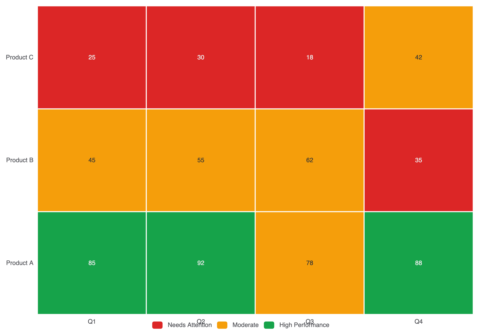
Instead of a continuous color gradient, use a piecewisevisualMap to group values into distinct operational bands (e.g., Low, Medium, High):
ECharts
Edit ECharts in VPasCode
option = {
    tooltip: { position: 'top' },
    xAxis: {
        type: 'category',
        data: ['Q1', 'Q2', 'Q3', 'Q4']
    },
    yAxis: {
        type: 'category',
        data: ['Product A', 'Product B', 'Product C']
    },
    visualMap: {
        type: 'piecewise',
        min: 0,
        max: 100,
        left: 'center',
        bottom: '5%',
        orient: 'horizontal',
        pieces: [
            { min: 80, label: 'High Performance', color: '#16a34a' },
            { min: 40, max: 79, label: 'Moderate', color: '#f59e0b' },
            { max: 39, label: 'Needs Attention', color: '#dc2626' }
        ]
    },
    series: [
        {
            type: 'heatmap',
            data: [
                [0, 0, 85], [1, 0, 92], [2, 0, 78], [3, 0, 88],
                [0, 1, 45], [1, 1, 55], [2, 1, 62], [3, 1, 35],
                [0, 2, 25], [1, 2, 30], [2, 2, 18], [3, 2, 42]
            ],
            label: { show: true },
            itemStyle: {
                borderColor: '#ffffff',
                borderWidth: 2
            }
        }
    ]
};
Fine-Tuning Layout and Color Gradients
Choosing legible color stops and enabling split areas makes large matrix grids effortless to scan.1. Gradient Customization and Label Alignment
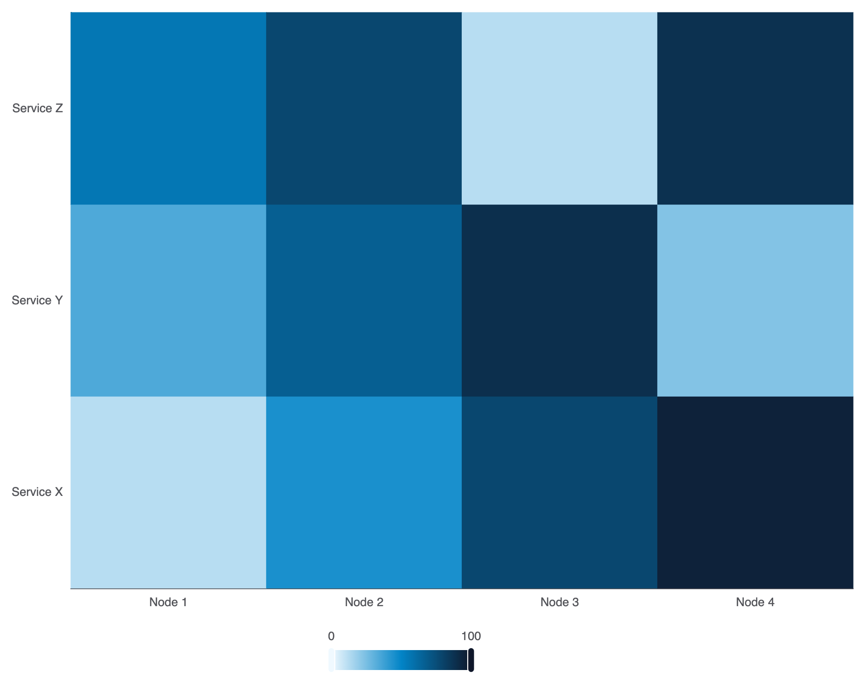
Configure custom multi-stop color ramps invisualMap.inRange to match your platform theme:
ECharts
Edit ECharts in VPasCode
option = {
    grid: { containLabel: true },
    xAxis: {
        type: 'category',
        data: ['Node 1', 'Node 2', 'Node 3', 'Node 4']
    },
    yAxis: {
        type: 'category',
        data: ['Service X', 'Service Y', 'Service Z']
    },
    visualMap: {
        min: 0,
        max: 100,
        calculable: true,
        orient: 'horizontal',
        left: 'center',
        bottom: '0%',
        inRange: {
            color: ['#f0f9ff', '#0284c7', '#0f172a'] // Soft blue to dark slate gradient
        }
    },
    series: [
        {
            type: 'heatmap',
            data: [
                [0, 0, 12], [1, 0, 45], [2, 0, 78], [3, 0, 95],
                [0, 1, 34], [1, 1, 67], [2, 1, 89], [3, 1, 23],
                [0, 2, 56], [1, 2, 78], [2, 2, 12], [3, 2, 88]
            ]
        }
    ]
};
Strategic Best Practices
- Always Include a
visualMap: A heatmap without a visual legend forces users to guess what colors mean. Always place a continuous or piecewisevisualMapclearly near the canvas edge. - Use Grid Borders for Separation: Apply thin white borders using
itemStyle.borderColor: '#fff'andborderWidth: 1or2to keep individual cells visually distinct in dense matrices. - Ensure High-Contrast Text: If cell numerical labels are active (
label.show: true), test that text color remains readable against both the lightest and darkest steps in your color gradient.