


The Mechanics of Stacked Horizontal Bars
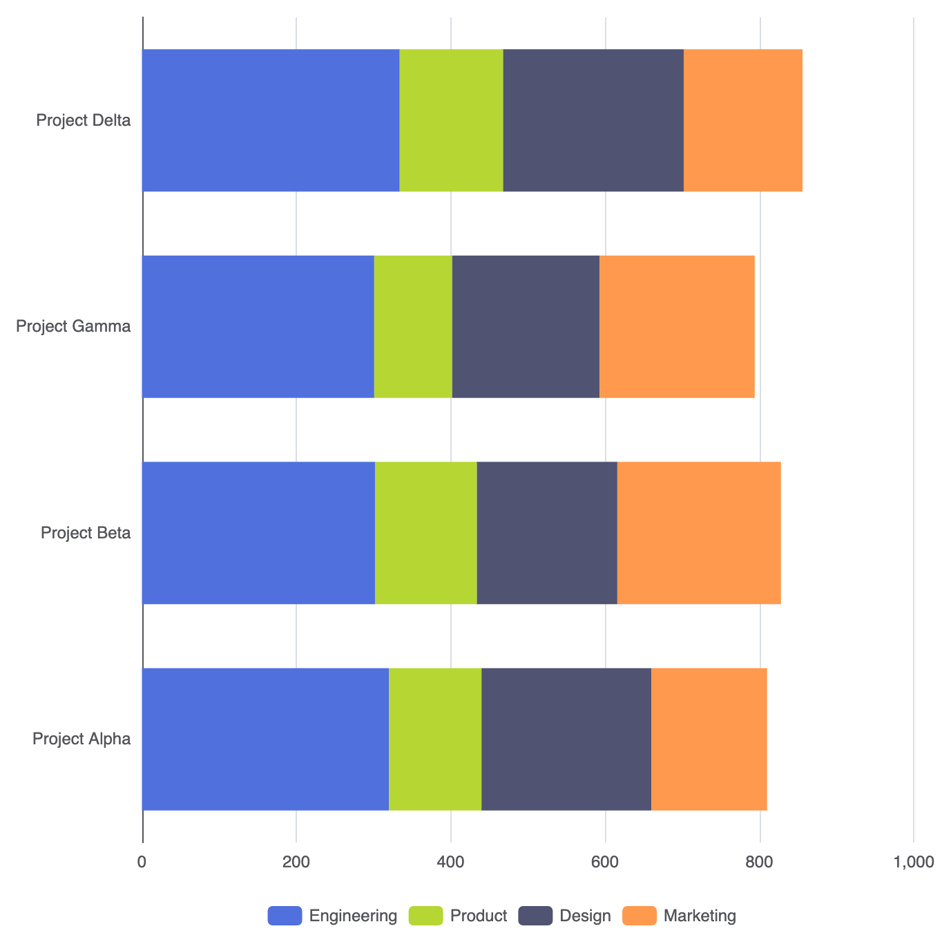
Creating a horizontal stacked chart involves using the samestack property as stacked column charts, paired with a category-based Y-axis. When multiple type: 'bar' series share an identical stack key on a horizontal orientation, the rendering engine accumulates values left-to-right along the X-axis.
1. Essential Setup
To build a basic stacked bar chart, setyAxis to type: 'category', xAxis to type: 'value', and assign a matching stack string to every series:
ECharts
Edit ECharts in VPasCode
option = {
    tooltip: {
        trigger: 'axis',
        axisPointer: { type: 'shadow' }
    },
    legend: {
        data: ['Engineering', 'Product', 'Design', 'Marketing']
    },
    xAxis: {
        type: 'value'
    },
    yAxis: {
        type: 'category',
        data: ['Project Alpha', 'Project Beta', 'Project Gamma', 'Project Delta']
    },
    series: [
        {
            name: 'Engineering',
            type: 'bar',
            stack: 'allocation',
            data: [320, 302, 301, 334]
        },
        {
            name: 'Product',
            type: 'bar',
            stack: 'allocation',
            data: [120, 132, 101, 134]
        },
        {
            name: 'Design',
            type: 'bar',
            stack: 'allocation',
            data: [220, 182, 191, 234]
        },
        {
            name: 'Marketing',
            type: 'bar',
            stack: 'allocation',
            data: [150, 212, 201, 154]
        }
    ]
};
Advanced Structural Techniques
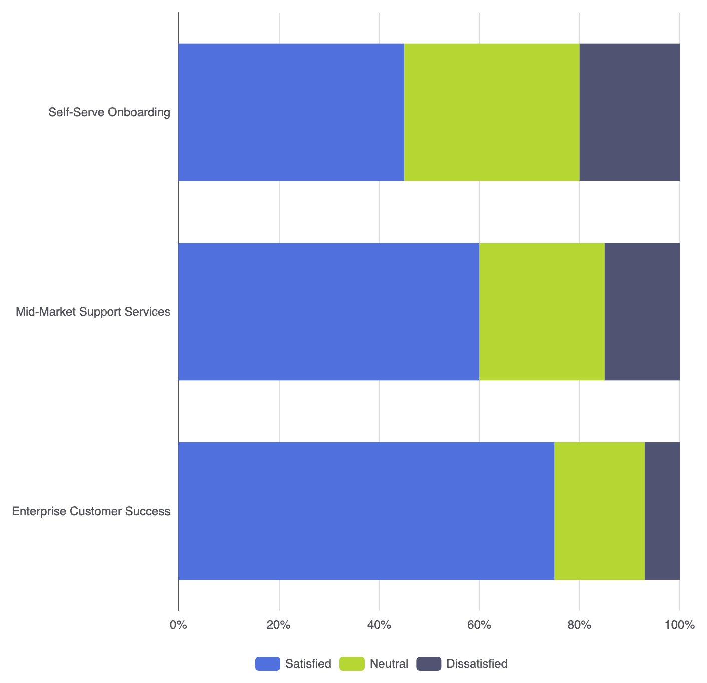
Stacked horizontal bars can be configured for absolute volume comparison or normalized to show percentage ratios across categories.1. 100% Normalized Horizontal Bar Chart
To evaluate relative ratios rather than absolute counts across long-form categories, normalize your series data to sum to 100% per row:
ECharts
Edit ECharts in VPasCode
option = {
    tooltip: {
        trigger: 'axis',
        axisPointer: { type: 'shadow' },
        formatter: '{b}
{a0}: {c0}%
{a1}: {c1}%
{a2}: {c2}%'
    },
    legend: {
        data: ['Satisfied', 'Neutral', 'Dissatisfied']
    },
    xAxis: {
        type: 'value',
        min: 0,
        max: 100,
        axisLabel: { formatter: '{value}%' }
    },
    yAxis: {
        type: 'category',
        data: [
            'Enterprise Customer Success',
            'Mid-Market Support Services',
            'Self-Serve Onboarding'
        ]
    },
    series: [
        {
            name: 'Satisfied',
            type: 'bar',
            stack: 'feedback',
            data: [75, 60, 45]
        },
        {
            name: 'Neutral',
            type: 'bar',
            stack: 'feedback',
            data: [18, 25, 35]
        },
        {
            name: 'Dissatisfied',
            type: 'bar',
            stack: 'feedback',
            data: [7, 15, 20]
        }
    ]
};
Fine-Tuning Layout and Styling
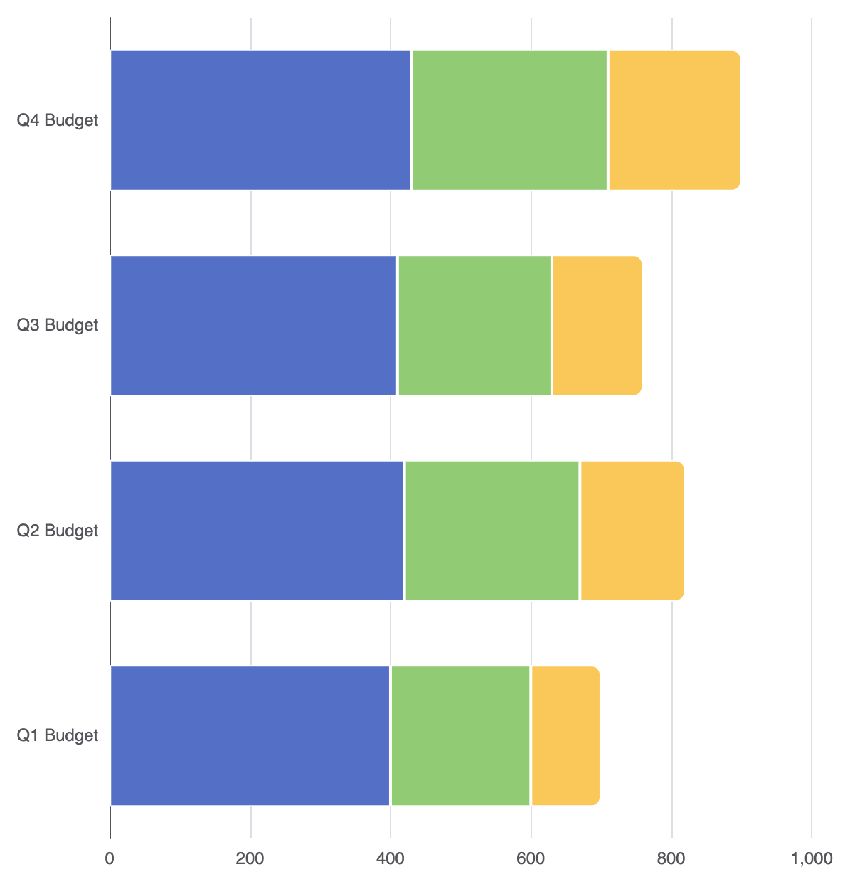
Clean visual boundaries and rounded outer ends give horizontal stacked bars a polished, modern feel.1. Segment Separation and Outer End Rounding
Apply thin vertical border lines to delineate inner segments, and restrict corner radius styling to the final segment on the right:
ECharts
Edit ECharts in VPasCode
option = {
    grid: {
        left: '15%',
        right: '10%',
        containLabel: true
    },
    xAxis: {
        type: 'value'
    },
    yAxis: {
        type: 'category',
        data: ['Q1 Budget', 'Q2 Budget', 'Q3 Budget', 'Q4 Budget']
    },
    series: [
        {
            name: 'Fixed Costs',
            type: 'bar',
            stack: 'budget',
            data: [400, 420, 410, 430],
            itemStyle: {
                color: '#5470c6',
                borderColor: '#ffffff',
                borderWidth: 1
            }
        },
        {
            name: 'Variable Costs',
            type: 'bar',
            stack: 'budget',
            data: [200, 250, 220, 280],
            itemStyle: {
                color: '#91cc75',
                borderColor: '#ffffff',
                borderWidth: 1
            }
        },
        {
            name: 'Discretionary',
            type: 'bar',
            stack: 'budget',
            data: [100, 150, 130, 190],
            itemStyle: {
                color: '#fac858',
                borderColor: '#ffffff',
                borderWidth: 1,
                borderRadius: [0, 6, 6, 0] // Rounded corners on the right end cap
            }
        }
    ]
};
Strategic Best Practices
- First Segment Baseline: The segment closest to the Y-axis baseline is the easiest to compare across categories. Always place your most critical component as the first series object.
- Limit Stacked Components: Keep the total number of stacked segments to 5 or fewer per bar to maintain clear visual analysis without overwhelming the viewer.
- In-Bar Text Labels: For horizontal stacked bars with wide segments, consider enabling
label: { show: true, position: 'inside' }to make individual segment values readable without relying on hover tooltips.