


The Mechanics of Area Charts
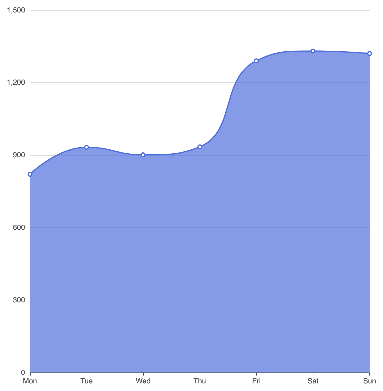
Area charts build directly on the line chart configuration. By settingtype: 'line' and including an areaStyle property on a series object, the rendering engine automatically fills the geometric space beneath the line path down to the horizontal baseline.
1. Essential Setup
To build a basic area chart, define a continuous X-axis, set seriestype: 'line', and declare an empty or customized areaStyle object:
ECharts
Edit ECharts in VPasCode
option = {
    tooltip: {
        trigger: 'axis'
    },
    xAxis: {
        type: 'category',
        boundaryGap: false,
        data: ['Mon', 'Tue', 'Wed', 'Thu', 'Fri', 'Sat', 'Sun']
    },
    yAxis: {
        type: 'value'
    },
    series: [
        {
            type: 'line',
            smooth: true,
            areaStyle: {}, // Enables default area fill
            data: [820, 932, 901, 934, 1290, 1330, 1320]
        }
    ]
};
Advanced Structural Techniques
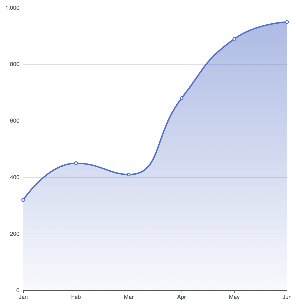
Area charts can be enhanced with modern color gradients and smooth curves to improve readability and visual polish.1. Gradient Fill Styling
A solid color fill can sometimes feel heavy. Applying a semi-transparent linear gradient creates a modern, sleek appearance where the fill softly fades toward the bottom axis:
ECharts
Edit ECharts in VPasCode
option = {
    tooltip: {
        trigger: 'axis'
    },
    xAxis: {
        type: 'category',
        boundaryGap: false,
        data: ['Jan', 'Feb', 'Mar', 'Apr', 'May', 'Jun']
    },
    yAxis: {
        type: 'value'
    },
    series: [
        {
            type: 'line',
            smooth: true,
            lineStyle: {
                width: 3,
                color: '#5470c6'
            },
            areaStyle: {
                opacity: 0.8,
                color: {
                    type: 'linear',
                    x: 0,
                    y: 0,
                    x2: 0,
                    y2: 1,
                    colorStops: [
                        { offset: 0, color: 'rgba(84, 112, 198, 0.6)' },
                        { offset: 1, color: 'rgba(84, 112, 198, 0.05)' }
                    ]
                }
            },
            data: [320, 450, 410, 680, 890, 950]
        }
    ]
};
2. Overlapping Multi-Series Area Comparison
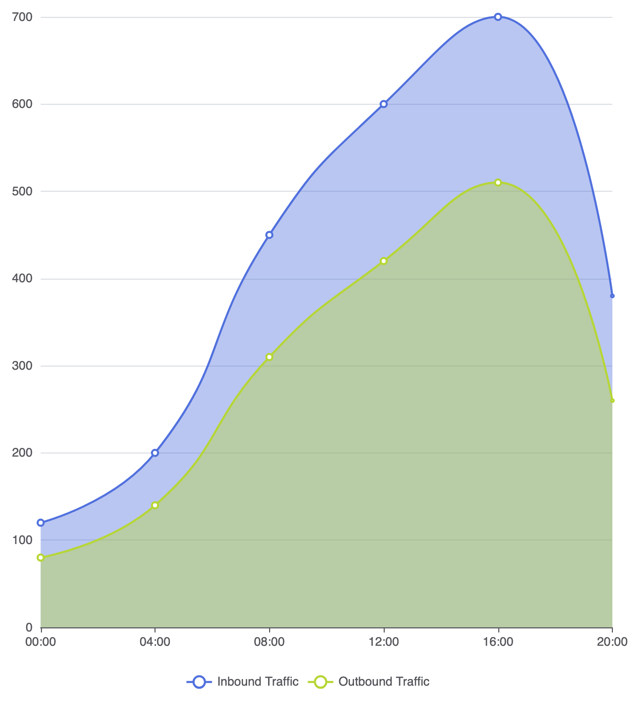
When displaying multiple area series in a single chart, adjusting fill opacity is crucial so underlying data paths remain fully visible:
ECharts
Edit ECharts in VPasCode
option = {
    tooltip: {
        trigger: 'axis'
    },
    legend: {
        data: ['Inbound Traffic', 'Outbound Traffic']
    },
    xAxis: {
        type: 'category',
        boundaryGap: false,
        data: ['00:00', '04:00', '08:00', '12:00', '16:00', '20:00']
    },
    yAxis: {
        type: 'value'
    },
    series: [
        {
            name: 'Inbound Traffic',
            type: 'line',
            smooth: true,
            areaStyle: { opacity: 0.4 },
            data: [120, 200, 450, 600, 700, 380]
        },
        {
            name: 'Outbound Traffic',
            type: 'line',
            smooth: true,
            areaStyle: { opacity: 0.4 },
            data: [80, 140, 310, 420, 510, 260]
        }
    ]
};
Fine-Tuning Layout and Spacing
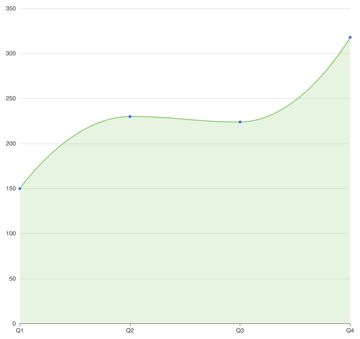
Because area fills run all the way down to the Y-axis baseline, configuring continuous boundary gaps keeps the fill aligned cleanly with the canvas border.1. Seamless Edge Alignment
By settingboundaryGap: false on the category X-axis, the fill starts at the absolute left edge of the container grid and terminates cleanly at the far right:
ECharts
Edit ECharts in VPasCode
option = {
    grid: {
        left: '3%',
        right: '4%',
        bottom: '3%',
        containLabel: true
    },
    xAxis: {
        type: 'category',
        boundaryGap: false,
        data: ['Q1', 'Q2', 'Q3', 'Q4']
    },
    yAxis: {
        type: 'value'
    },
    series: [
        {
            type: 'line',
            smooth: true,
            symbol: 'circle',
            symbolSize: 6,
            areaStyle: {
                color: 'rgba(145, 204, 117, 0.3)'
            },
            lineStyle: {
                color: '#91cc75',
                width: 2
            },
            data: [150, 230, 224, 318]
        }
    ]
};
Strategic Best Practices
- Use Low Fill Opacities: Solid area fills block underlying gridlines and overlapping series. Always maintain transparency levels around 20% to 50% for high contrast.
- Keep Series to 2 or 3: Too many overlapping area shapes cause visual confusion. For 4 or more cumulative continuous datasets, use a stacked area chart instead.
- Set
boundaryGap: false: Removing horizontal margins on time axes allows area fills to span the full grid width without leaving awkward empty gaps on the left and right edges.