


The Mechanics of Nightingale Charts
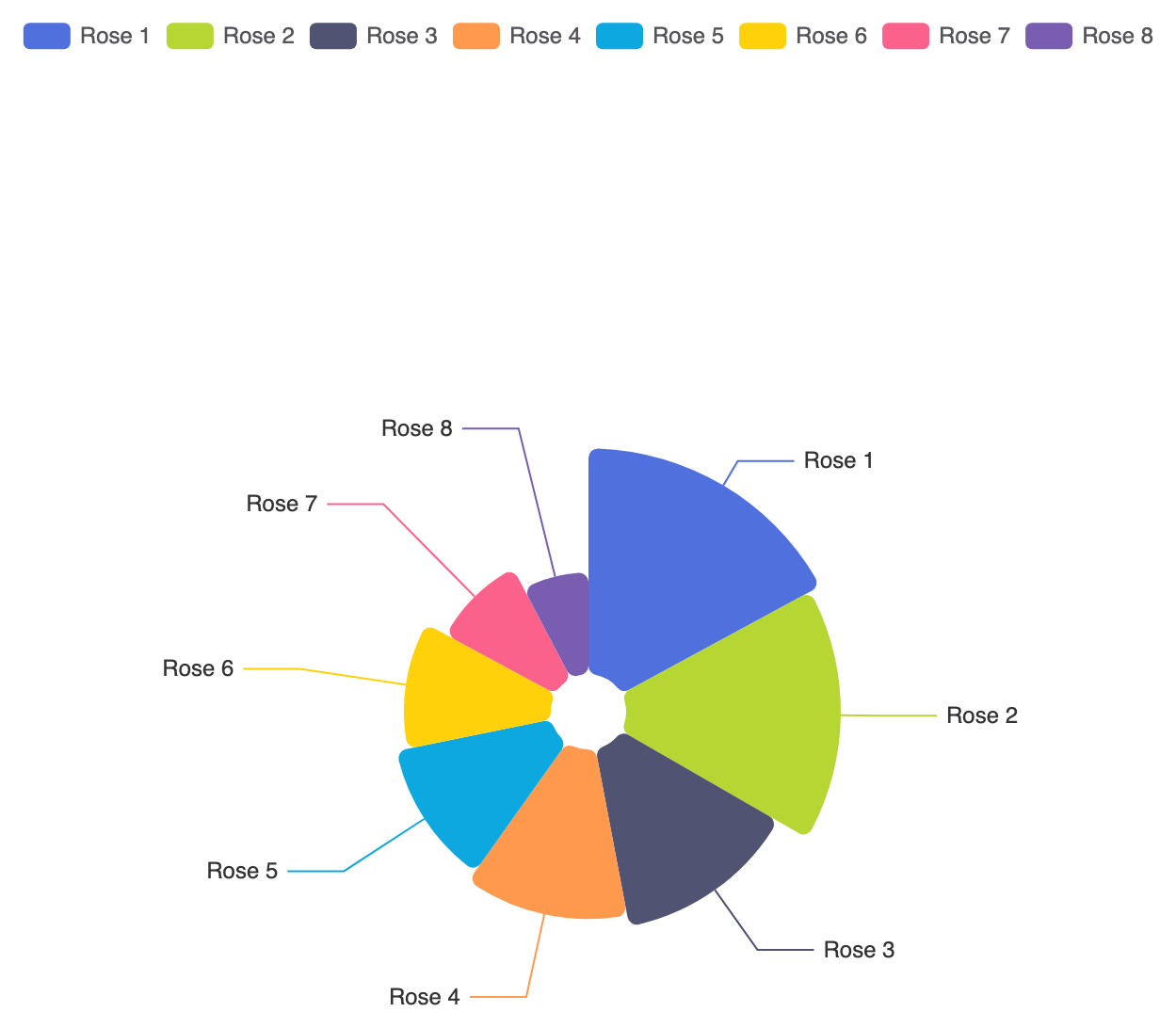
In Apache ECharts, a Nightingale chart uses the standard'pie' series type configured with the roseType property. Setting roseType: 'radius' instructs the engine to divide the circle into equal angular segments while sizing each sector’s outer radius based on its numerical value.
1. Essential Setup
To construct a basic Nightingale chart, setroseType: 'radius' inside a 'pie' series object and supply your dataset:
ECharts
Edit ECharts in VPasCode
option = {
    tooltip: {
        trigger: 'item',
        formatter: '{a}
{b}: {c} ({d}%)'
    },
    legend: {
        top: '5%',
        left: 'center'
    },
    series: [
        {
            name: 'Radius Mode',
            type: 'pie',
            radius: [20, 140],
            center: ['50%', '55%'],
            roseType: 'radius',
            itemStyle: {
                borderRadius: 5
            },
            data: [
                { value: 40, name: 'Rose 1' },
                { value: 38, name: 'Rose 2' },
                { value: 32, name: 'Rose 3' },
                { value: 30, name: 'Rose 4' },
                { value: 28, name: 'Rose 5' },
                { value: 26, name: 'Rose 6' },
                { value: 22, name: 'Rose 7' },
                { value: 18, name: 'Rose 8' }
            ]
        }
    ]
};
Advanced Structural Techniques
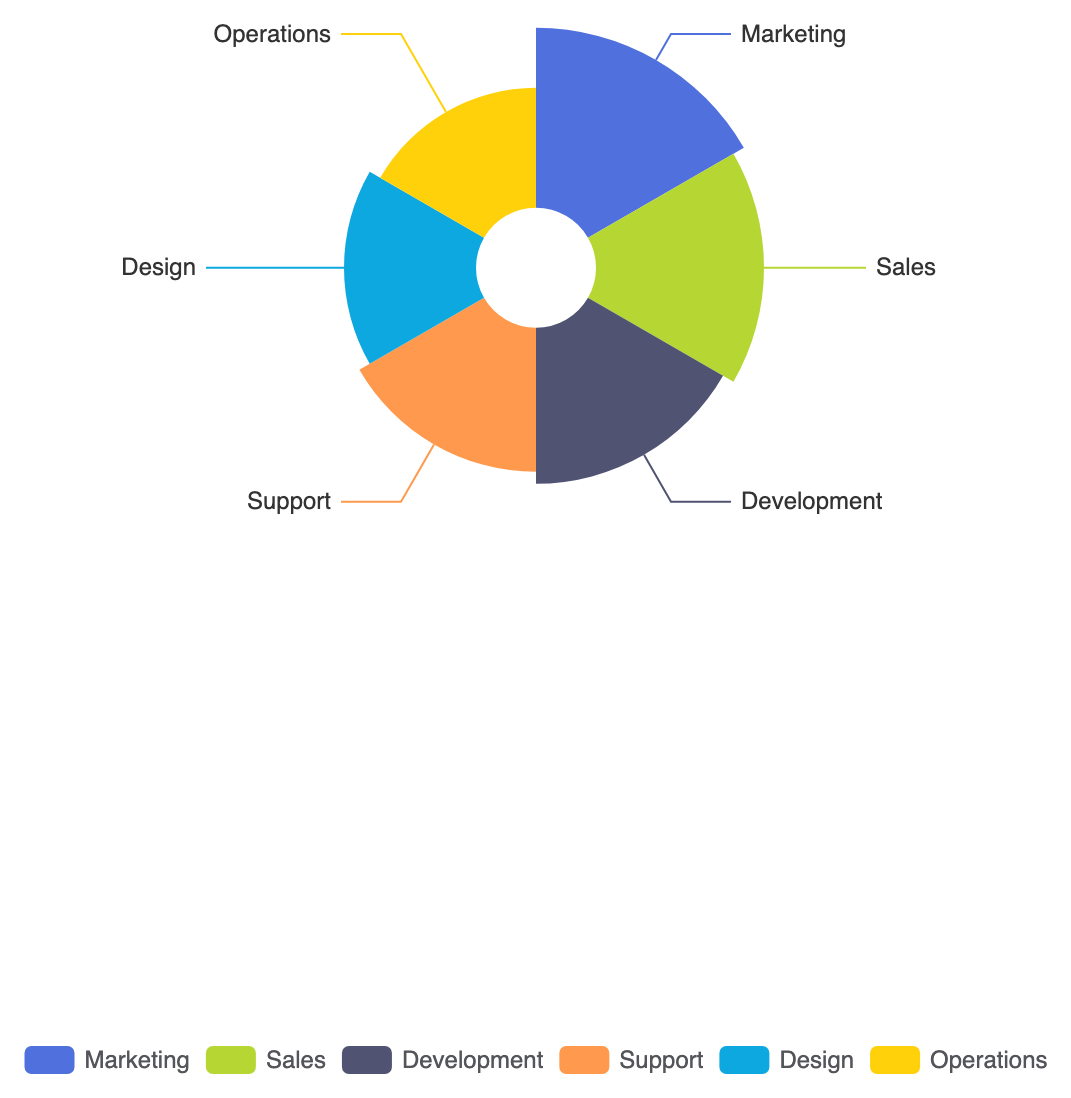
You can customize the rose chart display mode to vary both angle and radius simultaneously, or hollow out the center for a rose-donut hybrid.1. Area Rose Type (Equal Angles vs. Scaled Angles)
SettingroseType: 'area' keeps sector angles equal across all categories while scaling slice area rather than just radius:
ECharts
Edit ECharts in VPasCode
option = {
    legend: {
        top: 'bottom'
    },
    series: [
        {
            name: 'Area Mode',
            type: 'pie',
            radius: [30, 120],
            center: ['50%', '45%'],
            roseType: 'area',
            data: [
                { value: 30, name: 'Marketing' },
                { value: 28, name: 'Sales' },
                { value: 26, name: 'Development' },
                { value: 24, name: 'Support' },
                { value: 22, name: 'Design' },
                { value: 20, name: 'Operations' }
            ]
        }
    ]
};
Fine-Tuning Layout and Styling
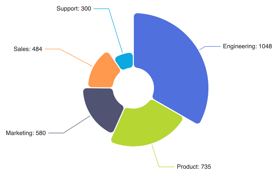
Applying rounded outer tips and distinct borders gives polar rose charts a refined appearance on modern web pages.1. Rounded Rose Tips and Segment Borders
UseborderRadius and white outline borders to separate adjacent radial petals cleanly:
ECharts
Edit ECharts in VPasCode
option = {
    tooltip: {
        trigger: 'item'
    },
    series: [
        {
            name: 'Department Impact',
            type: 'pie',
            radius: [40, 150],
            center: ['50%', '50%'],
            roseType: 'radius',
            itemStyle: {
                borderRadius: 8,
                borderColor: '#ffffff',
                borderWidth: 2
            },
            label: {
                show: true,
                formatter: '{b}: {c}'
            },
            data: [
                { value: 1048, name: 'Engineering' },
                { value: 735, name: 'Product' },
                { value: 580, name: 'Marketing' },
                { value: 484, name: 'Sales' },
                { value: 300, name: 'Support' }
            ]
        }
    ]
};
Strategic Best Practices
- Mind the Visual Distortion: Because area scales exponentially with radius, larger values appear visually dominant on rose charts compared to standard bar charts. Use them when impact and visual engagement take priority.
- Keep an Inner Radius Hole: Always set an inner radius (e.g.,
[20, 140]) so small sectors don’t shrink down to an unreadable sharp point at the absolute center. - Position Legends Off Center: Place legends at the top or bottom edge to prevent radial petals from overlapping text as they extend outward.