


The Mechanics of Boxplot Charts
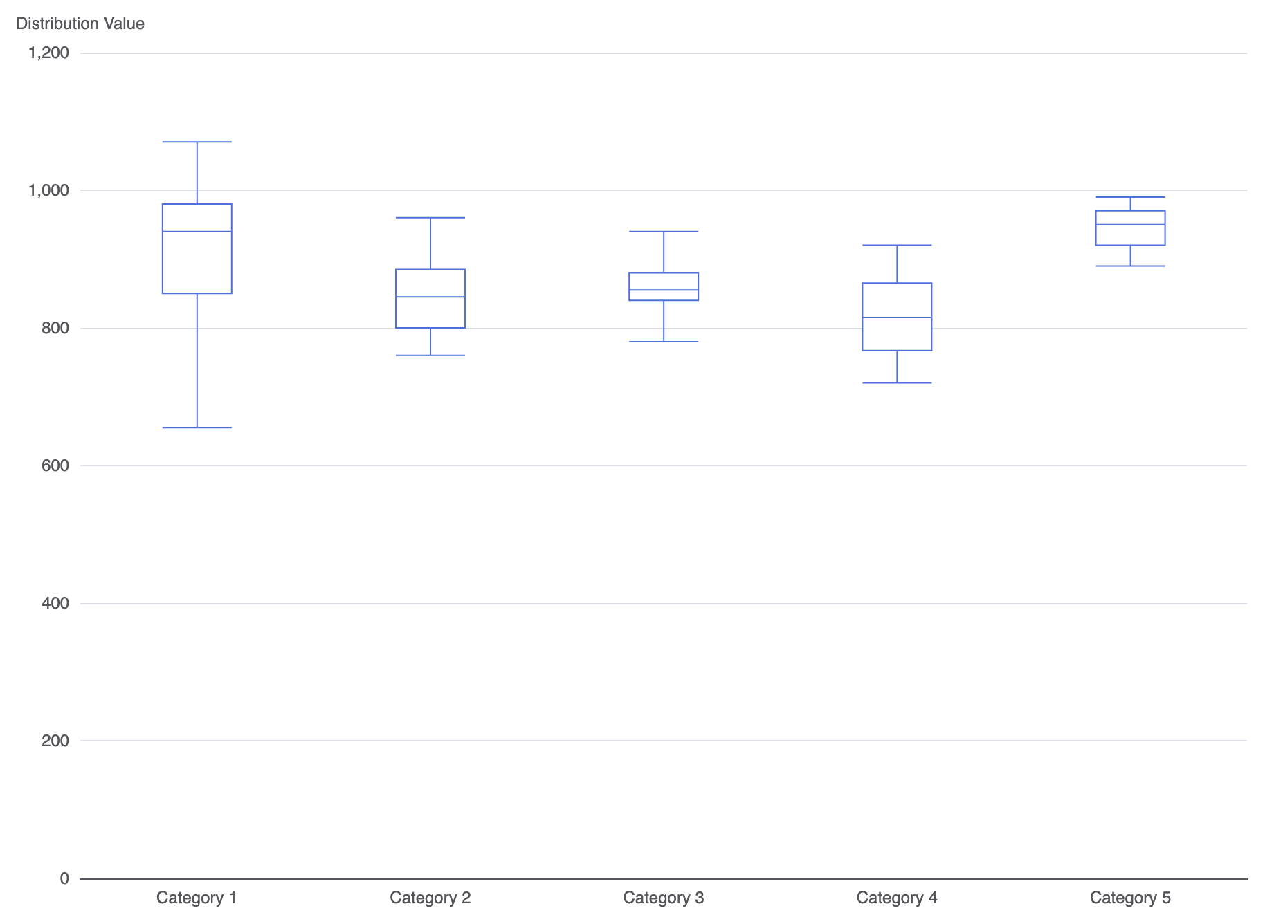
In Apache ECharts, statistical boxes are rendered usingtype: 'boxplot'. Each dataset entry expects a 5-element numerical array ordered as [Minimum, Q1, Median, Q3, Maximum]. ECharts also includes a built-in data preparation tool to compute these statistical boundaries directly from raw numbers.
1. Essential Setup
To construct a basic boxplot, map categories along the X-axis and supply calculated 5-number summary arrays inside your series data:
ECharts
Edit ECharts in VPasCode
option = {
    tooltip: {
        trigger: 'item',
        axisPointer: { type: 'shadow' }
    },
    xAxis: {
        type: 'category',
        data: ['Category 1', 'Category 2', 'Category 3', 'Category 4', 'Category 5']
    },
    yAxis: {
        type: 'value',
        name: 'Distribution Value'
    },
    series: [
        {
            name: 'Boxplot',
            type: 'boxplot',
            data: [
                [655, 850, 940, 980, 1070], // [Min, Q1, Median, Q3, Max]
                [760, 800, 845, 885, 960],
                [780, 840, 855, 880, 940],
                [720, 767, 815, 865, 920],
                [890, 920, 950, 970, 990]
            ]
        }
    ]
};
Advanced Structural Techniques
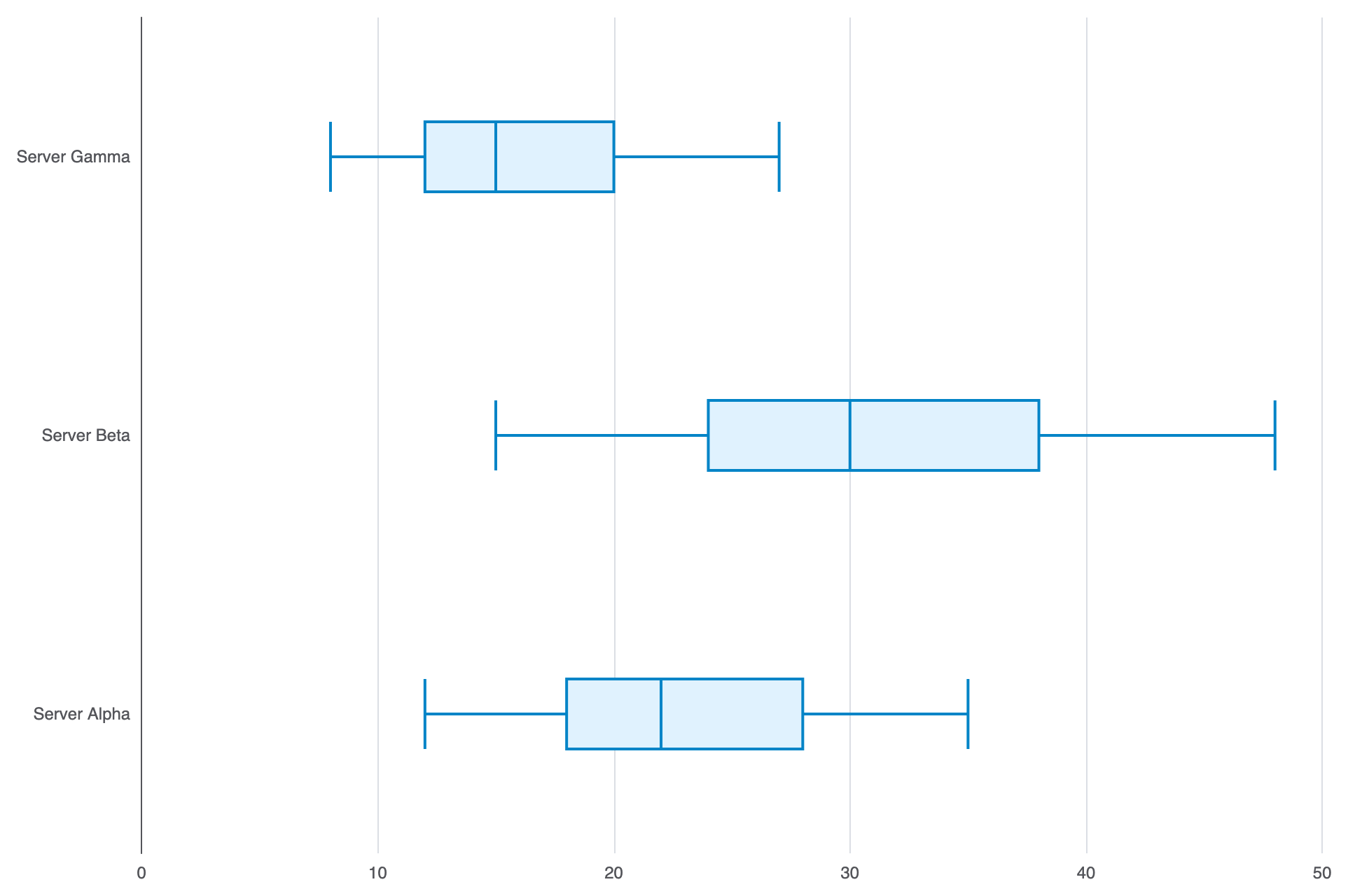
You can overlay outlier scatter points or build horizontal boxplots for categories with lengthy names.1. Horizontal Boxplot Layout
SetyAxis as the category scale and xAxis as the numerical value scale to flip boxplots horizontally for better label readability:
ECharts
Edit ECharts in VPasCode
option = {
    tooltip: {
        trigger: 'item',
        axisPointer: { type: 'shadow' }
    },
    xAxis: {
        type: 'value'
    },
    yAxis: {
        type: 'category',
        data: ['Server Alpha', 'Server Beta', 'Server Gamma']
    },
    series: [
        {
            name: 'Latency (ms)',
            type: 'boxplot',
            data: [
                [12, 18, 22, 28, 35],
                [15, 24, 30, 38, 48],
                [8, 12, 15, 20, 27]
            ],
            itemStyle: {
                color: '#e0f2fe',
                borderColor: '#0284c7',
                borderWidth: 2
            }
        }
    ]
};
Fine-Tuning Layout and Styling
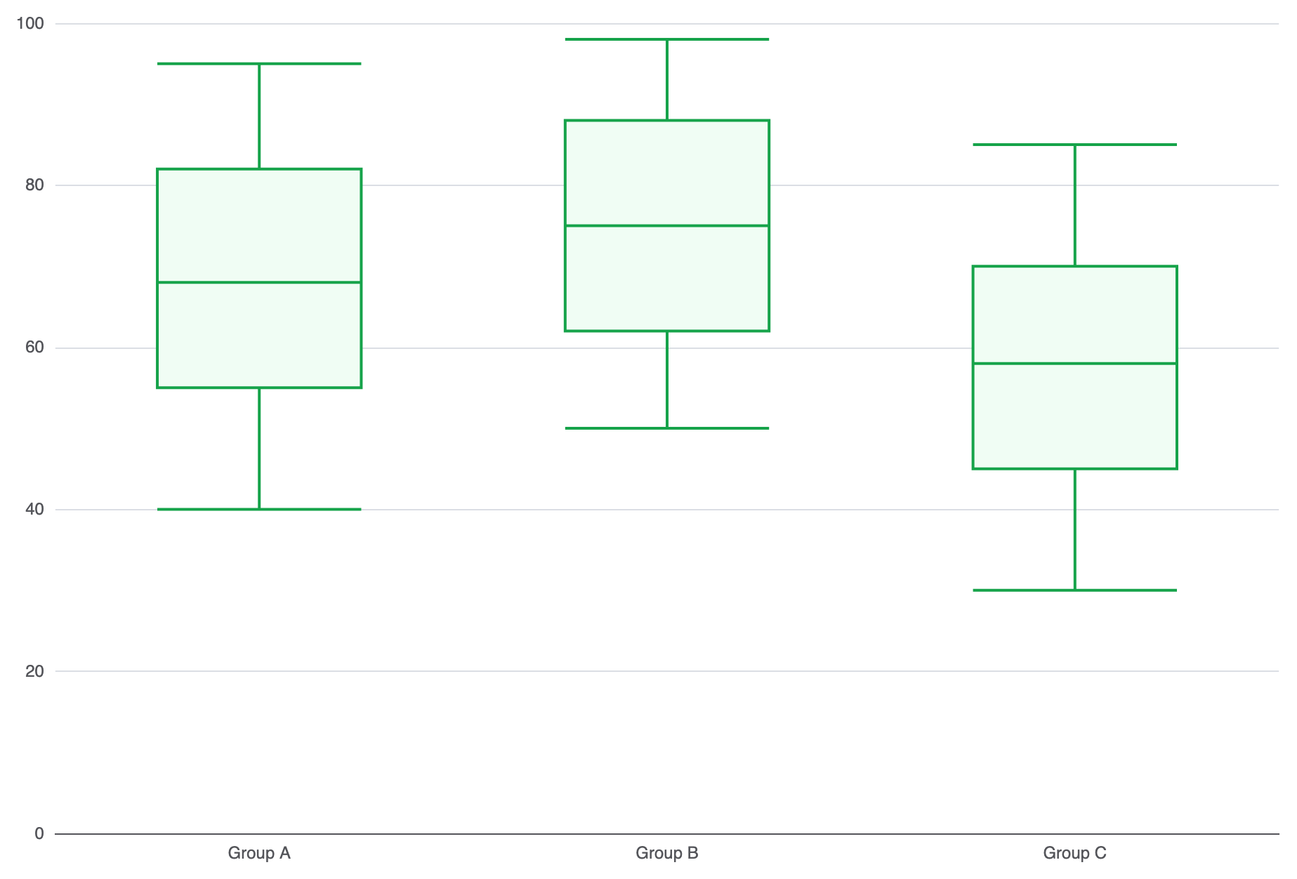
Custom box colors, whisker widths, and median line formatting improve visual distinction across complex dashboard layouts.1. Custom Box Fill and Outlier Styling
Style box borders, fill colors, and whisker line properties to match your interface design:
ECharts
Edit ECharts in VPasCode
option = {
    grid: {
        left: '10%',
        right: '10%',
        containLabel: true
    },
    xAxis: {
        type: 'category',
        data: ['Group A', 'Group B', 'Group C']
    },
    yAxis: {
        type: 'value'
    },
    series: [
        {
            name: 'Score Distribution',
            type: 'boxplot',
            boxWidth: ['20%', '50%'], // Responsive box width boundaries
            itemStyle: {
                color: '#f0fdf4',
                borderColor: '#16a34a',
                borderWidth: 2
            },
            data: [
                [40, 55, 68, 82, 95],
                [50, 62, 75, 88, 98],
                [30, 45, 58, 70, 85]
            ]
        }
    ]
};
Strategic Best Practices
- Double-Check Summary Order: Verify that array values follow the strict sequence:
[Minimum, Q1, Median, Q3, Maximum]. Incorrect ordering will cause rendering glitches. - Overlay Outliers with Scatter Series: Use a secondary
scatterseries on top of the boxplot to display extreme statistical outliers as individual data points. - Adjust Grid Padding: Ensure adequate
grid.bottomorgrid.leftpadding so long category names don’t clash with whisker lines.