


The Mechanics of Pictorial Bar Charts
In Apache ECharts, pictorial bar charts usetype: 'pictorialBar'. They operate on standard category and value axes just like regular bar charts, but replace rectangular bars with customizable graphics defined by the symbol property (such as standard shapes, image URLs, or SVG path strings).
1. Essential Setup
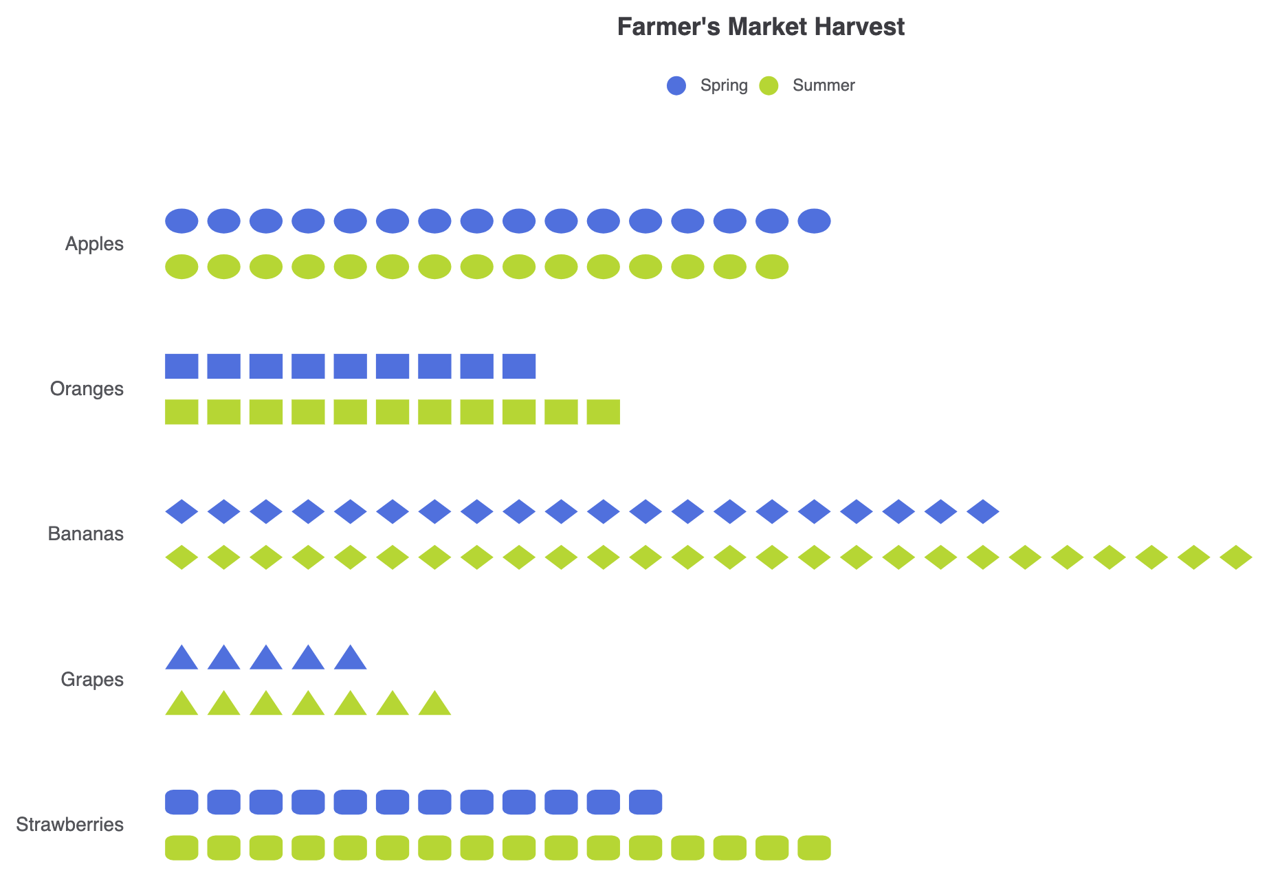
To construct a multi-series pictorial bar chart, set up categorical and numeric axes, definetype: 'pictorialBar' across series, and customize individual point symbols directly within the data array:
ECharts
Edit ECharts in VPasCode
option = {
  title: {
    text: "Farmer's Market Harvest",
    left: 'center'
  },
  legend: {
    data: ['Spring', 'Summer'],
    top: '8%'
  },
  tooltip: {
    trigger: 'axis',
    axisPointer: {
      type: 'shadow'
    }
  },
  grid: {
    containLabel: true,
    top: '18%',
    left: 20
  },
  yAxis: {
    data: ['Apples', 'Oranges', 'Bananas', 'Grapes', 'Strawberries'],
    inverse: true,
    axisLine: { show: false },
    axisTick: { show: false },
    axisLabel: {
      margin: 30,
      fontSize: 14
    }
  },
  xAxis: {
    splitLine: { show: false },
    axisLabel: { show: false },
    axisTick: { show: false },
    axisLine: { show: false }
  },
  series: [
    {
      name: 'Spring',
      type: 'pictorialBar',
      symbolRepeat: true,
      symbolSize: ['80%', '60%'],
      barCategoryGap: '40%',
      data: [
        { value: 320, symbol: 'circle' },
        { value: 180, symbol: 'rect' },
        { value: 410, symbol: 'diamond' },
        { value: 95, symbol: 'triangle' },
        { value: 240, symbol: 'roundRect' }
      ]
    },
    {
      name: 'Summer',
      type: 'pictorialBar',
      barGap: '10%',
      symbolRepeat: true,
      symbolSize: ['80%', '60%'],
      data: [
        { value: 290, symbol: 'circle' },
        { value: 210, symbol: 'rect' },
        { value: 520, symbol: 'diamond' },
        { value: 130, symbol: 'triangle' },
        { value: 310, symbol: 'roundRect' }
      ]
    }
  ]
};
Advanced Structural Techniques
Pictorial bar charts can repeat icons sequentially to build unit-based infographic counts or use clip paths to create fill-level visualizations.1. Single-Series Unit Count Patterns
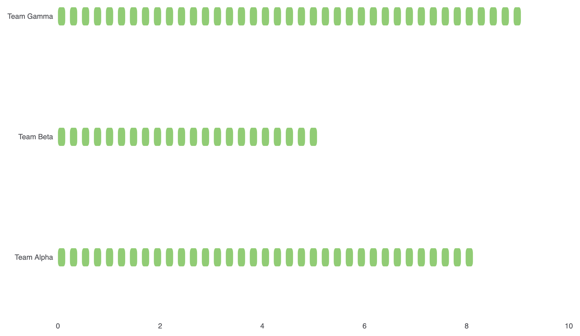
EnablesymbolRepeat: true on a single value axis to render horizontal unit-based symbol stacks:
ECharts
Edit ECharts in VPasCode
option = {
    tooltip: {
        trigger: 'axis'
    },
    xAxis: {
        type: 'value',
        max: 10,
        splitLine: { show: false }
    },
    yAxis: {
        type: 'category',
        data: ['Team Alpha', 'Team Beta', 'Team Gamma'],
        axisLine: { show: false },
        axisTick: { show: false }
    },
    series: [
        {
            type: 'pictorialBar',
            symbol: 'roundRect',
            symbolRepeat: true,
            symbolSize: [12, 30],
            symbolMargin: 4,
            data: [8, 5, 9],
            itemStyle: {
                color: '#91cc75'
            }
        }
    ]
};
Fine-Tuning Layout and Custom SVG Shapes
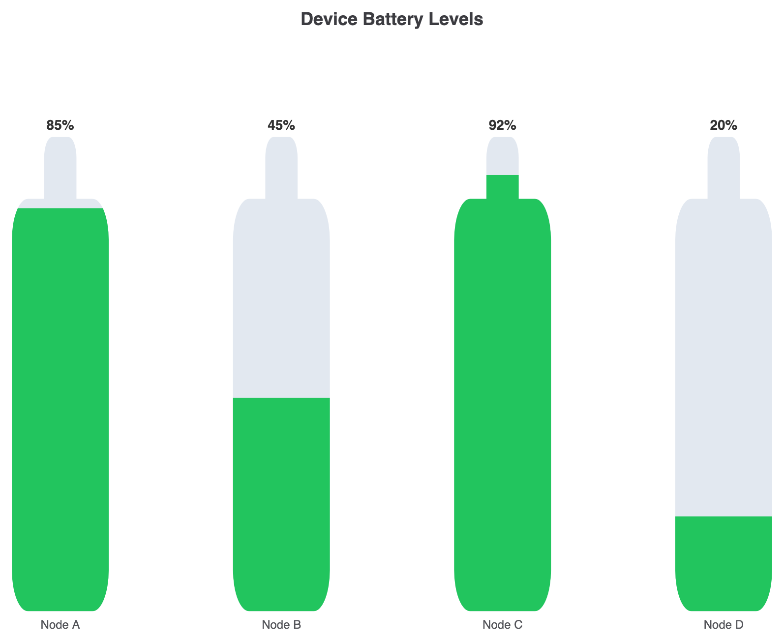
Using custom vector SVG path strings allows you to render tailored icons directly inside your chart series.1. Custom Vector Path and Background Overlay
Supply a custom SVG path string tosymbol and layer a full-scale background graphic underneath to build progress-style meters:
ECharts
Edit ECharts in VPasCode
const pathBattery = 'path://M16 4h-2V2a1 1 0 0 0-1-1H11a1 1 0 0 0-1 1v2H8a2 2 0 0 0-2 2v16a2 2 0 0 0 2 2h8a2 2 0 0 0 2-2V6a2 2 0 0 0-2-2z';

option = {
    title: {
        text: 'Device Battery Levels',
        left: 'center'
    },
    tooltip: {
        trigger: 'axis',
        axisPointer: { type: 'none' }
    },
    grid: {
        top: '20%',
        bottom: '15%',
        left: '10%',
        right: '10%'
    },
    xAxis: {
        type: 'category',
        data: ['Node A', 'Node B', 'Node C', 'Node D'],
        axisLine: { show: false },
        axisTick: { show: false }
    },
    yAxis: {
        type: 'value',
        max: 100,
        show: false
    },
    series: [
        {
            name: 'Battery Shell',
            type: 'pictorialBar',
            symbol: pathBattery,
            symbolSize: ['60%', '100%'],
            symbolPosition: 'start',
            symbolBoundingData: 100,
            symbolClip: false,
            itemStyle: {
                color: '#e2e8f0' // Empty background shell
            },
            data: [100, 100, 100, 100],
            z: 1
        },
        {
            name: 'Charge Level',
            type: 'pictorialBar',
            symbol: pathBattery,
            symbolSize: ['60%', '100%'],
            symbolPosition: 'start',
            symbolBoundingData: 100,
            symbolClip: true, // Fills proportionally relative to value
            label: {
                show: true,
                position: 'top',
                formatter: '{c}%',
                fontSize: 14,
                fontWeight: 'bold',
                color: '#333'
            },
            itemStyle: {
                color: '#22c55e' // Active charge green fill
            },
            data: [85, 45, 92, 20],
            z: 2
        }
    ]
};
Strategic Best Practices
- Assign Per-Item Symbols for Distinct Categories: Pass individual
symboldefinitions inside data objects (e.g.,{ value: 320, symbol: 'circle' }) to visually distinguish rows without relying purely on colors. - Keep Icon Metaphors Intuitive: Choose symbols that directly match the data topic (e.g., user silhouettes for demographic data or battery icons for power metrics) to make the visual immediately readable.
- Use
symbolClip: truefor Fill Indicators: When showing percentage metrics against full backgrounds, setsymbolClip: trueon the active series so the custom vector shape fills proportionally.